Query of the Month
Welcome to the ‘Query of the Month’ where we’ll be creating a collection of new and interesting queries to demonstrate the powerful combination of BigData from the NCI cancer programs like TCGA, and BigQuery from Google.
NOTE! We mostly spend time producing notebooks for our community collection. Check it out: https://github.com/isb-cgc/Community-Notebooks ReadTheDocs: https://isb-cancer-genomics-cloud.readthedocs.io/en/latest/sections/HowTos.html
Query of the Month is produced by the ISB-CGC team, with special effort by:
David L Gibbs (david.gibbs ( ~ at ~ ) systemsbiology ( ~ dot ~ ) org)
Kawther Abdilleh (kawther.abdilleh ( ~ at ~ ) gdit (~ dot ~) com)
Sheila M Reynolds (sheila.reynolds ( ~ at ~ ) systemsbiology ( ~ dot ~ ) org)
Table of Contents
2019
July2019: New notebooks added, cohorts and GEO data
June2019: Community Notebooks launched!
February2019: BigQuery in R - a refresher
January2019: Bam slicing in a cloud hosted python notebook.
2018
December2018: BigQuery Tips & Tricks
November2018: Transform VCF (DNA variants) files to BigQuery.
October2018: Jupyter notebooks & Dataproc clusters … in the cloud.
September2018: R scripts in the cloud.
August2018: Using BigQuery ML in a shiny app.
July2018: First look: BigQuery ML.
June2018: Processing bam files using WDL ‘scatter and gather’.
May2018: Processing bam files using CWL ‘scatter and gather’.
April2018: Running CWL workflows in the cloud.
March2018: Machine learning classifer in BigQuery?! Top Scoring Pairs implementation.
February2018: BioCircos shiny app, showing pairwise correlations within a pathway.
January2018: Gene Set Scoring in BigQuery, using the new hg38 mutation tables.
2017
December2017: BigQuery comparing TCGA samples to GTEx tissues with Spearman correlation.
November2017: Run an R (or python) script in batch mode using dsub on the google cloud.
October2017: Using plotly for visualization in Shiny apps. We implement an interatictive heatmap using heatmaply
September2017: We implement a new statistical test in BigQuery: the one-way ANOVA.
August2017: A small demo application using BigQuery as the backend for a Shiny app.
July2017: Look at the BigQuery RECORD data type in methylation tables from the GDC.
March2017: BigQuery to compute a pairwise distance matrix and a heatmap in R
February2017: Using BigQuery, define K-means clustering as a user defined (javascript) function
January2017: Comparing Standard SQL and Legacy SQL.
2016
December2016: Spearman correlation in BigQuery to compare the new hg38 expression data to the hg19 data
Links
Resources: Helpful information!
July, 2019
This month we’ve added a couple new notebooks. Let us know if they’re useful!
We have a notebook demonstrating how to create sample cohorts based on clinical characteristics. Second, a notebook demonstrating how to get a dataset from NCBI GEO, transform it to a ‘tidy’ format and make a BigQuery table.
June, 2019
#*Community Notebooks launched!*
After a lengthy hiatus, we’ve returned with a new Community Notebooks repository! This is a central hub, where very specific questions (like an FAQ) can be answered using a notebook format. This should make it easier to move from example to application.
Our first few notebooks include:
How do I get started fast (Python)?
How do I get started fast (R)?
How do I plot a BigQuery result (Python)?
How do I plot a BigQuery result (R)?
How do I work with cloud storage (Python)?
Stay tuned for more notebooks! And, we would love to hear from you! Have a notebooks you’d like to share with world, and attribution (!) , please send an email to dgibbs <at> systemsbiology <dot> org.
February, 2019
In this QoTM, we’ll look at the current open-access TCGA and TARGET datasets in BigQuery using R as our workspace. You can find in-depth descriptions of the BigQuery datasets in our documentation here:.
Note: You will need to have set up a Google Cloud Platform project to access/query the BigQuery tables in R, more info here:.
Here’s our example case-study for month:
Your lab is interested in comparing the gene expression profiles of 2 non-coding RNAs, specifically the lncRNA ANRIL and the miRNA miRNA-21 across multiple cancer types. From the literature and your own research studies, expression of both ANRIL and. miRNA-21 have been implicated in many different cancer types.
In R:
Let’s look at the currently available ISB-CGC BigQuery tables to find tables that will allow us to compare the expression profiles of the non-coding RNAs.
Once identified, let’s query and explore the BigQuery tables that contain the information we need.
Let’s generate an interactive scatterplot!
Let’s begin!
Within your R environment
install.packages("bigrquery")
install.packages("httpuv")
install.packages("ggplot2")
install.packages("reshape")
install.packages("scales")
install.packages("dplyr")


library(bigrquery)
library(httpuv)
library(ggplot2)
library(reshape)
library(scales)
library(dplyr)

##Let's investigate the publicly available ISB-CGC created TCGA and TARGET tables.
##There are a number of Level 3 datasets updated and available including:


#To list datasets associated with the ISB-CGC project in R:
list_datasets("isb-cgc")
[1] "CCLE_bioclin_v0"     "GDC_metadata"        "GTEx_v7"            "QotM"                "TARGET_bioclin_v0"
[6] "TARGET_hg38_data_v0" "TCGA_bioclin_v0"     "TCGA_hg19_data_v0"   "TCGA_hg38_data_v0"   "Toil_recompute"
[11] "ccle_201602_alpha"   "genome_reference"    "hg19_data_previews"  "hg38_data_previews"  "metadata"
[16] "platform_reference"  "tcga_201607_beta"    "tcga_cohorts"        "tcga_seq_metadata"

#Let's get the list of tables for the TCGA_hg38 dataset:
 list_tables("isb-cgc","TCGA_hg38_data_v0")
 [1] "Copy_Number_Segment_Masked"     "Copy_Number_Segment_Masked_r14" "DNA_Methylation"
 [4] "DNA_Methylation_chr1"           "DNA_Methylation_chr10"          "DNA_Methylation_chr11"
 [7] "DNA_Methylation_chr12"          "DNA_Methylation_chr13"          "DNA_Methylation_chr14"
 [10] "DNA_Methylation_chr15"          "DNA_Methylation_chr16"          "DNA_Methylation_chr17"
 [13] "DNA_Methylation_chr18"          "DNA_Methylation_chr19"          "DNA_Methylation_chr2"
 [16] "DNA_Methylation_chr20"          "DNA_Methylation_chr21"          "DNA_Methylation_chr22"
 [19] "DNA_Methylation_chr3"           "DNA_Methylation_chr4"           "DNA_Methylation_chr5"
 [22] "DNA_Methylation_chr6"           "DNA_Methylation_chr7"           "DNA_Methylation_chr8"
 [25] "DNA_Methylation_chr9"           "DNA_Methylation_chrX"           "DNA_Methylation_chrY"
 [28] "Protein_Expression"             "RNAseq_Gene_Expression"         "Somatic_Mutation"
 [31] "Somatic_Mutation_DR10"          "Somatic_Mutation_DR6"           "Somatic_Mutation_DR7"
 [34] "miRNAseq_Expression"            "miRNAseq_Isoform_Expression"    "tcga_metadata_data_hg38_220818"
 [37] "tcga_metadata_data_hg38_250718"


 #So let's remember our use-case: We want to compare the gene expression profiles of our non-coding RNAs
 #of interest. ANRIL is a lncRNA and lncRNA expression is captured in the RNAseq_Gene_Expression table and miRNA-21 is
 #a miRNA_seq_Expression table. Let's find get our RNAs expression from their respective tables

  #To access and query the BigQuery tables, you'll need to first specify your project id:
  project <-"isb-cgc-02-0001"

  #Information about lnRNAs are in the gene expression tables..Let's compose a query on the RNAseq_Gene_Expression dataset
  #for the lncRNA dataset

  #query the RNAseq BigQuery table that has info for lncRNAs
  sql1<-"SELECT case_barcode, project_short_name, gene_name,HTSeq__Counts FROM `isb-
  cgc.TCGA_hg38_data_v0.RNAseq_Gene_Expression` WHERE Ensembl_gene_id = 'ENSG00000240498' ORDER BY
  project_short_name"
  data1 <- query_exec(sql1, project = project, use_legacy_sql = FALSE,max_pages = Inf)
  head(data1)

  #query the BigQuery miRNA expression table
  sql2 <-"SELECT project_short_name, case_barcode, mirna_id,read_count FROM `isb-cgc.TCGA_hg38_data_v0.miRNAseq_Expression`     WHERE mirna_id = 'hsa-mir-21' ORDER BY project_short_name"
  data2 <- query_exec(sql2, project = project, use_legacy_sql = FALSE,max_pages = Inf)
  head(data2)

  #we can join these tables in BigQuery and have one datatable, we can also create 2 tables and merge them right here in R.
  #let's merge these two data tables here in R by case_barcode.
  merge_data = merge(data1,data2,by=c("case_barcode","project_short_name"))

  #The expression values were computed using different tools for the different datasets, so to compare the values we can        #normalize using the rescale function in R.

  merge_data$HTSeq__Counts= rescale(merge_data$HTSeq__Counts,to=c(0,1))
  merge_data$read_count = rescale(merge_data$read_count,to=c(0,1))

  #Let's take a look at our merged table, we now have information for expression of the CDKN2B-AS1 and hsa-mir-21 for          #almost 12,000 cases.
  head(merge_data)

  #We can create an interactive scatterplot plot using the function plotly in R to compare CDKN2B-AS1 and miRNA-21             #expression across multiple cancer types. This interactive plopt in R is called plotly.

  p <- ggplot(merge_data, aes((HTSeq__Counts), (read_count), colour=project_short_name)) + geom_point() + theme_classic() +     theme(legend.position="none") + labs(x = "ANRIL normalized expression",y="miRNA-21 normalized expression")
  ggplotly(p)
January, 2019
Bam slicing in the cloud
This month we’re going to do some bam slicing in a cloud hosted jupyter notebook.
Regarding bam slicing, ISB-CGC documentation can be found here.
BAM files are central to almost all genomic analyses. Often, they are very large in size, especially for larger genomes like the human genome. Researchers may only be interested in small genomic regions, and so rather than download and deal with massive files, we can extract or “slice out” subsections of the BAM file. The high performance HTSlib library (release 1.4+) is used to manipulate high-throughput genomics data and is what allows users to perform BAM-slicing. HTSlib is central to the SAMtools package, a popular tool for NGS data manipulation http://www.htslib.org/doc/samtools.html .
In this post, we’ll be using a python wrapper for SAMtools called PySAM.
In the Jupyter notebook (see link below), we demonstrate the following:
How to invoke bash commands within a Jupyter environment.
How to install packages/programs within a Jupyter environment
How to use available BigQuery tables within ISB-CGC to query and identify Google Cloud Storage bucket locations for BAM files of interest
How to use PySam to slice BAM files
How to save slices in your bucket and retrieve them
Brief example of working with reads
Link to the Jupyter notebook here .
How to invoke bash commands within a Jupyter environment.
We’re finding the free jupyter notebooks offered from Google Colaboratory really useful and surprisingly flexible. The level of access to the operating system is quite good and allows us to run bash commands to work on the file level.
To run a command, in your colaboratory notebook, create a cell like:
!ls -lha
That’s going to list out all the files in your environment. The ‘bang’ (exclaimation point) signals to the notebook to run this command using bash.
Another useful command is
!env
Which prints out all the environment variables. This is useful in a lot of cases, such as compiling software.
How to install packages/programs within a Jupyter environment
To install a new linux library, create a new cell in your colaboratory python notebook and run:
!sudo apt-get install libxml2
How to use available BigQuery tables
In the notebook, there’s other ‘magic commands’ as well. Since it’s a Google product, it’s relatively straightforward to connect to other Google products like BigQuery. This is really cool, because if the free colaboratory notebook is short on raw compute power, BigQuery gives you the power of a cluster, and with the summary results you can do visualization and downstream analysis in the notebook.
To run an SQL query, we use some %%BigQuery magic
%%bigquery --project our-project-id df
SELECT * FROM `isb-cgc.TCGA_hg19_data_v0.tcga_metadata_data_hg19_18jul`
where
data_format = 'BAM'
AND disease_code = 'OV'
AND experimental_strategy = "WGS"
AND platform = 'ABI SOLiD'
LIMIT 5
Where ‘our-project-id’ is your google project id, and df is a variable that will store the results of the query. In this query, we’re selecting all the available metadata for bam files (data_format = ‘BAM’) associated with ovarian cancer (disease_code = ‘OV’). From a query like this, you can get a list of bam files stored in a google cloud bucket, and slice out a section of reads from each.
Using Pysam to slice bams
Pysam is a python wrapper around SAMtools which uses the HTSlib in reading and processing bams.
In order to read out from GCS (cloud buckets), HTSlib needs to be compiled with some additional functionality.
export HTSLIB_CONFIGURE_OPTIONS="--enable-gcs"
Then, to slice out a region on chromosome 7 between 140453130-140453140, we would:
export GCS_OAUTH_TOKEN=`gcloud auth application-default print-access-token`

./samtools view gs://gdc-ccle-open/0a109993-2d5b-4251-bcab-9da4a611f2b1/C836.Calu-3.2.bam 7:140453130-140453140
In the python notebook, we do something very similar. We need to compile HTSlib gcs-enabled to read cloud-based files, which in turn requires installing a few extra libraries. Then we would:
samfile = pysam.AlignmentFile('gs://gdc-ccle-open/0a109993-2d5b-4251-bcab-9da4a611f2b1/C836.Calu-3.2.bam', "rb")

for read in samfile.fetch('7', 140453130, 140453135):
  print(read)

samfile.close()
The AlignmentFile lets you fetch a AlignedSegment object, and you use that object to call many different methods. You can see the full API here.
For a couple quick examples of working with AlignedSegments, such as processing sequence data, check out the notebook!
How to save slices in your bucket and retrieve them
Once you have a list of slices for analysis, we can use all our Google cloud tools, like gsutil!
!gsutil ls gs://my_bucket_1/
Here we list out all the file in my bucket. We can also use gsutil to move items in and out of our notebook environment.
!gsutil cp my.bam gs://my_bucket_1/my.bam
That’s it for this month, please let us know if you have questions, or have topics you’d like to see covered in later months!
December, 2018
BigQuery Tips & Tricks
Last month, we transformed a typical genomics file type (the vcf file format) into a BigQuery table. This month, we’ll continue exploring how to load data into bigquery tables. Because genomics files are often very large in size, we’ll also explore some tricks on how to partition tables to query to save both money and time!
I. Loading CSV Data into BigQuery
First, let’s explore how to load csv files into big query. Here’s an example of a common use-case:
A lab with which your group collaborates is generating large amounts of RNAseq gene expression data. They have been following the nice analyses your group has done using BigQuery and would like you to help them perform similar analyses. Thus far, they have saved all of their RNAseq expression data into CSV format. They need your help first loading their RNAseq data files into BigQuery.
Here, we’ll learn how to load CSV files into BigQuery tables. We’ll accomplish this with some very useful bq command-line tools and arguments.
Before starting:
– This tutorial assumes that you’ve already created a GCP project. If you don’t already have one, instructions on how to set up one up can be found: here
– Ensure that you have Google Cloud SDK installed
Loading CSV files into Google Cloud Storage
You can load local files as well as files from Google Cloud Storage (GCS). For this exercise, let’s make a GCS bucket to store our CSV files.
1. Make a bucket to store the RNAseq CSV
gsutil mb gs://RNAseq_CSVs
2. Copy the CSVs into your newly created storage bucket
gsutil cp *.csv gs://RNAseq_CSVs
Creating a BigQuery dataset
Creating tables and loading data via the BigQuery web-UI is good if you’re only loading a small amount of data. It can be a tediously manual process though if you have more than a handful of files. We can create tables and load data using Google SDK’s handy bq tool. bq is a python-based, command-line tool for BigQuery. https://cloud.google.com/bigquery/docs/bq-command-line-tool
Let’s create a dataset that will hold our RNAseq data:
bq mk RNAseq_data
If successful, you will get the following message:
Dataset 'Your_Project_ID:RNAseq_data' successfully created
You can also list all of the datasets associated with your project using the following command:
bq ls
Generate schema for BigQuery table
A schema for a table is a description of its field names and types. BigQuery allows you to specify a table’s schema when you load data into a table. We can create a schema file in JSON format. You can find a Python script (createSchema.py) to create a JSON schema for your table in our github examples-Python repository.
https://github.com/isb-cgc/examples-Python/tree/master/python
Usage: python createSchema.py <input-filename> <nSkip>
where nSkip specifies the # of lines skipped between lines that are parsed and checked for data-types; if the input file is small, you can leave set nSkip to be small, but if the input file is very large, nSkip should probably be 1000 or more (default value is 1000)
Loading Data in BigQuery
With the JSON schema file, we are now ready to load data into BigQuery. The bq load command is used to load data in BigQuery via the command-line.
# usage:
# bq --location=[LOCATION] load --source_format=[FORMAT] [DATASET].[TABLE] [PATH_TO_SOURCE] [SCHEMA]

  bq load \\

  --source_format=CSV \\

  --skip_leading_rows=1 \\

  RNAseq_data.expressionFile \\                 # where it's going

  gs://RNAseq_CSVs/ExpressionDataTable.csv \\   # the table in a bucket

  ExpressionDataTable.csv.json                  # the table schema
You can verify that the table loaded by showing the table properties with this command:
bq show RNAseq_data.expressionFile
II. BigQuery Table Clusters
The costs of using BigQuery center around how much of a table is read by the query. So, the same query applied to a small table versus a very large table will incur very different costs. It simply costs more to query a large table! In the past, we broke tables into many subtables to save costs and time. This was the case with the methylation tables where the entire thing consisted of 3.9 Billion rows (932 GB)! It’s pretty expensive to query that table, so we broke it into many tables by chromosome. OK, but not entirely convenient to work with.
Now, there’s a fairly simple step to accomplish the same thing, resulting in huge cost savings without changing your SQL or table schema! They’re called ‘clustered tables’, which groups rows of your BigQuery table so that your query only reads the appropriate portions of your table. This means you can specify the cluster to be over chromosomes, and your query will only read the portion of the table associated with that chromosome. docs here
There’s a number of different ways to partition your tables. For one, you can partition it at the time of ‘ingestion’. What that means is that each time new data arrives, a new partition is created when the data is appended to a new table.
So let’s look at an example using a table built from wikipedia (from Optimizing BigQuery: Cluster your tables, by *Felipe Hoffa*). This uses a query to select-*-everything from the table, and cluster it by wiki and title. The order matters in clusters (see notes below)! Clustered tables also have to be applied to partitioned tables. Below the table is being partitioned by a date.
CREATE TABLE `fh-bigquery.wikipedia_v3.pageviews_2017`

PARTITION BY DATE(datehour)

CLUSTER BY wiki, title

OPTIONS(
description="Wikipedia pageviews - partitioned by day,clustered by (wiki, title).
  Contact `*https://twitter.com/felipehoffa* <https://twitter.com/felipehoffa>`__",
  require_partition_filter=true)
AS SELECT * FROM `fh-bigquery.wikipedia_v2.pageviews_2017`
WHERE datehour > '1990-01-01' # nag
Now, Felipe notes:
- CLUSTER BY wiki, title: Whenever people query using the wiki
column, BigQuery will optimize these queries. These queries will be optimized even further if the user also filters by title. If the user only filters by title, clustering won’t work, as the order is important (think boxes inside boxes).
- require_partition_filter=true: This option reminds my users to
always add a date filtering clause to their queries. That’s how I remind them that their queries could be cheaper if they only query through a fraction of the year.
To use a clustered table, just GROUP BY on the clustered columns, then it’s done automatically. Most often, you’ll see a reduction in the amount of data read, but you can also see where the runtime is reduced, even if the amount of data read is the same.
SELECT wiki, title, SUM(views) views
FROM `fh-bigquery.wikipedia_v3.pageviews_2017`
WHERE DATE(datehour) BETWEEN '2017-06-01' AND '2017-06-30'
GROUP BY wiki, title
ORDER BY views DESC
LIMIT 10
without clustering
64.8s elapsed, 180 GB processed
with clustering
22.1 elapsed, 180 GB processed
So, in genomics data, this is an excellent technique to apply, and some experimentation might be necessary to find the best clustering schema for your work.
Let’s try this on the 1000 genomes table from last month. That was a table of genomic data, produced from a VCF file from the Wellcome Trust 1000 Genomes project.
Earlier I had written a query to flatten the VCF table, we’ll use that to partition, since some of the columns we’d like to use for partitioning and clustering are nested fields, which are incompatible. I saved that flat file to a new table ‘flat1000genomes’ with 2.7 *Billion* rows.
Partitioning tables (right now) only works with DATEs. So to get around that, we’ll create a ‘fake date’
see here.
CREATE TABLE
  `isb-cgc-02-0001.Daves_working_area.Clustered1000genomes`
PARTITION BY fake_date
CLUSTER BY chr, name
OPTIONS(
  description="1000 genomes partitioned by chr, cluster by call.name",
  require_partition_filter=true)
AS SELECT *, DATE('2018-12-14') fake_date FROM
  `isb-cgc-02-0001.Daves_working_area.flat1000genomes`
So here’s a query that counts up variants within samples.
SELECT chr, name, alt1, COUNT( alt1 ) AS n
FROM
`isb-cgc-02-0001.Daves_working_area.flat1000genomes`
GROUP BY chr,name,alt1
ORDER BY n ASC
Query complete (8.6s elapsed, 40.8 GB processed)
SELECT chr, name, alt2, COUNT( alt2 ) AS n
FROM `isb-cgc-02-0001.Daves_working_area.Clustered1000genomes`
WHERE fake_date is not NULL
GROUP BY chr, name, alt2
ORDER BY n ASC
LIMIT 10
Query complete (3.6s elapsed, 61.2 GB processed)
That’s more than 58% less time on ~50% more data!
November, 2018
Transforming VCF (DNA variants) files to BigQuery.
Variant calls, as organized in vcf files, are central to almost all genomics and bioinformatics analyses. As genomics datasets continue to become larger in both size and complexity, as researchers we are often faced with the scenario of having to gain biological insights from hundreds and sometimes even thousands of VCF files at once. Google Genomics has developed a tool for transforming and processing VCF files in a scalable manner based on *Apache Beam* using *Dataflow* on the Google Cloud Platform. Using this transform pipeline, one can load hundreds of thousands of VCF files with millions of samples and billions of records into BigQuery.
In the near future, ISB-CGC will make available controlled-access VCFs, transformed into BigQuery tables, allowing users with approved authorization to harness the power of BigQuery to conduct powerful variant analyses. This month, we will explore variant analysis in BigQuery. We transform a VCF into a BigQuery table and perform queries to gain biological insights into variant data.
Here’s some helpful links:
*Loading and transforming VCF files into BigQuery*,
*Understanding the BigQuery Variants Schema*,
*Analyzing Variants in BigQuery*
To start, you’ll first need to configure your Cloud environment:
A GCP project with billing
Enable the *Cloud Genomics, Compute Engine, Cloud Storage, and Cloud Dataflow APIs*
An existing *BigQuery dataset* and a *Cloud Storage bucket*.
Moving data into your GCS bucket:
If we have web addresses to the VCF files, we can use the cloud console (or gcloud) to transfer files directly to our GCS bucket.
For this exercise, we use a vcf file of chromosome 21 from the public 1000 genomes project already in GCS into a bigquery table: gs://genomics-public-data/1000-genomes-phase-3/vcf
VCF to BigQuery Transform:
The easiest way to run the VCF to BigQuery pipeline is to use the *docker* image and run it with the *Google Genomics Pipelines API* as it has the binaries and all dependencies pre-installed.
Run the script below and replace the following parameters:
GOOGLE_CLOUD_PROJECT: This is your project ID that contains the BigQuery dataset.
INPUT_PATTERN: A location in Google Cloud Storage where the VCF file are stored. You may specify a single file or provide a pattern to load multiple files at once. Please refer to the *Variant Merging* documentation if you want to merge samples across files. The pipeline supports gzip, bzip, and uncompressed VCF formats. However, it runs slower for compressed files as they cannot be sharded.
OUTPUT_TABLE: The full path to a BigQuery table to store the output.
TEMP_LOCATION: This can be any folder in Google Cloud Storage that your project has write access to. It’s used to store temporary files and logs from the pipeline.
GOOGLE_CLOUD_PROJECT=your_project_id

INPUT_PATTERN=gs://Path_to_your_vcf_file

OUTPUT_TABLE=your_project_id:bq_dataset.bqtable

TEMP_LOCATION=gs://path_to_a_temp_folder

COMMAND="/opt/gcp_variant_transforms/bin/vcf_to_bq
   --infer_undefined_headers --allow_incompatible_records \\

   --project ${GOOGLE_CLOUD_PROJECT} \\

   --input_pattern ${INPUT_PATTERN} \\

   --output_table ${OUTPUT_TABLE} \\

   --temp_location ${TEMP_LOCATION} \\

   --job_name vcf-to-bigquery \\

   --runner DataflowRunner"

gcloud alpha genomics pipelines run \\

   --project "${GOOGLE_CLOUD_PROJECT}" \\

   --logging "${TEMP_LOCATION}/runner_logs_$(date+%Y%m%d_%H%M%S).log" \\

   --service-account-scopes https://www.googleapis.com/auth/cloud-platform \\**

   --zones us-central1-f \\

   --docker-image  gcr.io/gcp-variant-transforms/gcp-variant-transforms \\**

   --command-line "${COMMAND}"
Note the operation ID returned by the above script. You can track the status of your operation by running:
gcloud alpha genomics operations describe <operation-id>
The resulting transformed vcf table looks something like this:

What are all those empty cells? Well, when you upload a vcf file, the schema automatically defines a lot of those fields as type:’Record’ that have mode:’Repeated’. This is compared to more common data types like ‘Integer’ or ‘String’. A ‘Record’ or ‘Struct’ is a data structure that brings related items together as a list or a nested set of lists. The example given in the Google documentation is:
“In BigQuery, you can preserve the relationship between book and author without creating a separate author table. Instead, you create an author column, and you nest fields within it such as the author’s first name, last name, date of birth, and so on. If a book has multiple authors, you can make the nested author column repeated.” *https://cloud.google.com/bigquery/docs/nested-repeated*
In our case, we have a single genomic position, and within that position we can list different alternate variants. In the example, the reference G is replaced by either an A or a C, and you can see this list in the column names ‘alternate_bases.alt’, ‘alternate_bases.AC’, etc.
*Unnesting BigQuery tables to query repeated fields *
Querying multiple independently repeated fields or calculating the cross product of such fields requires “flattening” of the BigQuery records. You may have seen error messages like “Cannot query the cross product of repeated fields …” from BigQuery in such scenarios. *Google Genomics* describes the workarounds for enabling such queries and exporting a flattened BigQuery table that can be directly used in tools that required a flattened table structure (e.g. for easier data visualization). BigQuery supports fields of type *ARRAY* for lists of values and fields of type *STRUCT* for hierarchical values. These field types are useful for representing rich data without duplication.
These type of tables can be pretty tricky, so…
*Let’s dive in with some examples! *
Colaboratory is a free Jupyter notebook environment that requires no setup and runs entirely in the cloud! Colaboratory is a great way to work on analysis projects with a group. A great feature is that BigQuery takes all the heavy-duty compute to the cloud, and lets the notebook be used for documentation and visualization. We’ve provided a notebook with all code in shared Colab notebook here:
Just as with all Google Cloud Platform (GCP) products, to work with BigQuery in the Colaboratory notebook you must first set up a GCP Project. If you’re starting up a new account you can get $300 in credit, plus there’s a sizable amount of querying that’s free every month. Detailed instructions on how to set up a GCP project can be found here in our documentation:
https://isb-cancer-genomics-cloud.readthedocs.io/en/latest/sections/HowToGetStartedonISB-CGC.html
Once you’ve set up your GCP project, insert your project ID into code within the Colaboratory notebook.
When you create a GCP, a billing account will be attached to it. Any charges incurred by BigQuery are billed to the attached billing account even if you’re accessing data found in another project. Here’s some information on BigQuery costs. You can keep an eye on your GCP expenses in your Google Cloud Platform Console home page.
Thank you! Please let know if you have any questions.
October, 2018
Jupyter notebooks and Dataproc clusters.
Switching gears from last month when we learned how to start the RStudio server in the Google cloud, this month we’ll discover how to quickly start up a Jupyter notebook. Secondly we’ll make that notebook the front end of a Dataproc cluster, for some serious compute power.
In this tutorial we’ll be following these tutorials: jupyter notebook and Dataproc with GCP.
Jupyter notebooks are popular as a workspace in data science that makes it easy to share work. From the Jupyter site: “The notebook is an open-source web application that allows you to create and share documents that contain live code, equations, visualizations and narrative text.”
From Google: Google Dataproc is a fast, easy-to-use, fully-managed cloud service for running Apache Spark and Apache Hadoop clusters in a simpler, more cost-efficient way. Operations that used to take hours or days take seconds or minutes instead, and you pay only for the resources you use (with per-second billing). Cloud Dataproc also easily integrates with other Google Cloud Platform (GCP) services, giving you a powerful and complete platform for data processing, analytics and machine learning.
Starting scripts
The first task is getting a VM up and running with Jupyter. Google has provided a set of bash scripts to make starting Jupyter notebooks more convenient. You can find this project on github. We will be passing the bucket address of the initialization script to gcloud dataproc clusters create to to all the needed installations on the VM.
Single node clusters
If you only want a single VM as the computational platform, then you can start a ‘single node cluster’. Single node clusters have dataproc-role set to ‘Master’ and the dataproc-worker-count set to 0. Most of the initialization actions in this repository should work out of the box, as they run only on the master. Actions that run on all nodes of the cluster (such as cloud-sql-proxy) similarly work out of the box.
To create a single node cluster, we use the ‘gcloud dataproc clusters create’ command with a special argument ‘–single-node’.
gcloud dataproc clusters create <<args>> --single-node
Multinode clusters
But let’s suppose we’d like a few worker nodes, to start up that small cluster we use the command:
gcloud dataproc clusters create isb-dataproc-cluster-test2 \
    --metadata "JUPYTER_PORT=8124" \
    --initialization-actions gs://dataproc-initialization-actions/jupyter/jupyter.sh \
    --properties spark:spark.executorEnv.PYTHONHASHSEED=0,spark:spark.yarn.am.memory=1024m \
    --worker-machine-type=n1-standard-4 \
    --master-machine-type=n1-standard-4
This, init script jupyter2/jupyter2.sh uses python2, and jupyter/jupyter.sh uses python3. In the metadata, it’s also possible to add JUPYTER_CONDA_PACKAGES=numpy:pandas:scikit-learn, but at the moment I’m getting some errors with those options. Running that we get a return message..
Waiting on operation [projects/isb-cgc-02-0001/regions/global/operations/e2b39fb6-e139-3028-b7bc-33e1c1ca352b].
Waiting for cluster creation operation...done.
Created [https://dataproc.googleapis.com/v1/projects/my-project-123/regions/global/clusters/cluster-name-here] Cluster placed in zone [us-west1-b].

Pay attention to the zone where the cluster lives!
Scaling Clusters
After creating a Cloud Dataproc cluster, you can scale the cluster by increasing or decreasing the number of primary or secondary worker nodes in the cluster. You can scale a Cloud Dataproc cluster at any time, even when jobs are running on the cluster.
Because clusters can be scaled more than once, you might want to increase/decrease the cluster size at one time, and then decrease/increase the size later.
gcloud dataproc clusters update cluster-name \
  [--num-workers and/or --num-preemptible-workers] new-number-of-workers
Connecting to the notebook
This is actually one of the tricky parts.
Now that we have the VMs running, we need to connect our browser to the notebook (living in the cloud).
When using DataLab, one opens the network-connection to the notebook via the Google Cloud Console and Cloud shell in particular. However, here, we can’t use the cloud shell to open the Jupyter notebook because it uses a different ssh tunnelling system. This is a clear case where using DataLab is going to be easier in the Google ecosystem.
If you log into the cloud console, find Dataproc and click on your cluster, under the cluster name is a link that brings up the commands to create an SSH tunnel to connect to a web interface.
Essentially, the two commands, ON A MAC, are:
gcloud compute ssh DATAPROC_CLUSTER_NAME-m \
  --project=GOOGLE_PROJECT_ID \
  --zone=ZONE -- -D 8124 -N  \
  &

"/Applications/Google Chrome.app/Contents/MacOS/Google Chrome" \
  --proxy-server="socks5://localhost:8124" \
  --user-data-dir="/tmp/DATAPROC_CLUSTER_NAME-m" http://DATAPROC_CLUSTER_NAME-m:8124
The two commands, ON UBUNTU LINUX, are:
gcloud compute ssh DATAPROC_CLUSTER_NAME-m \
  --project=GOOGLE_PROJECT_ID \
  --zone=ZONE -- -D 8124 -N  \
  &

/usr/bin/google-chrome \
  --proxy-server="socks5://localhost:8124" \
  --user-data-dir="/tmp/DATAPROC_CLUSTER_NAME-m" http://DATAPROC_CLUSTER_NAME-m:8124
note the ‘-m’ and putting it in the background with ‘&’ The first command opens an SSH tunnel to the server, and the second opens a browser window using the correct proxy and port. Just replace DATAPROC_CLUSTER_NAME with the name you gave your cluster in the gcloud dataproc clusters create call.
And that should open a chrome browser connection to Jupyter. Whew!
One more useful command is:
gcloud dataproc clusters describe ${DATAPROC_CLUSTER_NAME} ### this is just FYI ###
Now, there is a Google provided launch-jupyter-interface.sh script, but I had a lot of issues with it. So I’m not sure I would recommend it yet.
Ready for work!
We can now create a new notebook. To make backups of our notebook, under the File menu, select ‘save as’, and here we can select one of the cloud buckets associated with our project.
You can download the notebook I made here
~~Let’s try some BigQuery!~~
For the first bit of code, we’ll import the libraries we need.
The python client library for the Google cloud can be found here.
import sys
!{sys.executable} -m pip install --upgrade google-cloud-bigquery

import pandas as pd
from pandas.io import gbq

print("Imports run.")
OK! Next cell:
query_job = client.query("""
WITH
  table1 AS (
  SELECT
    project_short_name,
    case_barcode,
    IF (gender = 'FEMALE',
      1,
      0) AS F,
    IF (gender = 'MALE',
      1,
      0) AS M
  FROM
    `isb-cgc.TCGA_bioclin_v0.Clinical`
  WHERE
    project_short_name = 'TCGA-SKCM'
  GROUP BY
    project_short_name,
    case_barcode,
    gender)
    --
    --
SELECT
  project_short_name,
  SUM(F) AS F_count,
  SUM(M) AS M_count
FROM
  table1
GROUP BY
  project_short_name
""")

print('Running query...')
data = gbq.read_gbq(sql, project_id=projectId)

data
Ok, we run that cell, and notice it completes very quickly. Next we’ll write a cell to get the results.
    for row in results:
print("{} : {} : {}".format(row.project_short_name, row.F_count, row.M_count))
“TCGA-BRCA : 1085 : 12”
Let’s change that query and get results for all types of cancer in TCGA.
query_job = client.query("""
        WITH
          table1 AS (
          SELECT
            project_short_name,
            case_barcode,
            IF (gender = 'FEMALE',
              1,
              0) AS F,
            IF (gender = 'MALE',
              1,
              0) AS M
          FROM
            `isb-cgc.TCGA_bioclin_v0.Clinical`
          GROUP BY
            project_short_name,
            case_barcode,
            gender)
            --
            --
        SELECT
          project_short_name,
          SUM(M) AS M_count,
          SUM(F) AS F_count
        FROM
          table1
        GROUP BY
          project_short_name
        """)

results = query_job.result()
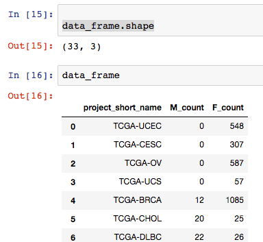
OK, that’s working great. But what about Pandas you’re saying?
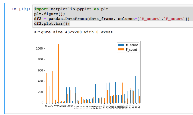
Well, it turns out we can do the same thing with the pandas and pandas-gbq libraries.
This is nice, because then we can use these summarized results in visualizations or in further analysis.
import matplotlib.pyplot as plt
plt.figure();
df2 = pandas.DataFrame(data_frame, columns=['M_count','F_count'])
df2.plot.bar();
OK, for the main work product here, we will define a cohort, save that cohort into a new BigQuery table (not download it!), and run a spark job that fits a model.
OK, to get started, I popped over to the BQ web interface and created a new dataset in my project: ‘spark_job’.
Then I’m created a table that’s going to be used for the spark job input.
SELECT
  sample_barcode AS sb,
  IF (project_short_name = 'TCGA-STAD', 1, 0) AS label,
  SUM (CASE
     WHEN (HGNC_gene_symbol = 'EGFR') THEN LOG10(normalized_count +1)
     ELSE (RAND()/1000000) END) AS'EGFR,
  SUM (CASE
     WHEN (HGNC_gene_symbol = 'TP53') THEN LOG10(normalized_count +1)
     ELSE (RAND()/1000000) END) AS TP53,
  SUM (CASE
     WHEN (HGNC_gene_symbol = 'NOTCH1') THEN LOG10(normalized_count +1)
     ELSE (RAND()/1000000) END) AS NOTCH1,
  SUM (CASE
     WHEN (HGNC_gene_symbol = 'GATA3') THEN LOG10(normalized_count +1)
     ELSE (RAND()/1000000) END) AS GATA3
FROM
  `isb-cgc.TCGA_hg19_data_v0.RNAseq_Gene_Expression_UNC_RSEM`
WHERE
  project_short_name IN ('TCGA-STAD','TCGA-BRCA')
  AND normalized_count IS NOT NULL
GROUP BY
  project_short_name,
  sample_barcode
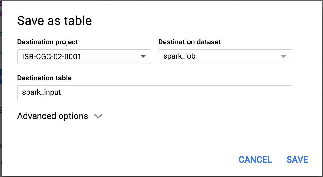
This table is now found in my project at: isb-cgc-02-0001:spark_job.tcga_spark
PySpark
In this section, we’re working with the following examples:
And here’s another resource <https://github.com/jadianes/spark-py-notebooks for working with python and spark in notebook environments.
There’s a special package we need to use in order to get our spark context from within a notebook. Typically, we would submit a job to spark using the PySpark interactive environment, or submit the job through the Google cloud console. But in the notebook we can use ‘findspark’ to connect with pyspark, and after that, instantiate our spark context.
!{sys.executable} -m pip install pyspark findspark
Then we can:
import findspark
findspark.init()
And now we’re ready to start coding our spark job. I have heavily borrowed from the examples above..
"""Run a logistic regression using Apache Spark ML.

In the following PySpark (Spark Python API) code, we take the following actions:

  * Load a previously created BigQuery input table
    into our Cloud Dataproc Spark cluster as an RDD (Resilient
    Distributed Dataset)
  * Transform the RDD into a Spark Dataframe
  * Vectorize the features on which the model will be trained
  * Compute a linear regression using Spark ML

"""

from datetime import datetime
from pyspark.context import SparkContext
from pyspark.ml.linalg import Vectors
from pyspark.ml.classification import LogisticRegression
from pyspark.sql.session import SparkSession

# The imports, above, allow us to access SparkML features specific to linear
# regression as well as the Vectors types.


# Use Cloud Dataprocs automatically propagated configurations to get
# the Cloud Storage bucket and Google Cloud Platform project for this
# cluster.
sc = SparkContext()
spark = SparkSession(sc)
bucket = spark._jsc.hadoopConfiguration().get("fs.gs.system.bucket")
project = spark._jsc.hadoopConfiguration().get("fs.gs.project.id")

# Set an input directory for reading data from Bigquery.
todays_date = datetime.strftime(datetime.today(), "%Y-%m-%d-%H-%M-%S")
input_directory = "gs:/input_directory = "gs://qotm_oct_2018" + todays_date

# Set the configuration for importing data from BigQuery.
# Specifically, make sure to set the project ID and bucket for Cloud Dataproc,
# and the project ID, dataset, and table names for BigQuery.

conf = {
    # Input Parameters
    "mapred.bq.project.id": project,
    "mapred.bq.gcs.bucket": bucket,
    "mapred.bq.temp.gcs.path": input_directory,
    "mapred.bq.input.project.id": project,
    "mapred.bq.input.dataset.id": "spark_job",
    "mapred.bq.input.table.id": "tcga_spark",
}

# Read the data from BigQuery into Spark as an RDD.
table_data = spark.sparkContext.newAPIHadoopRDD(
    "com.google.cloud.hadoop.io.bigquery.JsonTextBigQueryInputFormat",
    "org.apache.hadoop.io.LongWritable",
    "com.google.gson.JsonObject",
    conf=conf)

# Extract the JSON strings from the RDD.
table_json = table_data.map(lambda x: x[1])

# Load the JSON strings as a Spark Dataframe.
tcga_data = spark.read.json(table_json)

# Create a view so that Spark SQL queries can be run against the data.
tcga_data.createOrReplaceTempView("tcga_view")

# Define a function that collects the features of interest
# Package the vector in a tuple containing the label (`label`) for that
# row.
def vector_from_inputs(r):
  return (float(r["label"]), Vectors.dense(float(r['EGFR"]),
                                    float(r["TP53"]),
                                    float(r["NOTCH1"]),
                                    float(r["GATA3"])))

# As a precaution, run a query in Spark SQL against the view to ensure no NULL values exist.
sql_query = """
SELECT *
from tcga_view
where label is not null
        and'EGFR is not null
        and TP53 is not null
        and GATA3 is not null
        and NOTCH1 is not null
"""
clean_data = spark.sql(sql_query)

# Create an input DataFrame for Spark ML using the above function.
training_data = clean_data.rdd.map(vector_from_inputs).toDF(["label",
                                                             "features"])
training_data.cache()


# Construct a new LogisticRegression object and fit the training data.
# https://spark.apache.org/docs/latest/ml-classification-regression.html#binomial-logistic-regression

lr = LogisticRegression(maxIter=5, regParam=0.3, elasticNetParam=0.8)
lrModel = lr.fit(training_data)
# Print the model summary.
print("Coefficients:" + str(lrModel.coefficients))
print("Intercept:" + str(lrModel.intercept))


# getting the model performance metrics
trainingSummary = lrModel.summary

# Obtain the objective per iteration
objectiveHistory = trainingSummary.objectiveHistory
print("objectiveHistory:")
for objective in objectiveHistory:
    print(objective)

# Obtain the receiver-operating characteristic as a dataframe and areaUnderROC.
trainingSummary.roc.show()
print("areaUnderROC: " + str(trainingSummary.areaUnderROC))

# we can even convert the pyspark DataFrame to a Pandas DataFrame
# and plot the ROC
import pandas
import matplotlib.pyplot as plt
plt.figure();
trainingSummary.roc.toPandas().plot.scatter('FPR','TPR')
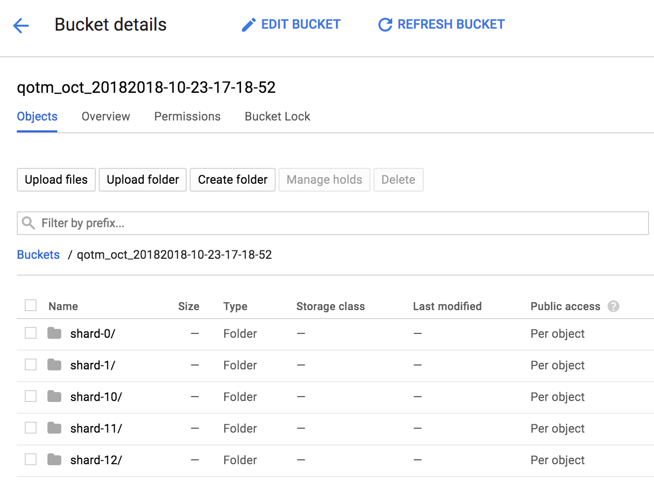
If we take a look inside our named bucket, we see that data shards.
Here’s what it looked like when I was running the natality example given by Google:
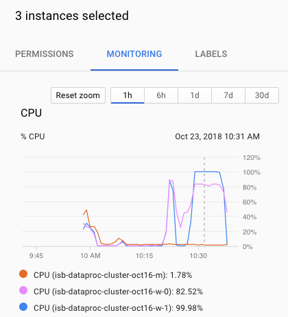
When we’re all done (it actually takes just an instant in this case), we have a model with an ROC of:
areaUnderROC: 0.9783191586648377
The coefficients from the model were:
Coefficients:[50.29267918772197,0.0,0.16224745918590844,-0.31689142394240727]
Intercept:-0.9932429393509908
So, it looks like only one gene was actually needed for the classification (EGFR).
Kill -9 the cluster
As with many other cloudy things, you can kill your cluster in the web console, on on the command line:
gcloud dataproc clusters update cluster-name \
  --graceful-decommission-timeout="timeout-value" \
  [--num-workers and/or --num-preemptible-workers]=decreased-number-of-workers
  other args ...
Hope that was helpful for getting started with Jupyter notebooks! Of course you don’t have to use clusters, there’s a lot you can do with a single node notebook! If you have some cool examples, I would love to see them!
September, 2018
R in the cloud.
Recently, I was asked to demonstate how to simply run an R script in the google cloud, so I decided to revisit the topic and look for new, easy methods. In the past I recommended methods like using dsub (link), which uses the Google Pipelines API. It’s still a good option, but it can be challenging for some users to install and use. As an alternative, I have two new (to me) methods that make running R scripts easy and straightforward.
Method 1
An RStudio server in the cloud
Super developer, Mark Edmondson (github: MarkEdmondson123), has released a number of very useful packages for working in the Google cloud. However, I would advise to work from the development versions in github to get the latest and greatest (see devtools::install_github).
These include:
- Also a couple cloudyr tutorial links: massively parallel
and install and auth.
With these packages, it becomes super easy and fast to start up an RStudio server that can acess all the resources within a google project (i.e. read and write to buckets, execute BigQueries).
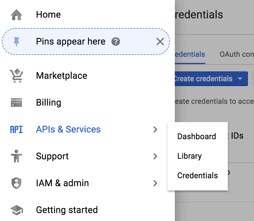
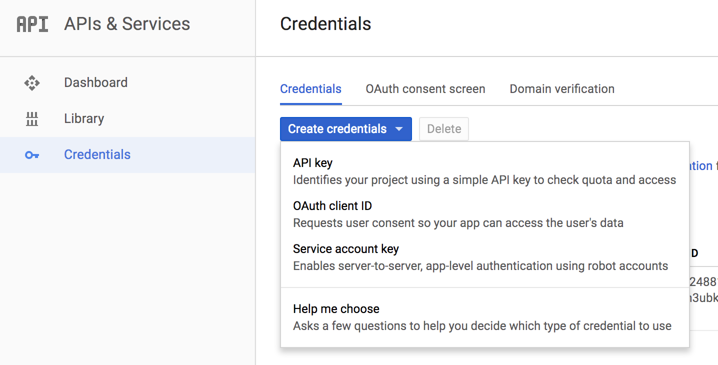
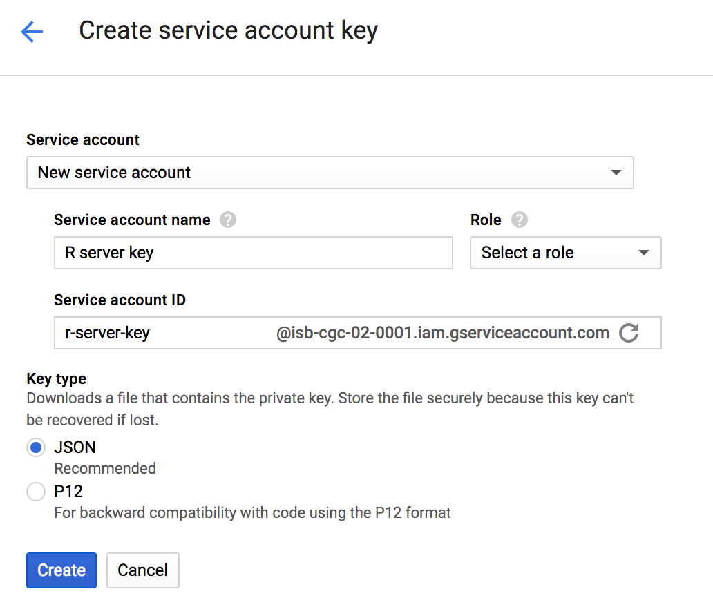
After a little setup, starting the server is accomplished with a single function call! The setup involves getting a project key. To do that, and you only need to do this once, you’ll log into your google cloud console.
Then, use the hamburger menu (upper left corner) to navigate to the ‘APIs and Credentials’ page. Find the create credentials button, and select ‘Service account key’. Under service account, select ‘New service account’ and you can give it a name and an role in the project. For simplicity you can select the editor role, knowing it has a great deal of permissions, which you may wish to scale back. When you hit the blue ‘create key’ button, a json file will be downloaded. Guard that key with your life!
OK.
Now, after starting up R, point your working dir to the directory holding your json key.
Sys.setenv("GCE_AUTH_FILE" = "~/tmp/auth.json")       # edit path to your file
Sys.setenv("GCE_DEFAULT_PROJECT_ID"="MY PROJECT ID")  # edit this
Sys.setenv("GCE_DEFAULT_ZONE"="us-west1-a")           # edit this


library(googleComputeEngineR)

vm <- gce_vm("rstudio-cron-googleauthr",
              predefined_type = "n1-standard-1",
              template = "rstudio",
              dynamic_image = "gcr.io/gcer-public/google-auth-r-cron-tidy",
              username = "myname",
              password = "secretpassword321")
After calling this function, a message is printed: ‘2018-09-28 15:48:06> VM running’. What happened? A new VM has been started using a docker image that contains Rstudio server and all of the tidyverse. How do you get to it? Well, if we exampine the vm object in R, we see:
> vm
==Google Compute Engine Instance==

Name:                rstudio-cron-googleauthr
Created:             2018-09-18 13:06:23
Machine Type:        n1-standard-1
Status:              RUNNING
Zone:                us-west1-b
External IP:         35.199.153.108
Disks:
                          deviceName       type       mode boot autoDelete
1 rstudio-cron-googleauthr-boot-disk PERSISTENT READ_WRITE TRUE       TRUE
If we copy that External IP, and paste it into our browser. Viola!
After logging in, we get a full Rstudio environment.
To get a file into your VM, the files panel in the lower right corner has an ‘Upload’ button that lets you select a file or dataset. To download, in the same pane, select ‘More’ and ‘export’.
But what about reading and writing to your google bucket? To do that, we need to get the session authorized. The RStudio instance, as started up with googleComputeEngineR, contains metadata about the project, and authorization is performed using the googleAuthR package. See below for an example of working with buckets.
### FROM WITHIN THE RSTUDIO ENVIRONMENT ###

# first we load this library and call the authorization function
library(googleAuthR)
gar_gce_auth()
At this point, authorization is done, and a token has been created. The function outputs: “Token cache file: .httr-oauth”.
# now we load up the cloud storage package and list the buckets
library(googleCloudStorageR)
googleCloudStorageR::gcs_list_buckets(projectId = 'isb-cgc-02-0001')

# we can then pick a bucket
googleCloudStorageR::gcs_global_bucket("gibbs_bucket_nov162016")

# we can also select the default bucket by setting a environment variable.
Sys.setenv("GCS_DEFAULT_BUCKET" = "gibbs_bucket_nov162016")
Now we’re ready to start accessing our buckets!
## getting a list of objects in the default bucket
objects <- gcs_list_objects()

head(objects$name)  # file names

## save directly to an R object (warning, don't run out of RAM if its a big object)
## the download type is guessed into an appropriate R object

parsed_download <- gcs_get_object(objects$name[4])

# this was a .csv file, and it parsed into a tibble

# or if you already know the name
parsed_download <- gcs_get_object("catter_input.txt")

## if you want to do your own parsing, set parseObject to FALSE
## and use httr::content() to parse afterwards
raw_download <- gcs_get_object("catter_input.txt",
                               parseObject = FALSE)

## Or move from a bucket to a file in your working directory
## parseObject has no effect, it is a httr::content(req, "raw") download
gcs_get_object("catter_input.txt", saveToDisk = "catter_downloaded.csv")

## **** ##
## Here's an example of getting text from a file in GCS
## and parsing it to a data frame

textobj <- gcs_get_object("catter_input.txt")
df <- read.delim( textConnection(textobj), header=T, sep=" ", strip.white=TRUE)
Great, now to move files back to the bucket.
dat <- read.table('catter_downloaded.csv', header=T)
# saved as cat_plot.png

## attempt upload back to the bucket
upload_try <- gcs_upload("cat_plot.png")
You can see how easy it is to startup a new Rstudio server (takes just a few seconds) and start reading and writing to buckets. When you’re done, you can stop the VM.
### BACK ON YOUR LOCAL MACHINE ###

gce_vm_stop(vm)
However, you will still be charged for the attached disk, but this lets you resume your session anytime to start where you left off. It’s also easy to just write out your files to the bucket, and delete the VM, which is what I tend towards.
As a note: it’s very fast (and free as long as the VMs and buckets are in the same region) to move data around in the google cloud.
Method 2
Running R functions on a cloud-based-cluster.
Next we’re going to start up a set of VMs, link them together as a cluster, and submit work to them. We’re still going to use googleComputeEngineR to start up VMs, keeping them in a list, and then using the future package to create the cluster.
Here’s a couple cloudyr links:
library(googleComputeEngineR) ## using the dev version from github
library(future)

## names for your cluster
vm_names <- c("vm1","vm2","vm3")

## creates jobs that are creating VMs in background

jobs <- lapply(vm_names, function(x) {
    gce_vm_template(template = "r-base",
                    predefined_type = "n1-standard-1",
                    name = x,
                    disk_size_gb = 15,
                    wait = FALSE)
                    })
Now, since we set wait = False, we call the function and then we get back control of the environment.
2018-09-28 17:23:11> Returning the startup job, not the VM instance.
2018-09-28 17:23:14> Returning the startup job, not the VM instance.
2018-09-28 17:23:16> Returning the startup job, not the VM instance.
>
> jobs
[[1]]
==Zone Operation insert :  PENDING
Started:  2018-09-28 14:23:09
[[2]]
==Zone Operation insert :  PENDING
Started:  2018-09-28 14:23:11
[[3]]
==Zone Operation insert :  PENDING
Started:  2018-09-28 14:23:14
The ‘jobs’ object is a list, which we’ll convert to a list of VM objects. Then we can apply functions to that list of VMs, in order to (for example) shut them all down.
## wait for all the jobs to complete and VMs are ready
vms <- lapply(jobs, gce_wait)

## get the VM objects
vms <- lapply(vm_names, gce_vm)

## set up SSH for the VMs
vms <- lapply(vms, gce_ssh_setup)
Now for creating the cluster! This part is somewhat tricky, and at times seems to flop. If the plan function doesn’t work, then just try again, the docker pulls already done will not pull again. A lot of times it takes a couple tries.
This is a cool part(!): I’ve created my own small docker image and pushed it to docker hub. When building the cluster, we’re able to start up those docker images in each VM in the cluster. This gives us control over what software is present on each worker node.
The docker file is found at: https://hub.docker.com/r/gibbsdavidl/googlesmallr/
## customise as needed, this for example sets shared RAM to 13GB
my_rscript <- c("docker",
                "run", c("--net=host","--shm-size=8G"),
                "gibbsdavidl/googlesmallr:latest",
                "Rscript")

## create the cluster using custom docker image
plan(cluster,
     workers = as.cluster(vms,
                          docker_image="gibbsdavidl/googlesmallr:latest",
                          rscript=my_rscript)
     )
OK, now the cluster should be alive and waiting for something to do. You can go and see the VMs in your google cloud console, monitoring their workloads.
The (below) task will be to read a file from our bucket and report the size of the table.
## test out if it's possible to access buckets.
work_chunks <- function(chunk){

  # first we'll get the worker node authorized
  require(googleAuthR)
  require(googleCloudStorageR)
  googleAuthR::gar_gce_auth()

  # then we'll point to the bucket
  gcs_global_bucket("gibbs_bucket_nov162016")

  # and get the object, read it, and report the dimensions.
  gcs_get_object("catter_input.txt", saveToDisk = "catter_downloaded.csv")
  dat <- read.table('catter_downloaded.csv', header=T)
  return(dim(dat))
}


# We use the future_lapply to send this function to each VM.
system.time(
  result2 <- future.apply::future_lapply(vm_names, work_chunks)
)
#   user  system elapsed
#  0.035   0.004   1.155

> result2
[[1]]
[1] 21  2

[[2]]
[1] 21  2

[[3]]
[1] 21  2
Great! In this example, I used the vm_names to iterate across, but it could been a list of data files, or a list of parameter sets.
paramList <- list(
  P1=c(1,2,3), P2=c(4,5,6), P3=c(7,8,9)
)

result3 <- future.apply::future_lapply(paramList, work_chunks)

## work_chunks would need an extra parameter in the argument list ##
I hope these examples help get you in the cloud! Please let me know if you have trouble or have questions.
August, 2018
Using BigQuery ML in a Shiny app.
Last month, we tried out the newly-released Google BigQuery ML. This month we’ll continue to build examples, learn some new things, and build a shiny web app.
One newsworthy bit of information, incase you missed it a few months ago, is that the R package used for interacting with BigQuery, bigrquery, has undergone a major revision (hitting version 1.0.0), and many of the function calls have changed significantly. The returned object from making a BigQuery call (with function ‘bq_project_query’) is now a “tibble” rather than a data frame.
Working with BigQuery ML is quite a bit different than what we’ve done before. In the past, when working with BigQuery, we’ve computed different statistics, and we’ve even used those statistics for classification, but that work was all done in the SQL – including, for example, formulating a Z-score in SQL. Now, most of our work will go into preparing the training data table to be used when fitting the model.
When fitting models, we have two important parameters to think about: the L1 and L2 regularization rates. (There are other parameters, but we’ll focus on these for the moment.) Both of these parameters effectively push the weights of less useful predictors towards zero. L2 (or euclidean norm) will push weights towards zero, but L1 regularization will make variable (gene) weights exactly zero. Using these regularizers can help us get an idea of which features (eg genes) are most useful in separating groups (eg cancer types).
A good tool for getting a feel for what parameter values to use can be found here.
In this Shiny App, we will select two “cohorts” as the two groups for our classification task. Then we’ll select one of the cancer hallmark gene sets from MSigDB which will provide the feature set as a list of genes. The BigQuery ML models take a number of parameters, so we’ll make those available to the user as well.
In general, when storing a gene-expression matrix in BigQuery, it is most useful to store it as a tidy data table, ie a “long” table with just 3 columns: sample_id, gene_id, expression_value, rather than a “wide” N x M table for N samples and M genes, in which the expression values for each gene are stored in a specific column.
However, when you want to fit a model with 10 variables, you will need a table with 10 columns. To do that we’ll need a new BigQuery skill! Converting long-to-wide tables. There’s two keys to doing it in BigQuery. The first is to programmatically construct the query string, given the list of genes and other relevant information (eg the cohort name), and the second is to use an aggregate function to create each row of the result table, where each row will represent a single sample.
Here’s a small example of doing that.
SELECT
  sample_barcode AS sb,
  project_short_name AS label,
  SUM (CASE
     WHEN (HGNC_gene_symbol = 'FRMD6') THEN LOG10(normalized_count +1)
     ELSE (RAND()/1000000) END) AS FRMD6,
  SUM (CASE
     WHEN (HGNC_gene_symbol = 'MMD') THEN LOG10(normalized_count +1)
     ELSE (RAND()/1000000) END) AS MMD,
  SUM (CASE
     WHEN (HGNC_gene_symbol = 'IMPDH2') THEN LOG10(normalized_count +1)
     ELSE (RAND()/1000000) END) AS IMPDH2,
  SUM (CASE
     WHEN (HGNC_gene_symbol = 'SNORD60') THEN LOG10(normalized_count +1)
     ELSE (RAND()/1000000) END) AS SNORD60
FROM
  `isb-cgc.TCGA_hg19_data_v0.RNAseq_Gene_Expression_UNC_RSEM`
WHERE
  project_short_name = 'TCGA-STAD'
  AND normalized_count IS NOT NULL
GROUP BY
  project_short_name,
  sample_barcode
Keen readers will notice that I’ve included a call to RAND() when the gene symbol is not matched. The reason is that some genes in the gene lists do not map to data in TCGA. This creates a column of all zeros across samples, and causes an error in the model fitting. To get around that, I’ve added a very small amount of noise to the data. If the gene is not present in TCGA’s annotation, it is represented as random noise and will not contribute to the model.
Now we’ll get to building the shiny app. Here’s the first couple functions to build up the SQL as a string. I put these SQL query-string building functions in a global.R file that gets imported in the server.R code. Then I make the query executions from an eventReactive function which is called when the user clicks on the submit button.
geneQuery <- function(gi) {
    # This function gets called for each gene in a list.
    # gi is the name of a gene as a string
    paste("SUM (CASE WHEN (HGNC_gene_symbol = '",gi,"') THEN normalized_count ELSE (RAND()/1000000) END) AS ", gi, sep='')
}


buildDataSQL <- function(geneNames, cohort1, cohort2, ngenes) {

    # here we can control the number of genes going into the model
    if (length(geneNames) > ngenes) {
            geneNames <- sample(geneNames, size = ngenes, replace = F)
    }

    # create model name // format the sys.time() return
    # to put in underscores and remove colons
    # and paste in the cohort names.
    modelname <- getModelname(cohort1, cohort2)

    q <- paste("
            WITH
            C1 AS (
            SELECT
               sample_barcode AS sb,
               project_short_name AS label,\n",
               paste(sapply(geneNames, function(gi) geneQuery(gi)),collapse = ',\n'), "\n
            FROM
               `isb-cgc.TCGA_hg19_data_v0.RNAseq_Gene_Expression_UNC_RSEM`
            WHERE
               project_short_name = '",cohort1,"'
               AND normalized_count IS NOT NULL
            GROUP BY
               project_short_name,
               sample_barcode ),

            C2 AS (
            SELECT
               sample_barcode AS sb,
               project_short_name AS label,\n",
               paste(sapply(geneNames, function(gi) geneQuery(gi)),collapse = ',\n'), "\n
            FROM
               `isb-cgc.TCGA_hg19_data_v0.RNAseq_Gene_Expression_UNC_RSEM`
            WHERE
               project_short_name = '",cohort2,"'
               AND normalized_count IS NOT NULL
            GROUP BY
               project_short_name,
            sample_barcode )

            SELECT
               0 AS label,",
               paste(geneNames,collapse = ','), "\n
            FROM
               C1
            UNION ALL
            SELECT
               1 AS label,",
               paste(geneNames,collapse = ','), "\n
            FROM
               C2
            ", sep = '')

    print(q)
    return(list(SQL=q, Dataset="tcga_model_1", Tablename=paste("isb-cgc-myproject123.tcga_model_1.data", Modelname=modelname,sep="")))
    }
Calling this function returns the SQL query string, the Dataset where the table will be placed, the full name ‘project.dataset.tablename’, and the modelname, all as a list.
The R code to create the query string, authenticate, and execute the query only takes a few lines:
# we've saved our service account token in the data directory
service_token <- set_service_token("data/ISB-CGC-myproject-1234567.json")

# previously I made a hash keyed on gene set names, to get the list of gene members
load("data/gene_set_hash.rda")
geneNames1 <- geneSets[[setname]]

# then we build the string using the above code.
datasql <- buildDataSQL(geneNames1, input$cohortid1, input$cohortid2, input$n_genes)

# and we execute the query, explicitly naming the location where it will be saved
res0 <- bq_project_query('isb-cgc-myproject123', datasql[["SQL"]],  destination_table = datasql[["Tablename"]])
At this point we’ve generated the dataset and saved it in a BigQuery dataset. The next step is to fit the model. We’ll construct another query string and execute it.
buildModelSQL <- function(datasetname, tablename, modelname, input) {

    l1reg <- input$l1_reg
    l2reg <- input$l2_reg
    maxit <- input$max_iterations
    lr <- input$learn_rate
    es <- input$early_stop

    q <- paste(
    "CREATE MODEL `", datasetname ,".", modelname, "`
     OPTIONS(model_type='logistic_reg', l1_reg=",l1reg,", l2_reg=",l2reg,", max_iterations=",maxit,")
     AS SELECT * FROM `", tablename ,"`
    ",sep="")

    print(q)
    return(list(SQL=q, Modelname=paste(datasetname ,".", modelname,sep='')))

}

# then build the model
# the datasql is returned from building the dataset query above
modSql <- buildModelSQL(datasql[["Dataset"]], datasql[["Tablename"]], as.list(input))
res1 <- bq_project_query('isb-cgc-myproject123', modSql[["SQL"]])
When the model fit is finished, we will query the model, rather than a table, to get information about the goodness-of-fit, and other classification metrics.
queryModelTrainingSQL <- function(modelname) {
  q <- paste(
    "SELECT
       *
     FROM
      ML.TRAINING_INFO(MODEL `",modelname,"`)
    ",sep="")
  print(q)
  return(list(SQL=q))
}

queryModelFeaturesSQL <- function(modelname) {
  q <- paste(
    "SELECT
       *
     FROM
      ML.FEATURE_INFO(MODEL `",modelname,"`)
    ",sep="")
  print(q)
  return(list(SQL=q))
}

queryModelWeightsSQL <- function(modelname) {
  q <- paste(
    "SELECT
      processed_input,
      weight
     FROM
      ML.WEIGHTS(MODEL `",modelname,"`)
    ",sep="")
  print(q)
  return(list(SQL=q))
}

queryModelROCSQL <- function(modelname, tablename) {
  q <- paste(
    "SELECT
       threshold,
       false_positive_rate,
       true_positives,
       false_positives,
       true_negatives,
       false_negatives,
       recall,
       true_positives / (true_positives + false_positives) AS precision
     FROM
       ML.ROC_CURVE(MODEL `",modelname,"`, TABLE `", tablename ,"`)", sep='')
  return(list(SQL=q))
}
and then we call all the query contruction functions and collect the performance of the classifier.
First, using the queryModelTrainingSQL function above, we get information about the model training, which is really useful. It will show a number of training iterations, where in each iteration, there’s a learning rate. When a model is fitting well, you should see a big jump in the magnitude of the learning rate. Also it needs to train for a number of iterations. In unsuccessful fittings, the model will not progress beyond just a few iterations. Here is the Google training module on this topic.
Second, we can get information about the features themselves, such as the mean and quartiles for each gene.
Finally, one of the most important calls will be to get the feature weights. Since this is a regularized regression, which is controlled using the L1 and L2 parameters, variables that are less helpful in the classification will have weights that will shrink to zero. We show the weights in an absolute value sorted order.
In supervised machine learning, each sample has a known label. In this example, the label is the tissue type. When the model is used to predict a label for a sample, we will either get it right or get it wrong. We can call the label of the sample either ‘cohort 1 positive’ or ‘cohort 1 negative (i.e. cohort 2 positive). Then our model makes a prediction on whether the sample is ‘cohort 1 positive’ or not, making it a boolean value (true or false).
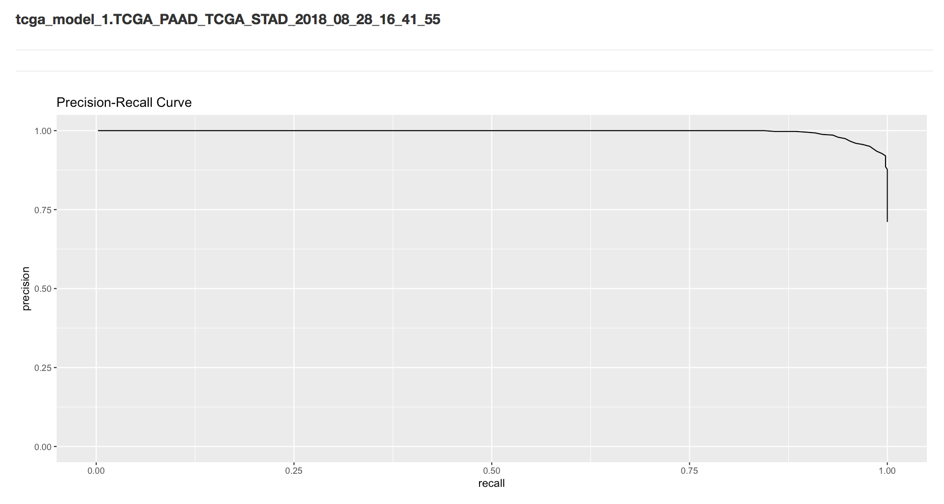
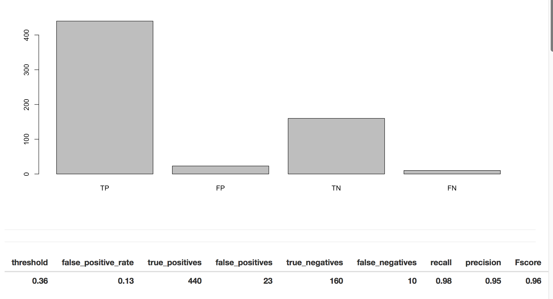
To determine if our model is doing well, we use classification metrics like recall and precision. Precision is the fraction of true positives over combined true and negative positives. Recall (or sensitivity) is the fraction of true positives over all positives. So when precision is very close to 100%, then there were very few false positives. When recall is close to 1, almost all of the positive cases were correctly called positive.
To put it another way, from Wikipedia: “In a classification task, a precision score of 1.0 for a class C means that every item labeled as belonging to class C does indeed belong to class C (but says nothing about the number of items from class C that were not labeled correctly) whereas a recall of 1.0 means that every item from class C was labeled as belonging to class C (but says nothing about how many other items were incorrectly also labeled as belonging to class C). … Often, there is an inverse relationship between precision and recall, where it is possible to increase one at the cost of reducing the other.”
Below is the R code for the “server” component of our Shiny app. We want all of the bigrquery functions to be called when the user clickson the ‘submit’ button – to accomplish this, we wrap all of the functions together in a eventReactive.
Once it’s all wrapped in a the eventReactive, we can access the results of all the queries repeatedly without having to redo any of the queries.
Let’s take a look at an example. You can of course try the app here.
First we have the UI where we can pick our cohorts, the number of genes to use, the regularization rates, and a maximum number of iterations.
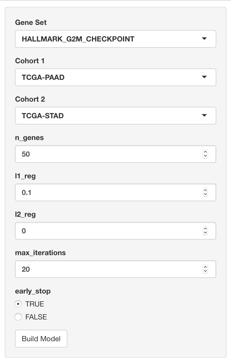
Then we see the name of the model (and data) which can be found in the Google BigQuery web interface. Also we see the precision-recall curve.
Next we have the metrics that are found when using the threshold that maximizes the F-score.
Then we have the list of features (genes) with the model weights.
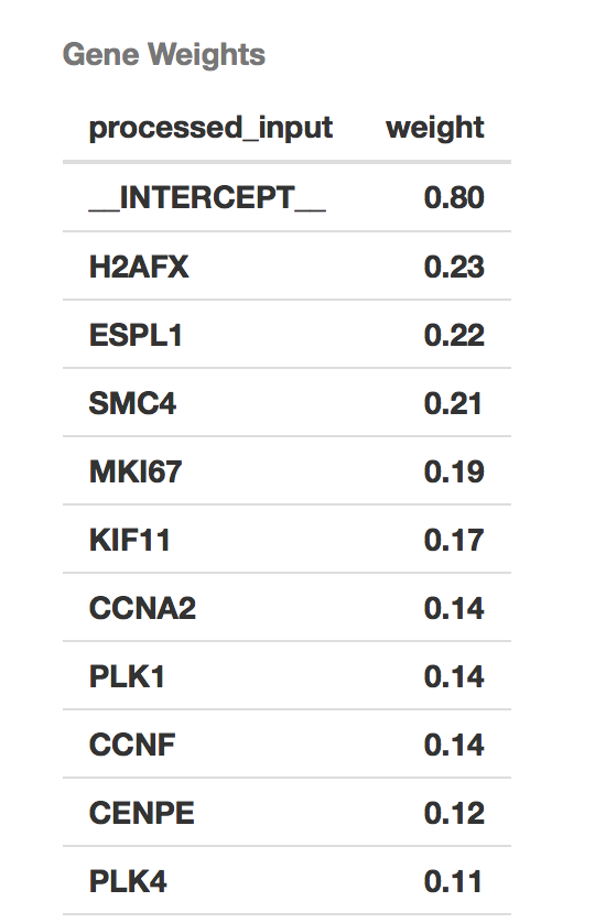
Finally, we have the record of iterative model fitting.
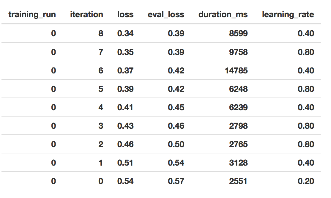
That’s it for this month. I hope you found this informative, and can see how to integrate model building and exploration within an interactive web environment. This sort of tool would allow anyone with some familiarity of gene sets and TCGA to build and reason about models. And we think that’s pretty cool!
July, 2018
First look: BigQuery ML.
Exciting news! Google has just released a beta feature in BigQuery: Machine Learning (ML)! There are two availble model types, linear and logistic. The first, linear regression, models a continuous variable given a selection of variables, both categorical (eg US postal code) and numeric (eg height or weight). The second, logistic regression, models a binary label given some variables. This is used for classification between two groups, which we have used extensively in this blog. An example of groups we created had features like ‘does or does not have a mutation in GATA3’. Even better, the logistic regression is regularized! We have both L1 and L2 regularization available, which makes it similar to an implementation of elasticnet.
In the following examples, I’m going to be working in the BigQuery web interface, but it’s also possible to train and apply these models using the command line tool (bq), the REST API, and from a scripting language (R or python).
The introductory documentation can be found here.
Something people are always concerned about: how much does it cost?! Well, from reading the docs, at this time (July 2018) pricing is still under development. But essentially it’s similar to any other query. You’re charged according to how much data is processed in training the model and storage fees for the model (first 10GB free). However, the actual data read for training the model is more than just the size of the table. It’s not entirely clear at this point, but when I learn more, I’ll report it.
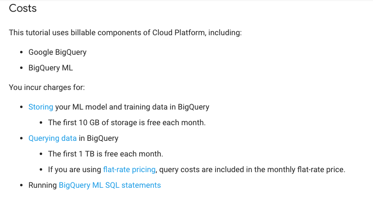
Something kind of amazing (doc link): If you’re using a categorical variable, the variable is split into a number of columns, one for each category-element. This is called one hot encoding. For example, we might have two columns from our mutation status category: has-GATA3-mutation, no-GATA3-mutation. That’s only 2 categories, so 2 columns of binary variables. But, if you have many, many, many more categories, those get split into columns too. From the docs: “When you use a CREATE MODEL statement, the size of the model must be 90 MB or less or the query fails. Generally, if all categorical variables are short strings, a total feature cardinality (model dimension) of 5-10 million is supported. The dimensionality is dependent on the cardinality and length of the string variables.” WOW! That’s a lot of columns.
Let’s jump in! The first task will be to classify a couple of cancer types (by tissue) using gene expression data for 4 specific genes.
First I’m going to create a new data set to hold the training data and models. To create a new dataset, click on the blue down-arrow next to your project ID in the left side-panel of the web UI), and select “Create new dataset”. I called it ‘tcga_model_1’.
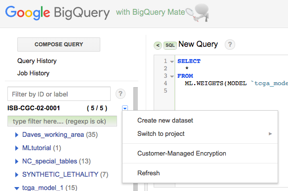
I’ve selected ‘TCGA-COAD’ (colon cancer) and ‘TCGA-PAAD’ (pancreatic cancer) as my two cancer types. They’re really pretty different, so it shouldn’t be a difficult classification challenge.
Below, we use a Standard SQL query to create the training data, which we then save as a table in the dataset created above.
-- For each gene, we'll make a subtable named C1-C4.
-- You can see where we select the gene in the WHERE section.

With

C1 AS (
SELECT
  project_short_name AS label,
  sample_barcode,
  HTSeq__FPKM_UQ CCNE1
from
  `isb-cgc.TCGA_hg38_data_v0.RNAseq_Gene_Expression`
WHERE
  project_short_name IN ('TCGA-COAD','TCGA-PAAD')
        and gene_name='CCNE1'
),

C2 AS (
SELECT
  project_short_name AS label,
  sample_barcode,
  HTSeq__FPKM_UQ CDC6
from
  `isb-cgc.TCGA_hg38_data_v0.RNAseq_Gene_Expression`
WHERE
  project_short_name IN ('TCGA-COAD','TCGA-PAAD')
        and gene_name='CDC6'
),

C3 AS (
SELECT
  project_short_name AS label,
  sample_barcode,
  HTSeq__FPKM_UQ MDM2
from
  `isb-cgc.TCGA_hg38_data_v0.RNAseq_Gene_Expression`
WHERE
  project_short_name IN ('TCGA-COAD','TCGA-PAAD')
        and gene_name='MDM2'
),

C4 AS (
SELECT
  project_short_name AS label,
  sample_barcode,
  HTSeq__FPKM_UQ TGFA
from
  `isb-cgc.TCGA_hg38_data_v0.RNAseq_Gene_Expression`
WHERE
  project_short_name IN ('TCGA-COAD','TCGA-PAAD')
        and gene_name='TGFA'
)

-- Now we join the above gene-tables into our training data.

SELECT
C1.label AS label,
C1.sample_barcode AS sample_barcode,
  CCNE1,
  CDC6,
  MDM2,
  TGFA
FROM
C1
JOIN C2 ON C1.label=C2.label AND C1.sample_barcode=C2.sample_barcode
JOIN C3 ON C1.label=C3.label AND C1.sample_barcode=C3.sample_barcode
JOIN C4 ON C1.label=C4.label AND C1.sample_barcode=C4.sample_barcode
I ran the above query, and when done, clicked the ‘Save to Table’ button, placing it in the ‘tcga_model_1’ dataset. Now we’re ready to train a model, which we’ll do using the CREATE MODEL statement. (You will need to modify the CREATE MODEL statement below to use your project and dataset names.)
#standardSQL
CREATE MODEL
  `isb-cgc-02-00001.tcga_model_1.coad_vs_paad_expr_l1_l2`  -- the name of our model, project.dataset.model_name
OPTIONS
  ( model_type='logistic_reg',            -- various options for the model
    l1_reg=1, l2_reg=1 ) AS
SELECT
  label,                                  -- here you define the training data
  CCNE1,                                  -- it's possible to give it a random subset
  CDC6,                                   -- see the next query for that.
  MDM2,
  TGFA
FROM
  `isb-cgc-02-0001.tcga_model_1.paad_coad_expr_2`
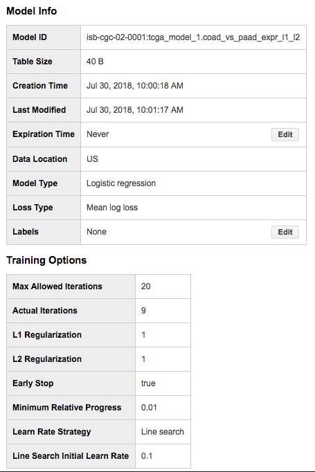
The model training should take a minute or two, and once complete you will now have a “Model” in your dataset (identified in the webUI using a green icon which is different from the blue one we are used to seeing next to tables). You can click on this model to see information about it, along with new buttons such as “Query Model” and “Training Stats”:
Looking at the “Training Stats” will give you a sense of how the training process went. Each row in the Training Stats table represents a single iteration, with the following four pieces of information:
training data loss: loss metric on the training data, calculated after this training iteration
evaluation data loss: loss metric computed on the held-out data
learn rate: hyper-parameter which controls how fast the model weights are adjusted (how this value is determined will depend on the learn_rate_strategy specified in the CREATE MODEL statement)
completion time (sec)
When the model’s fit is not improving, the training will end early (you can turn this feature off). I found that models that were not doing well, tended to end after just about four rounds, with high training data loss (~0.45). Also, when models are doing well, you should see the learning rate really ramp up, otherwise the model is ‘not getting any traction’.
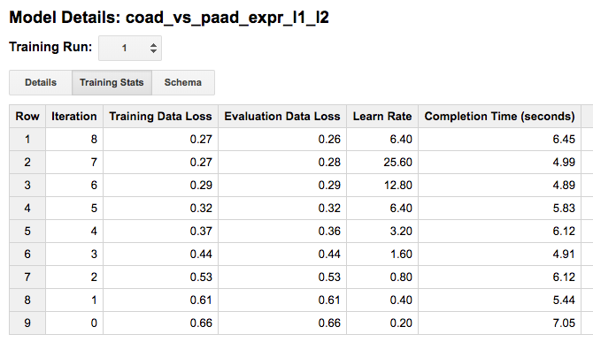
Once we have created a model, we have a few options of what to do with it:
evaluation functions: ML.EVALUATE and ML.ROC_CURVE (which only applies to logistic regression models)
prediction function: ML.PREDICT
inspection functions: ML.TRAINING_INFO, ML.FEATURE_INFO, and ML.WEIGHTS
Below is an example “query” showing how to use the ML.EVALUATE function: here I am evaluating the model on a random subset (half) of the data that I used to train the model. (In a more rigorous scenario, you would of course either do cross-fold validation or evaluate on a subset of the data that was not used at all during training.)
#standardSQL
SELECT
  *
FROM
  ML.EVALUATE(MODEL `isb-cgc-02-0001.tcga_model_1.coad_vs_paad_expr_l1_l2`, (
SELECT
  label,
  CCNE1,
  CDC6,
  MDM2,
  TGFA
FROM
  `isb-cgc-02-0001.tcga_model_1.paad_coad_expr_2`
WHERE
  RAND() < 0.5
  )
 )

One last thing, we can get the weights (or model coefficients) by again querying the model.
SELECT
  *
FROM
  ML.WEIGHTS(MODEL `isb-cgc-02-0001.tcga_model_1.coad_vs_paad_expr_2`)
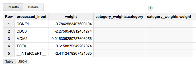
From the magnitude of the weights, we can see that CDC6 was very useful, but MDM2 wasn’t. It’s a great way of testing the use of each variable for the particular problem at hand.
Neat! Let’s do one more example, this time using the somatic mutation data for a couple of well-known genes (above we used gene expression data). For this training data, I’m going to do a little feature engineering (see also this). Our “engineering” will simply consist of combining two columns to create a new “feature”.
One tricky aspect of working with the somatic mutation data table is that the table only contains rows describing observed somatic mutations. The lack of a mutation at a particular position in a gene, for a particular sample, is only implied by the lack of such a row in the table. It is also possible that a mutation occurred but was missed by the sequencing or the mutation-calling pipeline. We will assume, however, that all samples that are mentioned at least once in the table can be assumed to have been “tested” for all of the mutations that are present in the table. We will therefore start with a list of all of the samples we are interested in, and then join in the mutation data using a LEFT JOIN, which will retain all of the same barcodes. At the end, after selecting for a number of different genes, we join subtables for each gene of interest.
WITH

-- First we make a table with all barcodes for the two cancer types.
-- (This table will have 579 rows, one per tumor sample.)
all_barcodes AS (
SELECT
  project_short_name AS label,
  sample_barcode_tumor AS barcode
FROM
  `isb-cgc.TCGA_hg38_data_v0.Somatic_Mutation_DR10`
WHERE
  project_short_name IN ('TCGA-COAD', 'TCGA-PAAD')
GROUP BY 1, 2 ),

-- Then we make a table of mutations, concatenating strings into new features.
-- For now, we'll do this only for the APC gene, but we could easily
-- add more genes or change the gene being tested for.
--
-- This table will have 444 rows, describing APC mutations in 313 tumor samples.
-- For example, sample TCGA-AA-A010-01A has 3 mutations, TCGA-AA-AA017-01A has one,
-- and TCGA-AA-A01P-01A has none and is not present in this table.
apc_mut AS (
SELECT
  project_short_name AS label,
  sample_barcode_tumor AS barcode,
  CONCAT(Hugo_Symbol, ' Mut') AS Variant,
  CONCAT(Hugo_Symbol, ' ', Variant_Classification) AS Variant_Classification,
  CONCAT(Hugo_Symbol, ' ', Variant_Type) AS Variant_Type
from
  `isb-cgc.TCGA_hg38_data_v0.Somatic_Mutation_DR10`
WHERE
  project_short_name IN ('TCGA-COAD','TCGA-PAAD') AND Hugo_Symbol='APC'
GROUP BY 1, 2, 3, 4, 5),

-- Left Join all the barcodes, with barcodes that have mutation data.
apc_join AS (
SELECT
  b.label,
  b.barcode,
  m.Variant AS apc,
  m.Variant_Classification AS apcvarclass,
  m.Variant_Type AS apcvartype
FROM
  all_barcodes b
LEFT JOIN
  apc_mut m
ON
  b.barcode=m.barcode AND b.label=m.label
GROUP BY 1, 2, 3, 4, 5 ),

-- Finaly, we do need to replace the NULL values since the ML functions
-- cannot be trained with NULL values
apc_final AS (
SELECT
  label, barcode, apc, apcvarclass, apcvartype
FROM
  apc_join
WHERE
  apc IS NOT NULL
UNION ALL
SELECT
  label, barcode,
  "APC WT" AS apc,
  "APC WT" AS apcvarclass,
  "APC WT" AS apcvartype
FROM
  apc_join
WHERE
  apc IS NULL )
So, if a sample doesn’t have a mutation in APC, the nulls are replaced with the “APC WT” strings, and otherwise, the features specify the mutation class and type, eg:
Row label      barcode            apc       apcvarclass             apcvartype
1   TCGA-COAD  TCGA-AD-6965-01A   APC WT    APC WT                  APC WT

-- But if you select a tumor with a mutation in APC you get:

1   TCGA-COAD  TCGA-AA-A010-01A   APC Mut   APC In_Frame_Del        APC DEL
2   TCGA-COAD  TCGA-AA-A010-01A   APC Mut   APC Nonsense_Mutation   APC SNP
3   TCGA-COAD  TCGA-AA-A010-01A   APC Mut   APC Intron              APC SNP
Let’s repeat the above, but this time with KRAS, and then join the two results so that we have data for both KRAS and APC. We will save this table in our new dataset with the name apc_kras_data. (The apc_join table should have 710 rows containing information for 579 barcodes, and the kras_join table should have 589 rows containing information for the same 579 barcodes. Joining these two will produce a table with 721 rows. 105 of these rows represent tumor samples with no mutations in either APC or KRAS; 167 rows represent tumor samples with mutations only in KRAS; 223 rows represent tumor samples with mutations only in APC; and finally 226 rows represent samples with mutations in both APC and KRAS.)
SELECT
  k.label, k.barcode,
  apc, apcvarclass, apcvartype,
  kras, krasvarclass, krasvartype
FROM
  kras_final k
JOIN
  apc_final a
ON
  k.label=a.label AND k.barcode=a.barcode
Then we create our model:
#standardSQL
CREATE MODEL `isb-cgc-02-0001.tcga_model_1.apc_kras_model`
OPTIONS(
model_type='logistic_reg', l1_reg=1, l2_reg=1
) AS
SELECT
  label,
  apc, apcvarclass, apcvartype,
  kras, krasvarclass, krasvartype
FROM
  `isb-cgc-02-0001.tcga_model_1.apc_kras_data`
and we can evaluate it:
#standardSQL
SELECT
  *
FROM
  ML.EVALUATE(MODEL `isb-cgc-02-0001.tcga_model_1.apc_kras_model`, (
SELECT
  label,
  apc, apcvarclass, apcvartype,
  kras, krasvarclass, krasvartype
FROM
  `isb-cgc-02-0001.tcga_model_1.apc_kras_data`
WHERE
  RAND() < 0.5
  )
 )

Let’s take a look at the model weights. Our model wound up having 20 weights: 11 for APC-related features and 9 for KRAS-related features, and it is clear that the APC-related features are the most informative for this particular task.
SELECT
  w.category, w.weight
FROM
  ML.WEIGHTS(MODEL `isb-cgc-02-0001.tcga_model_1.apc_kras_model`),
  UNNEST(category_weights) AS w
GROUP BY 1, 2
HAVING
  category LIKE "APC%"
ORDER BY
  ABS(weight) DESC
OK, pretty cool! We see some of the features have very little information and have weights of zero (or close to zero) like ‘APC Silent’ or most of the KRAS-related features, while others seem very important. You could test this by removing a specific feature from your input data, and then checking to see if the model statistics change.
Overall, that seems pretty useful! Of course, BigQuery ML is in beta, and our experiance with Google products: expect things to change! Have you found any good tricks? If you have, please share them via email or on twitter (@isb-cgc)!
June, 2018
Processing bam files using WDL, scatter, and Cromwell
In the last two editions, we’ve described a multi-step workflow for generating statistics from bam files (from ENCODE) using the common workflow language (CWL). This month, we’ve translated the example to WDL (workflow description language) and moved to executing the workflow using Cromwell, a ‘workflow management system’ that can operate in the Google cloud.
So again, starting with a collection of bam files, we’re going to bin sequence reads by GC content, and produce a single output file summarizing all the input files.
Using the same dockerized tools as last time (tool reuse!) , we’re going to be using Cromwell to run the workflows. You can find installation instructions here. Also install ‘womtool’, availble in the same location as cromwell.
The plan:
compute some statistics over a list of bam files with samtools
use grep to parse out a portion of the stats output
use cut to process columns from the output
use cat to gather the outputs into a single file
Each of these steps is now defined as a WDL task, and together they make a workflow.
Let’s look at the first task:
task samtools_stats_tool {
    File filein
    String filename

    runtime {
      docker: "biocontainers/samtools"
    }
    command {
        samtools stats ${filein} > ${filename}_gc_stats.txt
    }
    output {
         File statsout = "${filename}_gc_stats.txt"
    }
}
In this task, we have two input parameters, a file and a string. Then, we define the runtime environment (AKA the docker image). This is followed by the actual command we would use in running the job. If the command needs to be split across multiple lines, just use the ‘' to end each line (just like in a terminal). Notice we reference the parameters with a ${}. We are reading ${filein} and writing to ${filename}. Last, we have the output of the task, setting an output variable to be referenced in other tasks.
The next three tasks follow this same form: input parameters (usually a file), runtime definition, command, and output. Here’s what they look like:
task grep_tool {
    File grepin

    runtime {
      docker: "biocontainers/samtools"
    }

    command {
        grep --with-filename '^GCF' ${grepin} > grep_out.txt
    }

    output {
        File grepout = "grep_out.txt"
    }
}


task cut_tool {
    File cutin

    runtime {
      docker: "biocontainers/samtools"
    }

    command {
      cut -d '/' -f 9- ${cutin} > cut_out.txt
    }

    output {
        File cuttoolout = "cut_out.txt"
    }

}


task cat_tool {
    Array[File] filesin

    runtime {
      docker: "biocontainers/samtools"
    }

    command {
        cat ${sep=" " filesin} > final_gc_stats_out.txt
    }

    output {
        File finalfile = "final_gc_stats_out.txt"
    }
}
The stats tool, grep tool, and cut tool all take a single file, while the cat tool (as you might expect) takes an array of files. Additionally, in this case, the output of grep was different compared to running the workflow in CWL, so the cut tool command changed to account for that.
The next ‘task’ for us is to take these task-definitions and connect them together into a workflow. In this example, I’ve got a tab separated file with two columns. The first column has google bucket paths to bam files, and the second column is a file label (see below). That said, the input parameter to the workflow, is just telling the workflow where the list of bam files is.
workflow gcStats {

    File inputSamplesFile

    Array[Array[String]] inputSamples = read_tsv(inputSamplesFile)

    scatter (sample in inputSamples) {
     call samtools_stats_tool {
       input:
         filein=sample[0],
         filename=sample[1]
       }
     }

     scatter (statout in samtools_stats_tool.statsout) {
      call grep_tool {
        input:
          grepin = statout
      }
     }

     scatter (grepped in grep_tool.grepout) {
       call cut_tool {
            input:
              cutin = grepped
       }
     }

     call cat_tool {
       input:
         filesin = cut_tool.cuttoolout
     }

} # end workflow
In calling the first tool, we perform a scatter operation over input files. For the next tools, we perform scatter operations over the previously called tool outputs. The last tool (the cat tool) gets an array of files as an input, and concatenates them.
The task definitions and the workflow are placed into the same file, here named ‘gcstats.wdl’. We can validate the workflow by calling:
java -jar womtool-32.jar validate gcstats.wdl
If it’s valid, there’s no errors reported.
The list of bam files is stored in a file named ‘bamfiles.txt’. Below is the file listing.
gs://daves-cromwell-bucket/bamfiles/wgEncodeUwRepliSeqBg02esG1bAlnRep1.bam      bam1
gs://daves-cromwell-bucket/bamfiles/wgEncodeUwRepliSeqBjG1bAlnRep1.bam  bam2
gs://daves-cromwell-bucket/bamfiles/wgEncodeUwRepliSeqBjG2AlnRep1.bam   bam3
gs://daves-cromwell-bucket/bamfiles/wgEncodeUwRepliSeqBg02esG1bAlnRep1.bam      bam4
The workflow input then refers to the list of bam files. This file is named ‘gcstats.input’. A template for the json input can be generated, and filled in using this command:
java -jar womtool-32.jar inputs gcstats.wdl > gcstats.inputs
After it’s filled in, the file looks like:
{
        "gcStats.inputSamplesFile": "gs://daves-cromwell-bucket/bamfiles.txt"
}
Then, a new bucket was created which serves as the root for the cromwell execution. In that bucket, ‘daves-cromwell-bucket’, I created another folder called ‘bamfiles’ and placed the data. In the root I placed the bamfile list ‘bamfiles.txt’.
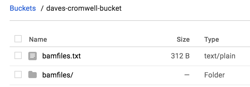
We’re almost ready to run! But first we need to deal with authorization. So, to do that, all the instructions for ‘Configuring a Google Project’ need to be followed here. That configuration is saved in a file named ‘google.conf’. Make sure you can run the ‘hello.wdl’ example.
FINALLY, now we’re ready to run with this command:
java -Dconfig.file=google.conf -jar cromwell-32.jar run gcstats.wdl -i gcstats.inputs
This command starts up a VM in the Google cloud, runs the tasks in parallel, and writes the output to your bucket. The resulting directory ‘cromwell-execution’ looks like this:
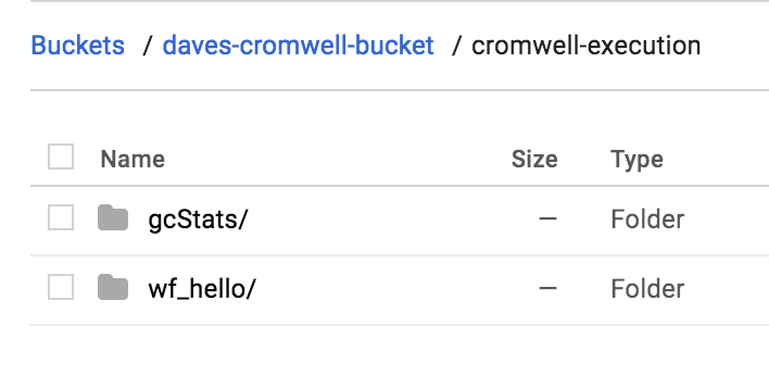
The take outputs are organized (under an unreadable folder name) by name:
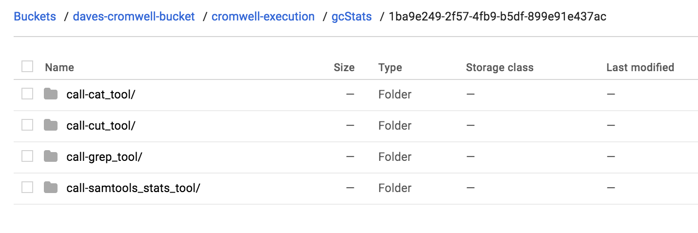
And if we look inside our cat_tool folder, we see the final output file. Cool.
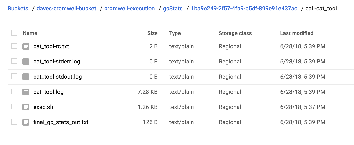
That’s it! We’ve run a multi-step workflow, with steps in parallel, written in WDL, and run with Cromwell in the google cloud. Not too bad, right? Were you able to run your own workflow? Let us know!
May, 2018
Processing bam files using CWL ‘scatter and gather’
In this edition, we’re going to continue our exploration of using CWL to run workflows on the Google cloud. Last time, we performed a ‘scatter’ operation, where a tool is applied to a list of files. This time, we’ll complete the paradigm by performing a ‘gather’ to collate the results of a scatter. Additionally, we will propagate the scatter through a series of steps.
Specifically, for a list of files, we’re going to bin sequence reads by GC content, producing a single output file that we can use to make a plot.
The tools are found in this docker image
The plan:
compute some statistics over a list of bam files with samtools
use grep to parse out a portion of the stats output
use cut to select some columns from the output
use cat to gather the outputs into a single file
Each of these steps is defined as a CWL tool, and together they make a workflow.
The first three steps of the workflow are considered scatter operations, and the last is the gather, where outputs are combined.
Let’s look at the first tool:
#samtools_stats_tool.cwl

cwlVersion: v1.0
class: CommandLineTool

baseCommand: [samtools, stats]

requirements:
  - class: InlineJavascriptRequirement

inputs:
  filein:
    type: File
    inputBinding:
      position: 1

outputs:
  statsout:
    type: File
    outputBinding:
      glob: "*.stats"

stdout: $(inputs.filein.path.split('/').pop() + '.stats')
This tool definition is going to compute several different statistics for each bam file. The statistic-type is delineated by a column label. An interesting thing here, is that the standard output, usually printed to the screen, is captured and saved using the input file name with ‘.stats’ added on, and the output looks for that ‘.stats’ with the file glob. We want to hold onto the file name to use as a label in the final results.
The next tool is going to parse out our statistic of interest, the GC content.
#grep_tool.cwl

cwlVersion: v1.0

class: CommandLineTool

baseCommand: grep

arguments:
  - "--with-filename"
  - "^GCF"

inputs:
  input_file:
    type: File
    inputBinding:
      position: 1

outputs:
  grepout:
    type: stdout
This is a very general tool that could be applied in many settings… it’s just grep! Grep is a pattern matching tool, so each line of text that starts with ‘GCF’ is printed. Also we’re going to add the input file name to each line (–with-filename). Interesting thing here: since we don’t explicitly define the file name for the standard output (stdout), the file name is random. We can let the workflow runner worry about it.
The next tool wraps the cut command.
#cut_tool.cwl

cwlVersion: v1.0

class: CommandLineTool

baseCommand: cut
arguments:
  - "-d "
  - "-f"
  - "1,5-"

inputs:
  input_file:
    type: File
    inputBinding:
      position: 1

outputs:
  cutout:
    type: stdout
Here, we define some ‘arguments’ to the baseCommand. The ‘-d ‘ sets the delimiter to white space, ‘-f 1,5-’ says we want fields (-f) 1, and 5+. Column 1 is the file name, and the stats of interest appear in columns 5 and beyond. Again we don’t define any file names for the output.
Lastly, we are going to gather all the results.
#cat_tool.cwl

cwlVersion: v1.0

class: CommandLineTool

baseCommand: cat

inputs:
  filein:
    type: File[]
    inputBinding:
      position: 1

outputs:
  catout:
    type: stdout

stdout: final_output.txt
It’s important to note that in the cat tool, we have defined the input to be an array of files. The command becomes ‘cat file.a file.b file.c’. And here we do define the output file name.
OK! Let’s work these tools into a flow.
Important note: I developed all these tools on my local machine with small test cases. When I was ready to test on the google cloud, the only change I made was adding the docker hint (DockerRequirement, see below), and moving tool definitions (the cwl files) data into a bucket. It was surprisingly easy to move from the local environment to the cloud.
The main workflow:
#!/usr/bin/env cwl-runner

cwlVersion: v1.0
class: Workflow

requirements:
  ScatterFeatureRequirement: {}

hints:
  DockerRequirement:
    dockerPull: biocontainers/samtools

inputs:
  filein: File[]

outputs:
  pipeline_result:
    type: File
    outputSource: step4/catout

steps:

  step1:
    run: data/samtools_stats_tool.cwl
    scatter: [filein]
    scatterMethod: dotproduct
    in:
      filein: filein
    out:
      [statsout]

  step2:
    run: data/grep_tool.cwl
    scatter: [input_file]
    scatterMethod: dotproduct
    in:
      input_file: step1/statsout
    out:
      [grepout]

  step3:
    run: data/cut_tool.cwl
    scatter: [input_file]
    scatterMethod: dotproduct
    in:
      input_file: step2/grepout
    out:
      [cutout]

  step4:
    run: data/cat_tool.cwl
    in:
      filein: step3/cutout
    out:
      [catout]
You will notice, that we only define an array of bam files as inputs to the workflow (File[]), the intermediates are carried through without explicitly naming them. Inputs to the middle steps point to the outputs of previous steps (step1/statsout -> step2).
And we need to define our input files (scatter_gather_pipeline.yml):
filein:
  - {class: File, path: data/wgEncodeUwRepliSeqBg02esG1bAlnRep1.bam}
  - {class: File, path: data/wgEncodeUwRepliSeqBjG1bAlnRep1.bam}
  - {class: File, path: data/wgEncodeUwRepliSeqBjG2AlnRep1.bam}
To run this, we use the google_cwl_runner found here.
I made a working folder in my google bucket called ‘workflow-1’, and two additional folders within, ‘data’ and ‘output’. I put the bam files and the cwl tool definitions into ‘data’ and I put the workflow file in the top level of my working folder.
./examples-Compute/google_cwl_runner/cwl_runner.sh \
     --workflow-file gs://my-bucket/workflow-1/scatter_gather_pipeline.cwl \
     --settings-file gs://my-bucket/workflow-1/scatter_gather_pipeline.yml \
     --input-recursive gs://my-bucket/workflow-1/data \
     --output gs://my-bucket/workflow-1/output \
     --machine-type n1-standard-4 \
     --zone us-west1-a \
     --preemptible
Running this command prints out some google cloud commands to enable us to check on the status of the job, and when it’s finished we have logs for stderr, stdout, and status. Additionally we get the cwl_startup.sh, cwl_runner.sh, and cwl_shutdown.sh scripts for your perusal.
But most importantly(!), we get our single output file containing the binned GC content (shown below). The first column is the file name that produced the result, the second column is the percent GC, and the last column is the number of reads.
/long.tmp.path/wgEncodeUwRepliSeqBg02esG1bAlnRep1.bam.stats:GCF 1.26    22
/long.tmp.path/wgEncodeUwRepliSeqBg02esG1bAlnRep1.bam.stats:GCF 4.02    66
/long.tmp.path/wgEncodeUwRepliSeqBg02esG1bAlnRep1.bam.stats:GCF 6.78    232
/long.tmp.path/wgEncodeUwRepliSeqBg02esG1bAlnRep1.bam.stats:GCF 9.55    349
/long.tmp.path/wgEncodeUwRepliSeqBg02esG1bAlnRep1.bam.stats:GCF 12.31   647
/long.tmp.path/wgEncodeUwRepliSeqBg02esG1bAlnRep1.bam.stats:GCF 15.08   1413
/long.tmp.path/wgEncodeUwRepliSeqBg02esG1bAlnRep1.bam.stats:GCF 17.84   3473
/long.tmp.path/wgEncodeUwRepliSeqBg02esG1bAlnRep1.bam.stats:GCF 20.60   7676
/long.tmp.path/wgEncodeUwRepliSeqBg02esG1bAlnRep1.bam.stats:GCF 23.37   15064
...
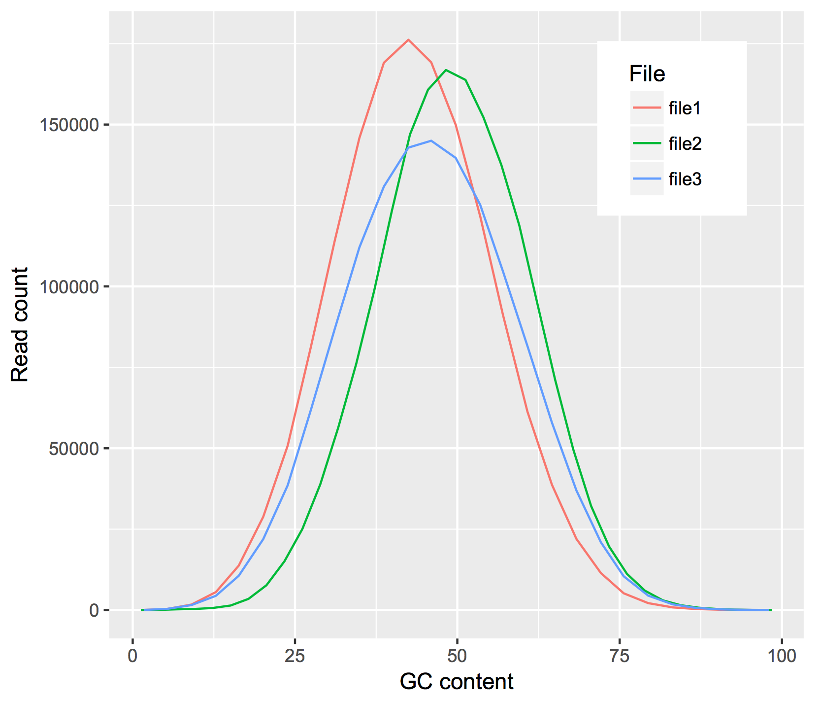
Thanks for reading! Let us know if you have questions or comments!
April, 2018
For the next few months, we’re going to be focusing on running workflows in the Google cloud, starting with workflows defined with CWL. There’s a lot to explore in this area, and it’s hopefully going to be useful for people.
We appear to be moving towards a future where bioinformatics tools are routinely bundled into runtime containers (like docker), which are somehow ‘approved’ by the research community as being safe and effective, launched in the cloud, process data in the cloud, and write results to the cloud. Sounds great, but how does one do that?
We previously documented some very low level details on running CWL workflows, but to make things easier, we started with some code from Google, made some updates to the scripts, and with them you can (fairly) easily run CWL workflows in the cloud. The current working google CWL runner is found in our examples-Compute repo.
In this example, we’ll be using a workflow (transform.cwl) from the GDC that was used to ‘harmonize’ TCGA data.
The CWL workflow has a few sections: requirements, inputs, outputs, and steps. The purpose of the workflow is to execute the steps, where each step is a tool (also described by a CWL) which has a set of inputs and outputs.
In transform.cwl, the first step is:
steps:
  - id: samtools_bamtobam
    run: ../../tools/samtools_bamtobam.cwl
    in:
      - id: INPUT
        source: bam_path
    out:
      - id: OUTPUT
Let’s look more closely at this first step (samtools_bamtobam.cwl) and see if we can run it; first on one file, and then on a set of files.
single file
To make the example a little more accessible, I’ve rewritten the CWL, as seen below.
#!/usr/bin/env cwl-runner

cwlVersion: v1.0

class: CommandLineTool

hints:
  DockerRequirement:
    dockerPull: biocontainers/samtools

baseCommand: [samtools, view, -Shb]

inputs:
  filein:
    type: File
    inputBinding:
      position: 1
  fileout:
    type: string
    inputBinding:
      prefix: -o
      position: 2

outputs:
  bamsout:
    type: File
    outputBinding:
      glob: "*.bam"
OK, let’s start at the top. This is going to run samtools, so we’ve defined this CWL as a CommandLineTool.
Then, since this is running in the cloud, we need the tool to be dockerized. I did a little searching, and found a biocontainer with samtools. We let CWL know this is a dockerized tool with our DockerRequirement hint.
Next we have the baseCommand, which is a command line command that’s broken up by commas. What’s samtools view doing? Well, if we look in Aaron Quinlan’s github repo: “The samtools view command is the most versatile tool in the samtools package. It’s main function, not surprisingly, is to allow you to convert the binary (i.e., easy for the computer to read and process) alignments in the BAM file view to text-based SAM alignments that are easy for humans to read and process.” The ‘view’ command, with the -Shb flags will (-S is depreciated) -h includes the header, -b outputs a bam. This is simply a bam-to-bam workflow.
We will ‘view’ an input file, named ‘filein’, and output a file, named ‘fileout’ (creative huh?). But those are the inputs, or arguments, that I’m giving to samtools. The order of the samtools parameters is controlled by the position, and in the case of ‘fileout’, I’m attaching a prefix ‘-o’ (the output flag).
We still have the CWL outputs section. This is actually what gets connected up to a workflow (a series of steps). Here I’ve called it ‘bamsout’, and declare the file will be named ‘something dot bam’ (*.bam).
OK then, still with me? Next I set up a google bucket with data and output folders. This is also where the CWL files go.
my-bucket/
    bamtobam/
        samtools_bamtobam_single_file.cwl
        data/
            bam1.bam
            bam2.bam (etc)
        outputs/
To get some data to work on, I moved some bams from the ENCODE project to my bucket’s data folder.
The last thing we need is a settings file. This maps actual file names in our bucket and parameter values to variable names found in the CWL. The paths are relative to the location to the CWL file. Here’s what I used (in the yaml format):
filein:
  class: File
  path: data/wgEncodeUwRepliSeqBjG1bAlnRep1.bam
fileout: samoutput.bam
You can see the filein and fileout names match up with what’s in the CWL. This is important.
Then after cloning our repo (git clone https://github.com/isb-cgc/examples-Compute), we can run it! The cwl_runner.sh script sets up a new VM, runs the cwl_startup.sh script, attaches a disk, copies over the data, runs the CWL, copies out the data, and shuts everything down by running the cwl_shutdown.sh script. Here’s the command:
./examples-Compute/google_cwl_runner/cwl_runner.sh \
  --workflow-file gs://my-bucket/bamtobam/samtools_bamtobam_single_file.cwl \
  --settings-file gs://my-bucket/bamtobam/bamtobam_params.yml \
  --input-recursive gs://my-bucket/bamtobam/data \
  --output gs://isb-cgc-02-0001-workflows/bamtobam/output \
  --machine-type n1-standard-4 \
  --zone us-central1-f \
  --keep-alive \
  --preemptible
Notice we can use preemptible machines to save money. So running this command reads the bam and writes out a new bam, which is found in our bucket after a few minutes.
debugging
If something geos wrong (it probably will), there’s a few things we can do. First, check the logs! The stderr and stdout is copied back to our bucket, and within those files we can find errors. Commonly (for me) paths can be wrong.
Second, you can try modifying the cwl_startup.sh script to include some print statements. I’ve put in some statements to print out directory listings, which gives you a view into the runtime environment.
Third, towards the bottom of the stderr, you can see the actual command that’s run. Then, if you use the –keep-alive flag (given to cwl_runner.sh), the VM will not shutdown, and you can get in there and try the command and see what happens.
multiple files
It’s much more common to run a tool over a set of files. To do that, we’re going to take our tool definition above, and write a new workflow that uses it. In CWL terms, this is called a ‘scatter’. Later we’ll perform the ‘gather’, but for now we’ll process the files, and write them back to our bucket.
#!/usr/bin/env cwl-runner

cwlVersion: v1.0

class: Workflow

requirements:
  ScatterFeatureRequirement: {}

inputs:
  filein: File[]
  fileout: string[]

outputs:
  bamsout:
    type: File[]
    outputSource: step1/bamsout

steps:
  step1:
    run: data/samtools_bamtobam_single_file.cwl
    scatter: [filein, fileout]
    scatterMethod: dotproduct
    in:
      filein: filein
      fileout: fileout
    out:
      [bamsout]
There’s some big differences between this definition and our tool definition. For starters we have a new requirements: ScatterFeatureRequirement which let’s us perform a scatter (process multiple files in parallel).
Then in our input section, we have defined an array of files and strings. In the output section, an array of output files, noting that the source of these outputs is from step1 (outputSource: step1/bamsout).
The steps section has only a single step. We’ll run our previously defined tool, as a scatter over files and parameters (the output file name), with scatterMethod dotproduct (match up the input and output file names), and we have in: and out: names that match up with the tool definition. Very important that names connect across the CWL definitions. It has to all fit together like legos.
Our settings file, the yaml, is also different because now we’re going to be giving it a list of files and output file names. Note the use of ‘dictionaries’ with the curly brackets.
filein:
  - {class: File, path: data/wgEncodeUwRepliSeqBjG1bAlnRep1.bam}
  - {class: File, path: data/wgEncodeUwRepliSeqGm12801G1bAlnRep1.bam}
  - {class: File, path: data/wgEncodeUwRepliSeqGm12878S4AlnRep1.bam}
fileout:
    - wgEncodeUwRepliSeqBjG1bAlnRep1_OUT.bam
    - wgEncodeUwRepliSeqGm12801G1bAlnRep1_OUT.bam
    - wgEncodeUwRepliSeqGm12878S4AlnRep1_OUT.bam
And again we run it the same way, except, note that we put our tool definition into the data folder so it gets copied over with the data.
./pipelines-api-examples/cwl_runner/cwl_runner.sh \
  --workflow-file gs://isb-cgc-02-0001-workflows/bamtobam/samtools_bamtobam_scatter.cwl \
  --settings-file gs://isb-cgc-02-0001-workflows/bamtobam/bamtobam_params_scatter.yml \
  --input-recursive gs://isb-cgc-02-0001-workflows/bamtobam/data \
  --output gs://isb-cgc-02-0001-workflows/bamtobam/output \
  --machine-type n1-standard-4 \
  --zone us-central1-f \
  --preemptible
If all goes well, you should see:
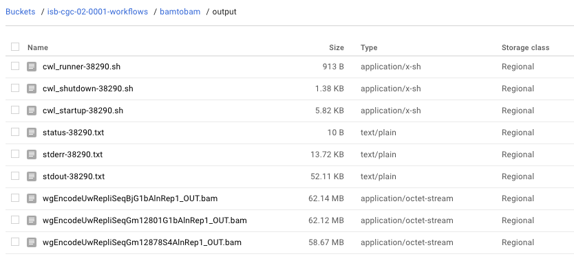
Whew! It’s a really steep learning curve, but the payoff is that in two years, when you wonder ‘how did I do this?’, you can look back and easily figure that out and probably (maybe) even run it again.
Next month we’ll continue our exploration of workflows and workflow runners. Let me know how it goes!
March, 2018
This month we demonstrate an implementation of a machine learning classifier using BigQuery.
The ‘Top Scoring Pairs’ method, finds a pair of genes that show the maximum difference in ranking between two user specified groups. Given two genes, and two groups of samples, the ranking of the genes flip-flops between the two groups. If gene_i < gene_j in group 1, then gene_i > gene_j in group 2.
To describe this more formally, let R_i be a vector of ranks denoting the rank of the i-th gene in a given sample.
Genes are evaluated in pairs, and scored by their differences in the probabilities, P(R_i < R_j ), between class C1 and class C2, formally defined as the difference in the following conditional probabilities:
Δ_ij = ∣ P(Ri < Rj ∣ C1) − P(Ri < Rj ∣ C2) ∣
Then Δ_ij is used as a criterion to produce a ordering on gene pairs.
For reference see this.
First let’s produce some simulated data for testing.
# phenotype
ys <- c(rep(1, 10), rep(0,10))

# matrix of features
xs <- matrix(data=rnorm(n=200), nrow=20)

# the IDs
idstr <- as.character(randomStrings(n=nrow(df), len=5, digits=FALSE,
                      upperalpha=TRUE,loweralpha=FALSE, unique=TRUE, check=TRUE))

# the two best genes
i <- 5
j <- 6

# create the gene pair
xs[ys == 1, i] <- rnorm(n=10, mean=-2)
xs[ys == 1, j] <- rnorm(n=10, mean=+2)
xs[ys == 0, i] <- rnorm(n=10, mean=+2)
xs[ys == 0, j] <- rnorm(n=10, mean=-2)
df <- data.frame(IDs=idstr, Y=ys, xs)

tidydf <- df %>% tidyr::gather(key="Gene", value="Expr", X1,X2,X3,X4,X5,X6,X7,X8,X9,X10)

write.table(tidydf, file="sim_for_tsp.tsv", sep='\t', row.names=F, col.names=F, quote=F)
The results should show genes X5 & X6 as the best pair for separating groups (y==0 vs y==1).
OK, let’s walk through this Top Scoring Pairs (TSP) query.
  1WITH
  2  #
  3  # First we'll rank the gene expression data by sample
  4  # using the simulated data.
  5  #
  6  GeneRanks AS (
  7  SELECT
  8    ID,
  9    Phenotype,
 10    Gene,
 11    Expr,
 12    RANK() OVER (PARTITION BY ID ORDER BY Expr ) AS ERank
 13  FROM
 14    `isb-cgc.QotM.tsp_sim_data`
 15  GROUP BY
 16    ID,
 17    Phenotype,
 18    Gene,
 19    Expr ),
 20  #
 21  # Then let's prepare to
 22  # generate the conditional probability for each
 23  # pair of genes within Class 1.
 24  # Calculating the upper triangle here.
 25  #
 26  Class1GenePairs AS (
 27  SELECT
 28    a.Gene AS Genei,
 29    b.Gene AS Genej,
 30    a.ID AS IDi,
 31    b.ID AS IDj,
 32    a.ERank AS Eranki,
 33    b.ERank AS Erankj
 34  FROM
 35    GeneRanks a
 36  JOIN
 37    GeneRanks b
 38  ON
 39    a.Gene < b.Gene
 40    AND a.ID = b.ID
 41  WHERE
 42    a.Phenotype = 1
 43    AND b.Phenotype = 1
 44  GROUP BY
 45    a.Gene,
 46    b.Gene,
 47    a.ID,
 48    b.ID,
 49    a.ERank,
 50    b.ERank ),
 51  #
 52  # Then, for each pair of genes,
 53  # how many times does gene_i have lower rank
 54  # than gene_j? That's where the probability comes from.
 55  #
 56  Class1Probs AS (
 57  SELECT
 58    Genei,
 59    Genej,
 60    SUM(CAST(Eranki > -1000 AS INT64)) AS N,  # number of pairs
 61    SUM(CAST(Eranki < Erankj AS INT64)) AS P  # pairs with i < j
 62  FROM
 63    Class1GenePairs
 64  WHERE
 65    (Genei != Genej)
 66  GROUP BY
 67    Genei,
 68    Genej ),
 69  #
 70  # Then repeat the process for Class 2.
 71  #
 72  Class2GenePairs AS (
 73  SELECT
 74    a.Gene AS Genei,
 75    b.Gene AS Genej,
 76    a.ID AS IDi,
 77    b.ID AS IDj,
 78    a.ERank AS Eranki,
 79    b.ERank AS Erankj
 80  FROM
 81    GeneRanks a
 82  JOIN
 83    GeneRanks b
 84  ON
 85    a.Gene < b.Gene
 86    AND a.ID = b.ID
 87  WHERE
 88    a.Phenotype = 1
 89    AND b.Phenotype = 1
 90  GROUP BY
 91    a.Gene,
 92    b.Gene,
 93    a.ID,
 94    b.ID,
 95    a.ERank,
 96    b.ERank ),
 97  #
 98  # and get our conditional probabilities
 99  #
100  Class2Probs AS (
101  SELECT
102    Genei,
103    Genej,
104    SUM(CAST(Eranki > -1000 AS INT64)) AS N,
105    SUM(CAST(Eranki < Erankj AS INT64)) AS P
106  FROM
107    Class2GenePairs
108  WHERE
109    (Genei != Genej)
110  GROUP BY
111    Genei,
112    Genej )
113  #
114  # and compute differences in conditional probs
115  #
116SELECT
117  a.Genei AS ai,
118  a.Genej AS aj,
119  b.Genei AS bi,
120  b.Genej AS bj,
121  a.P AS Pa,
122  a.N AS Na,
123  b.P AS Pb,
124  b.N AS Nb,
125  ABS((a.P / a.N) - (b.P / b.N)) AS PDiff
126FROM
127  Class1Probs a
128JOIN
129  Class2Probs b
130ON
131  a.Genei = b.Genei
132  AND a.Genej = b.Genej
133ORDER BY
134  PDiff DESC
Running this query returns a table that is ordered by the Probability difference (the pair of genes that best separates the classes in ‘rank-space’). As a note, I left in the gene names from both tables after the join, as a sanity check.
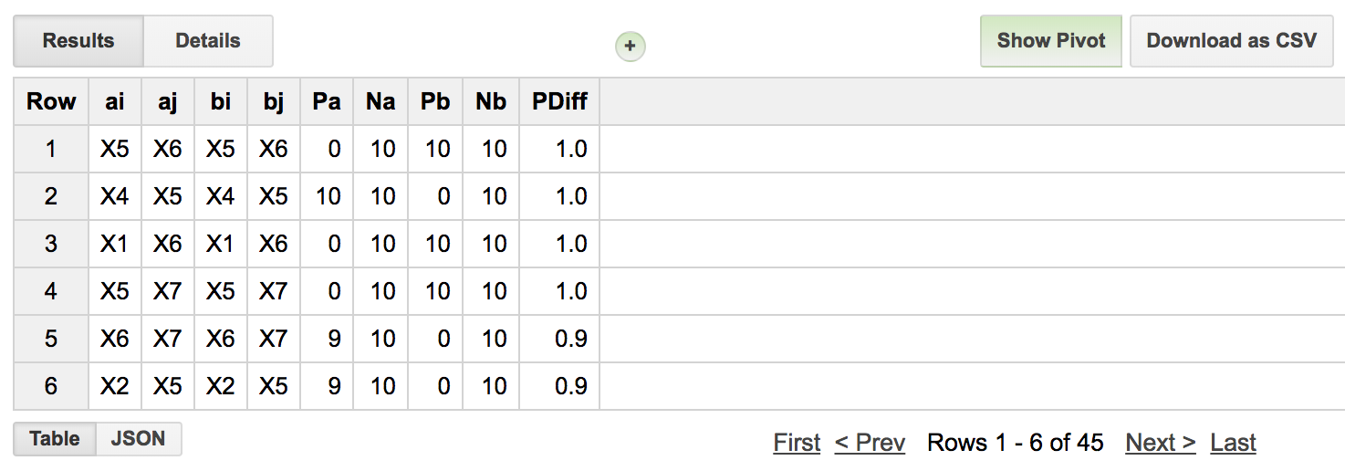
And we see that genes ‘X5’ and ‘X6’ are indeed the ‘top pair’. Trailing the leading spot, we see other pairs that are composed of one of the two ‘top pair’.
But, let’s suppose that we want to ‘train’ the model using a subset of samples. In that case we want to pull out a sample, train on the remainder, and then apply to the ‘test’ case.
WITH
  #
  # Now we pull out a sample (ID: DRRTF)
  # and use the remaining samples to train the model.
  #
  GeneRanks AS (
  SELECT
    ID,
    Phenotype,
    Gene,
    Expr,
    RANK() OVER (PARTITION BY ID ORDER BY Expr ) AS ERank
  FROM
    `isb-cgc.QotM.tsp_sim_data`
  WHERE
    ID != 'DRRTF'
  GROUP BY
    ID,
    Phenotype,
    Gene,
    Expr ),
Then, last, we will query using that sample to determine if it’s been classified correctly.
#
# first we'll join the TSP result table, that contains the best pair of genes,
# with the expression data for our held out ID.
#
callTbl AS (
  SELECT
    ai AS gene_i,
    aj AS gene_j,
    Pa,
    Pb,
    b.ID AS ID,
    b.Phenotype AS Phenotype,
    Expr
  FROM
    PairScore a
  JOIN
    `isb-cgc.QotM.tsp_sim_data` b
  ON
    b.ID = 'DRRTF'
    AND (a.ai = b.Gene
      OR a.aj = b.Gene) )
#
# Then, depending on the gene_a & gene_b comparison,
# we make a prediction using the expr. values.
#
SELECT
  ID,
  Phenotype,
  IF(Pa < Pb,
      0,
      1) AS Prediction
FROM
  callTbl
GROUP BY
  ID,
  Phenotype,
  Prediction
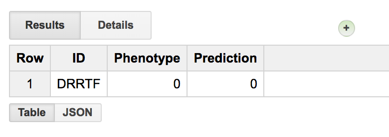
Seems to be working. Let’s make a few small changes, and apply it to TCGA expression data! First we’ll create our data set, then we’ll apply TSP on it.
  1WITH
  2#
  3# To reduce the number of genes we're working with,
  4# first we'll rank the gene expression data by coefficient of variation.
  5# Then we'll be able to take a subset with high variance.
  6# Also we'll filter out some long RNAs, etc.
  7#
  8GeneSelection AS (
  9SELECT
 10  gene_name,
 11  STDDEV(HTSeq__FPKM_UQ) / AVG(HTSeq__FPKM_UQ) AS CVExpr
 12FROM
 13  `isb-cgc.TCGA_hg38_data_v0.RNAseq_Gene_Expression`
 14WHERE
 15  HTSeq__FPKM_UQ > 0
 16  AND REGEXP_CONTAINS(sample_barcode, '-01A')
 17  AND (project_short_name = 'TCGA-PAAD'
 18   OR project_short_name = 'TCGA-KIRP')
 19  AND (NOT (REGEXP_CONTAINS(gene_name, 'MT-')
 20      OR REGEXP_CONTAINS(gene_name, 'RN7')
 21      OR REGEXP_CONTAINS(gene_name, 'RNU')
 22      OR REGEXP_CONTAINS(gene_name, 'SNOR') ) )
 23GROUP BY
 24  gene_name
 25ORDER BY
 26  CVExpr DESC
 27LIMIT
 28  50 ),
 29#
 30#
 31# Then we'll pick a set of random samples from
 32# the biospecimen table. Making sure we get only
 33# primary tumors by filtering barcodes that don't
 34# end with '-01A'.
 35#
 36SampleSelection AS (
 37SELECT
 38  project_short_name,
 39  sample_barcode
 40FROM
 41  `isb-cgc.TCGA_bioclin_v0.Biospecimen`
 42WHERE
 43  REGEXP_CONTAINS(sample_barcode, '-01A')
 44  AND (project_short_name = 'TCGA-PAAD'
 45    OR project_short_name = 'TCGA-KIRP')
 46GROUP BY
 47  sample_barcode,
 48  project_short_name
 49ORDER BY
 50  rand()
 51LIMIT
 52  200 ),
 53#
 54#
 55# With genes and samples, we can subset our expression data.
 56#
 57ExprTable AS (
 58SELECT
 59  sample_barcode,
 60  project_short_name,
 61  gene_name AS Gene,
 62  HTSeq__FPKM_UQ AS Expr
 63FROM
 64  `isb-cgc.TCGA_hg38_data_v0.RNAseq_Gene_Expression`
 65WHERE
 66  gene_name IN (
 67  SELECT
 68    gene_name
 69  FROM
 70    GeneSelection)
 71  AND sample_barcode IN (
 72  SELECT
 73    sample_barcode
 74  FROM
 75    SampleSelection)
 76GROUP BY
 77  sample_barcode,
 78  project_short_name,
 79  Gene,
 80  Expr )
 81#
 82# And we rank the gene expression and create a phenotype variable.
 83#
 84SELECT
 85  sample_barcode AS ID,
 86  project_short_name,
 87  IF(project_short_name = 'TCGA-PAAD',
 88    0,
 89    1) AS Phenotype,
 90  Gene,
 91  Expr,
 92  RANK() OVER (PARTITION BY sample_barcode ORDER BY Expr ) AS ERank
 93FROM
 94  ExprTable
 95GROUP BY
 96  ID,
 97  project_short_name,
 98  Phenotype,
 99  Gene,
100  Expr
And I’ll save that ranked table in the query of the month dataset as isb-cgc.QotM.paad_kirp_random_sample_1002.
  1WITH
  2  #
  3  # First let's create the table of gene pairs.
  4  #
  5  Class1GenePairs AS (
  6  SELECT
  7    a.Gene AS Genei,
  8    b.Gene AS Genej,
  9    a.ID AS IDa,
 10    b.ID AS IDb,
 11    a.ERank AS Eranka,
 12    b.ERank AS Erankb
 13  FROM
 14    `isb-cgc.QotM.paad_kirp_random_sample_1002` a
 15  JOIN
 16    `isb-cgc.QotM.paad_kirp_random_sample_1002` b
 17  ON
 18    a.Gene < b.Gene
 19    AND a.ID = b.ID
 20  WHERE
 21    a.Phenotype = 0
 22    AND b.Phenotype = 0
 23  GROUP BY
 24    a.Gene,
 25    b.Gene,
 26    a.ID,
 27    b.ID,
 28    a.ERank,
 29    b.ERank ),
 30  #
 31  # Then, for each pair of genes,
 32  # how many times does gene_i have lower rank
 33  # than gene_j? This is how the conditional
 34  # probability is calculated.
 35  #
 36  Class1Probs AS (
 37  SELECT
 38    Genei,
 39    Genej,
 40    SUM(CAST(Eranka > -1000 AS INT64)) AS N,
 41    SUM(CAST(Eranka < Erankb AS INT64)) AS P
 42  FROM
 43    Class1GenePairs
 44  WHERE
 45    (Genei != Genej)
 46  GROUP BY
 47    Genei,
 48    Genej ),
 49  #
 50  # Then pair up the genes in class2
 51  #
 52  Class2GenePairs AS (
 53  SELECT
 54    a.Gene AS Genei,
 55    b.Gene AS Genej,
 56    a.ID AS IDa,
 57    b.ID AS IDb,
 58    a.ERank AS Eranka,
 59    b.ERank AS Erankb
 60  FROM
 61    `isb-cgc.QotM.paad_kirp_random_sample_1002` a
 62  JOIN
 63    `isb-cgc.QotM.paad_kirp_random_sample_1002` b
 64  ON
 65    a.Gene < b.Gene
 66    AND a.ID = b.ID
 67  WHERE
 68    a.Phenotype = 1
 69    AND b.Phenotype = 1
 70  GROUP BY
 71    a.Gene,
 72    b.Gene,
 73    a.ID,
 74    b.ID,
 75    a.ERank,
 76    b.ERank ),
 77  #
 78  # and get our conditional probabilities
 79  #
 80  Class2Probs AS (
 81  SELECT
 82    Genei,
 83    Genej,
 84    SUM(CAST(Eranka > -1000 AS INT64)) AS N,
 85    SUM(CAST(Eranka < Erankb AS INT64)) AS P
 86  FROM
 87    Class2GenePairs
 88  WHERE
 89    (Genei != Genej)
 90  GROUP BY
 91    Genei,
 92    Genej ),
 93  #
 94  # and compute differences in conditional probs
 95  #
 96  Results AS (
 97  SELECT
 98    a.Genei AS gene_i,  # gene pair #1
 99    a.Genej AS gene_j,  # gene pair #2
100    a.P AS Pa,          # number of pairs where gene #1 < gene #2 in group A
101    a.N AS Na,          # total number of pairs
102    b.P AS Pb,          # numbers for group B.
103    b.N AS Nb,
104    ABS((a.P / a.N) - (b.P / b.N)) AS PDiff  # difference in conditional probabilities
105  FROM
106    Class1Probs a
107  JOIN
108    Class2Probs b
109  ON
110    a.Genei = b.Genei
111    AND a.Genej = b.Genej
112  ORDER BY
113    PDiff DESC )
114SELECT
115  *
116FROM
117  Results
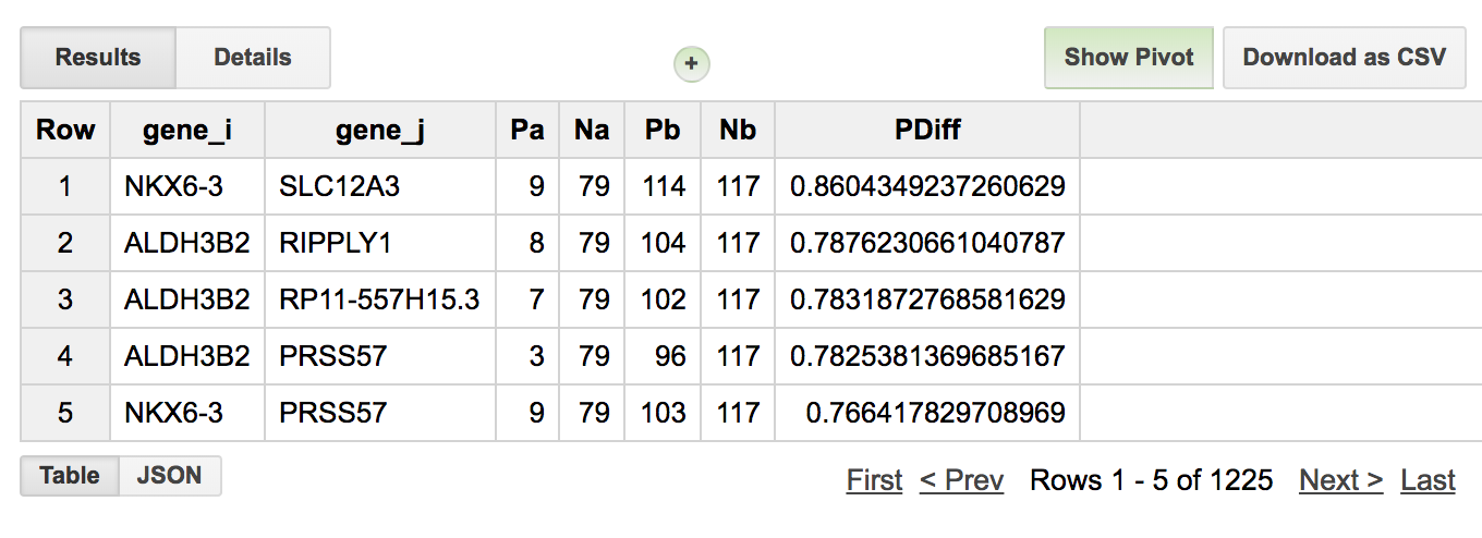
So we see that the best pair of genes for separating these two studies are NKX6-3 and SLC12A3 and 9/79 PAAD samples had expression ranking where (NKX6-3 < SLC12A3) and for KIRP samples 114/117 had a ranking where (NKX6-3 < SLC12A3). So it’s doing a pretty good job!
Let’s check this gene pair with another random set of samples. To do that, I’ll make another data table, similar to the above method, but pull out our top scoring pair of genes. Then check if the rank ordering is consistent within the two groups. This is a good exercise for the reader. You can use the following tables: isb-cgc.QotM.results_1002 and isb-cgc.QotM.paad_kirp_result_check
Phenotype |
FALSE |
TRUE |
|---|---|---|
TCGA-KIRP |
5 |
119 |
TCGA-PAAD |
54 |
18 |
When we see how we did (see table above, 88% accuracy), it’s very similar to what we previously found, but clearly there’s room for improvement. Probably changing the way genes are selected would make a difference, and perhaps using more samples. Let me know if you give it a try!
February, 2018
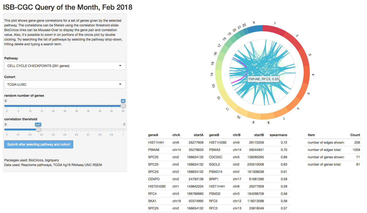
For this entry, we’re going to get back to Shiny programming and work on the skeleton of a BioCircos app. These types of plots show data and relations across the genome (typically), using a circular layout.
The Circos plot was first described in Circos: An information aesthetic for comparative genomics by Krzywinski et al., Genome Research, 2009 (cited 3,295 times!), and originally aimed to display relations between genomic loci. From the paper: “Circos uses a circular ideogram layout to facilitate the display of relationships between pairs of positions by the use of ribbons”. Visualizing genomic rearrangements was one of the key uses of the circos plot, but it’s also a good way to visualize gene-gene interactions which are often separated by large genomic distances.
In this example, we will select a group of samples, and a pathway (a set of genes), and look at the correlations between pairs of genes. If a pathway is active, we might expect strong correlations between the participating genes. The pathways come from Reactome which was supplied by the Bader Lab and can be found in our Query of the Month table, isb-cgc:QotM.Reactome_a1 (a1 indicates annotation).
For the remainder of this month’s episode, we’ll go through the app, and see how it works.
In this app, there are a few objects that must stay in sync. First we have the big table of correlations, which is generated by constructing and executing a BigQuery based on user inputs. That table is filtered based on the user-adjustable slider bar, and summary statistics are shown in the small table on the right. The filtered table is also shown in a table directly under the BioCircos plot.
First we’ll define the UI.
library(shiny)
library(BioCircos)
library(bigrquery)
library(stringr)
source("global.R")

ui <- fluidPage(

   # Application title
   titlePanel("ISB-CGC Query of the Month, Feb 2018"),

   sidebarLayout(
      sidebarPanel(
        fluidRow(
          textOutput('pageInfo'),
          HTML("<br><br>")
        ),
        fluidRow(
          selectInput("pathway", "Pathway", pathwayNames(), selected ="SIGNALLING TO RAS (18 genes)"),
          getTCGAProjs(),
          sliderInput('numGenes', 'random number of genes',min=0, max=50, value=10),
          actionButton(inputId="submit",label = "Submit after selecting pathway and cohort",
                       style="color: #ffffff; background-color: #67abe5; border-color: #2e6da4"),
          HTML("<br><br>"),
          sliderInput('corrThershold', 'abs value correlation threshold',min=0, max=1, value=0.33)
        ),
        fluidRow(
          HTML("<br><br>"),
          textOutput('pageOutro')
        )
      ),

      mainPanel(
         BioCircosOutput("circosPlot", width = "100%", height = "500px"),  # MAIN PLOT!
         fluidRow(
           column(8, align="center", div(tableOutput('table'), style = "font-size:80%") ),
           tableOutput('textboxinfo')
         )
      )
   )
)
It’s a pretty simple layout. We have some user-interface objects on the left, and a plot and tables on the right. The code to populate the interface is shown below.
server <- function(input, output, session) {

    # some variables used in the table summary
    rvar <- reactiveValues(geneCount = 0, edgeCount = 0, edgesTotal = 0, genesTotal = 0)

    # info text
    output$pageInfo <- renderText(infoTextBlock())
    # and some text citing the packages we used
    output$pageOutro <- renderText("Packages used: BioCircos, bigrquery")

    # calling BigQuery
    bq_data <- eventReactive(input$submit, {
      withProgress(message = 'Contacting the cloud...', value = 0, {
        incProgress(1/2, "BigQuerying...")
        pathname <- input$pathway
        cohort   <- input$cohort
        n        <- input$numGenes
        sql      <- buildQuery(pathname, cohort, n)
        service_token <- set_service_token("data/our_saved_token.json")
        data <- query_exec(sql, project='our-project-id', use_legacy_sql = F)
        data
      })
    })

    # filter out the edges by correlation strength
    filterData <- reactive({
      bqdf <- bq_data()
      bqdfFilt <- bqdf[abs(as.numeric(bqdf$spearmans)) > input$corrThershold,]
      # potentially there are no gene-gene edges after filtering
      bqdfFilt
    })

    # update the table summary after filtering the data.
    checkTable <- observe(
      {
      # grab our handles
      bqdf <- bq_data()
      bqdfFilt <- filterData()
      # collect some counts on this data
      rvar$edgeCount <- nrow(bqdfFilt)
      rvar$edgeTotal <- nrow(bqdf)
      rvar$geneTotal <- length( c(unique(bqdf$geneA), unique(bqdf$geneB)) )
      rvar$geneCount <- length( c(unique(bqdfFilt$geneA), unique(bqdfFilt$geneB)) )
      if (nrow(bqdf) == 0) {
        rvar$edgeTotal <- 0
        rvar$geneCount <- 0
      }
      if (nrow(bqdfFilt) == 0) {
        bqdfFilt <- data.frame(geneA="NA",chrA="NA",startA=0,geneB="NA",chrB="NA",startB=0,spearmans=0)
        rvar$edgeCount <- 0
        rvar$geneCount <- 0
      }
    })

    # the main plot
    output$circosPlot <- renderBioCircos({

        # edge positions, From and To
        bqdfFiltered <- filterData()
        links_chromosomes_1 <- str_replace_all(bqdfFiltered$chrA, pattern="chr", replacement="")
        links_chromosomes_2 <- str_replace_all(bqdfFiltered$chrB, pattern="chr", replacement="")
        links_pos_1 <- bqdfFiltered$startA
        links_pos_2 <- bqdfFiltered$startB
        links_corr <- round(bqdfFiltered[,7],2)
        links_labels = sapply(1:length(links_pos_1), function(i) {
            paste(bqdfFiltered[i,1],bqdfFiltered[i,4], round(bqdfFiltered[i,7],2), sep=',  ')
        })

      # start with the base circos-track
      tracklist = BioCircosBackgroundTrack("myBackgroundTrack",
                                           minRadius = 0,
                                           maxRadius = 0.55,
                                           borderSize = 0,
                                           fillColors = "#EEFFEE")

      # if there's links to display, add in a link-track to the track-list
      if (nrow(bqdfFiltered) > 0) {
        tracklist = tracklist + BioCircosLinkTrack('myLinkTrack',
                                                   links_chromosomes_1, links_pos_1, links_pos_1 + 50000,
                                                   links_chromosomes_2, links_pos_2, links_pos_2 + 50000,
                                                   maxRadius = 0.8, labels=links_labels, displayLabel=FALSE)
      }

      # and call the main function with our track-list
      expr2 <- BioCircos(tracklist, genome = "hg19", yChr = FALSE, chrPad = 0,
                         displayGenomeBorder = FALSE, genomeTicksDisplay = FALSE, genomeLabelDy = 0,
                         LINKMouseOverTooltipsHtml01 = "",
                         LINKMouseOutStrokeWidth=3)

      expr2
      }, quoted = F)

      # display the table of correlations
      output$table <- renderTable({
        df <- filterData();
        df$lociA <- str_c(df$chrA, ':', df$startA)
        df$lociB <- str_c(df$chrB, ':', df$startB)
        df$corr <- df$spearmans
        df <- df[, c("geneA","lociA","geneB", "lociB", "corr")]
        df
      })


      # and the table of table summaries
      output$textboxinfo <- renderTable({
        data.frame(Item=c("number of edges shown:", "number of edges total:",
                          "number of genes shown:", "number of genes total:"),
                   Count=c(rvar$edgeCount, rvar$edgeTotal,
                           rvar$geneCount, rvar$geneTotal)
        )})
    }

# Run the application
shinyApp(ui = ui, server = server)
That’s it! The BigQuery tables are only executed when we make a change to one of the drop-down selectors and click the ‘submit’ button. But, in using the observer function, the tables are updated whenever the correlation filter is used.
The BigQuery data-getting function is very similar to the one used in our October example you can find it here . The user inputs are pasted into the query-string, and bigrquery::query_exec() is used to retrieve the data. We’ve had a lot of examples of this in the past.
One fun BigQuery trick is to use RAND() to shuffle the order of rows, followed by a LIMIT to get a random sub-sample.
ORDER BY
  rand()
LIMIT
  N
Let’s try an looking at an example in some detail.

“Analyzing biological system abnormalities in cancer patients based on measures of biological entities, such as gene expression levels, is an important and challenging problem. This paper applies existing methods, Gene Set Enrichment Analysis and Signaling Pathway Impact Analysis, to pathway abnormality analysis in lung cancer using microarray gene expression data.”
This study uses the Lung Squamous Cell Carcinoma (LUSC) data from the TCGA. In this work, they’ve performed a gene set enrichment analysis, reporting some high scoring pathways. Table 4 has a comparison of two gene set scoring methods, each gene set is ranked by method, so we can get a sense of where the agreement lies. Let’s look at the correlation structure of a couple high ranking gene sets: cell cycle and p53 signaling pathway.
First, the cell cycle. We have the Reactome Cell Cycle pathway, but it’s made up from 617 genes, which produces way more correlations that BioCircos can display. This is an interesting, but unsolved, problem regarding having too many gene-pairs. Alternately, by selecting the pathway, hitting delete, and searching for cycle, I found the ‘TP53 regulates transcription of the cell cycle’ pathway, perfect!
The top correlations include the gene pairs (CCNB1, AURKA, 0.68). It’s an interesting pair since Cyclin B1 is strongly related to oncogenesis and AURKA, another kinase related to cell cycle, is recently getting some attention for new theraputics. Looking at the table of correlations, it’s safe to say that the correlated pairs make sense in this context.
An extension to this work would involve producing a distribution of correlations through permuations which would give a good background for comparison.
That’s it for this month. As always, if you have any special requests for queries you would like to see or would like to submit a query of the month, please get a hold of us! Thanks!
January, 2018
This month, we’re going to implement a common bioinformatics task: gene set scoring. In this procedure, we will compare the <joint> expression of a set of genes between two groups.
Gene sets frequently result from experiments in which, for example, expression is compared between two groups (e.g. control and treatment), and the genes that are significantly differentially expressed between the two groups form the “gene set”. Given a gene set, numerous approaches have been proposed to assign functional interpretations to a particular list of genes.
An related approach is to consider pathways as gene sets: each gene set will therefore be a canonical representation of a biological process compiled by domain experts. We will use the WikiPathways gene sets that were assembled for a previous Query of the Month (May2017_). In total, 381 pathways were downloaded from WikiPathways. In the BQ table, each row contains a pathway and a gene associated with that pathway.
Our task will be to determine which genesets are differentially expressed when comparing two groups of samples. We will define groups of samples using the new hg38 Somatic Mutations table based on Data Release 10 (DR10) from the NCI Genomic Data Commons.
The BigQuery table at ISB-CGC is found at: isb-cgc:TCGA_hg38_data_v0.Somatic_Mutation_DR10
The BigQuery pathway table is found at: isb-cgc:QotM.WikiPathways_20170425_Annotated
We will implement a method found in a paper titled “Gene set enrichment analysis made simple” (Rafael A Irrazary et al, PMID 20048385). They propose a simple solution which outperforms a popular and more complex method known as GSEA.
In short, (I’ll explain more later), the gene set score comes from an average of T-tests, where the T-statistics come from testing each gene for differential expression between the two groups. The statistic is then weighted by the square root of the sample size (number of genes in the set), so that with larger gene sets, the ‘signficant’ effect size can get pretty small.
At the end of it, the full query processes 29.8GB in 10.1s and cost ~$0.15.
Let’s get started. First, which tissue type should we focus on? Let’s choose PARP1 as an interesting gene – it encodes an enzyme involved in DNA damage repair and is also the target of some therapeutic drugs – and use the Somatic Mutation table to choose a cancer type:
SELECT
  project_short_name,
  COUNT(DISTINCT(sample_barcode_tumor)) AS n
FROM
  `isb-cgc.TCGA_hg38_data_v0.Somatic_Mutation_DR10`
WHERE
  Hugo_Symbol = 'PARP1'
GROUP BY
  project_short_name
ORDER BY
  n DESC
The result of that query shows that 46 tumor samples have PARP1 mutations in UCEC, followed by COAD and STAD with 22 each. That’s a big lead by UCEC, so let’s focus our work there.
Here’s where our main query will begin. Since this is standard SQL, we’ll be naming each subtable, and the full query can be constructed by concatenating each of the following sub-queries.
WITH
s1 AS (
  SELECT
    sample_barcode_tumor AS sample_barcode
  FROM
    `isb-cgc.TCGA_hg38_data_v0.Somatic_Mutation_DR10`
  WHERE
    project_short_name = 'TCGA-UCEC'
  GROUP BY
    1
)
SELECT * FROM s1
This query returns 530 tumor sample barcodes with at least one known somatic mutation. (The TCGA Biospecimen table includes information for a total of 553 UCEC tumor samples, but some may have not been sequenced or may have no somatic mutations – the former being more likely than the latter.) Recall that somatic mutations are variants in the DNA that are found when comparing the tumor sequence to the ‘matched normal’ sequence (typically from a blood sample, but sometimes from adjacent tissue). Next, for all these samples, we’ll want to restrict our analysis to samples for which we also have mRNA expression data:
sampleGroup AS (
SELECT
  sample_barcode
FROM
  `isb-cgc.TCGA_hg38_data_v0.RNAseq_Gene_Expression`
WHERE
  project_short_name = 'TCGA-UCEC'
  AND sample_barcode IN
  (select sample_barcode from s1)
GROUP BY
  1 )
Now we have 526 samples for which we have gene expression and somatic mutation calls. We are interested in partitioning this group into two parts: one with a mutation of interest, and one without. So let’s gather barcodes for tumors with non-silent mutations in PARP1.
--
-- The first group has non-synonymous mutations in PARP1
--
grp1 AS (
SELECT
  sample_barcode_tumor AS sample_barcode
FROM
  `isb-cgc.TCGA_hg38_data_v0.Somatic_Mutation_DR10`
WHERE
  Hugo_Symbol = 'PARP1'
  AND One_Consequence <> 'synonymous_variant'
  AND sample_barcode_tumor IN (
    SELECT
      sample_barcode
    FROM
      sampleGroup )
  GROUP BY sample_barcode
),
--
-- group 2 is the rest of the samples
--
grp2 AS (
SELECT
  sample_barcode
FROM
  sampleGroup
WHERE
  sample_barcode NOT IN (
    SELECT
      sample_barcode
    FROM
      grp1)
),
This results in 41 tumor samples with non-synonymous PARP1 variants and 485 samples without.
Next we’re going to summarize the gene expression within each of these groups. This will be used for calulating T-statistics in the following portion of the query we are constructing. For each gene, we’ll take the mean, variance, and count of samples.
-- Summaries for Group 1 (with mutation)
--
summaryGrp1 AS (
  select
    gene_name as symbol,
    AVG(LOG10( HTSeq__FPKM_UQ +1)) as genemean,
    VAR_SAMP(LOG10( HTSeq__FPKM_UQ +1)) as genevar,
    count(sample_barcode) as genen
  FROM
    `isb-cgc.TCGA_hg38_data_v0.RNAseq_Gene_Expression`
  WHERE
    sample_barcode IN (select sample_barcode FROM grp1)
    AND gene_name IN (
      SELECT
        Symbol as gene_name
      FROM
        `isb-cgc.QotM.WikiPathways_20170425_Annotated`
    )
  GROUP BY
    gene_name
),
--
-- Summaries for Group 2 (without mutation)
--
summaryGrp2 AS (
  select
    gene_name as symbol,
    AVG(LOG10( HTSeq__FPKM_UQ +1)) as genemean,
    VAR_SAMP(LOG10( HTSeq__FPKM_UQ +1)) as genevar,
    count(sample_barcode) as genen
  FROM
    `isb-cgc.TCGA_hg38_data_v0.RNAseq_Gene_Expression`
  WHERE
    sample_barcode IN (select sample_barcode FROM grp2)
    AND gene_name IN (
      SELECT
        Symbol as gene_name
      FROM
        `isb-cgc.QotM.WikiPathways_20170425_Annotated`
    )
  GROUP BY
    gene_name
),
--
This results in two sets of summaries for 4,822 genes. (There are 4,962 unique gene symbols in the WikiPathways table, but 140 of them do not match any of the symbols in the TCGA hg38 expression table.) With this, we are ready to calculate T-statistics. Here we’re going to use a two sample T-test assuming independent variance (and that we have enough samples to assume that). The T-statistic is found by taking the difference in means (of gene expression between our two groups), and normalizing it by measures of variance and sample size. Here, we want to keep T-statistics that are zero, which might come from having zero variance, because having a T-stat for each gene is important in the gene set score, even if it’s a zero. To do that, you’ll see the use of an IF statement below.
tStatsPerGene AS (
SELECT
  grp1.symbol as symbol,
  grp1.genen as grp1_n,
  grp2.genen AS grp2_n,
  grp1.genemean AS grp1_mean,
  grp2.genemean AS grp2_mean,
  grp1.genemean - grp2.genemean as meandiff,
  IF ((grp1.genevar > 0
       AND grp2.genevar > 0
       AND grp1.genen > 0
       AND grp2.genen > 0),
    (grp1.genemean - grp2.genemean) / SQRT( (POW(grp1.genevar,2)/grp1.genen)+ (POW(grp2.genevar,2)/grp2.genen) ),
    0.0) AS tstat
FROM
  summaryGrp1 as grp1
  JOIN
  summaryGrp2 AS grp2
  ON
  grp1.symbol = grp2.symbol
GROUP BY
  grp1.symbol,
  grp1.genemean,
  grp2.genemean,
  grp1.genevar,
  grp2.genevar,
  grp1.genen,
  grp2.genen
),
OK! We have a distribution of T statistics. The question is whether there’s some hidden structure to these values. Are there gene sets with unusually high T-statistics? And do these gene sets make any sort of biological sense? Let’s find out!
Now we are going to integrate our gene set table. This is as easy as doing a table join.
geneSetTable AS (
SELECT
  gs.pathway,
  gs.wikiID,
  gs.Symbol,
  st.grp1_n,
  st.grp2_n,
  st.grp1_mean,
  st.grp2_mean,
  st.meandiff,
  st.tstat
FROM
  `isb-cgc.QotM.WikiPathways_20170425_Annotated` as gs
JOIN
  tStatsPerGene as st
ON
  st.symbol = gs.symbol
GROUP BY
  gs.pathway,
  gs.wikiID,
  gs.Symbol,
  st.grp1_n,
  st.grp2_n,
  st.grp1_mean,
  st.grp2_mean,
  st.meandiff,
  st.tstat
)
That’s it! For each gene in the pathways (gene sets) table, we have joined in the T-statistic comparing our two groups. Now for the gene set score! To get this, we’re going to simply average over the T’s within each pathway, and scale the result by the square root of the number of genes. When the number of genes gets large (reasonably so), the value approximates a Z-score. In this way, using R for example, we could get a p-value and perform multiple testing correction in order to control the false discovery rate.
geneSetScores AS (
SELECT
  pathway,
  wikiID,
  COUNT(symbol) AS n_genes,
  AVG(ABS(meandiff)) AS avgAbsDiff,
  (SQRT(COUNT(symbol))/COUNT(symbol)) * SUM(tstat) AS score
FROM
  geneSetTable
GROUP BY
  pathway,
  wikiID )
--
--
SELECT
  *
FROM
  geneSetScores
ORDER BY
  score DESC

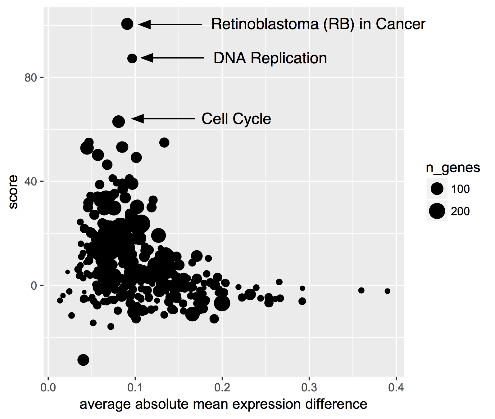
So, we see that ‘Retinoblastoma (RB) in Cancer’ is in the top spot with a score way above the #2 position. Why might that be? Well, PARP1 is involved in DNA damage repair, specifically through the non-homologous endjoining (NHEJ) mechanism. Samples that are deficient in PARP1 are going to have a hard time repairing DNA breaks, which makes cancer more likely. So, RB1 might need to take up the slack, and indeed it’s known as a ‘tumor suppressor protein’: when DNA is damaged, the cell cycle needs to freeze, which happens to be one of RB1’s special tricks, and also probably why we see the next two top ranked pathways ‘DNA Replication’ and ‘Cell Cycle’.
For more on this topic see:
Retinoblastoma (RB) in Cancer (Homo sapiens) (Wiki pathway WP2446)
RB1 gene (Wikipedia entry)
Direct involvement of retinoblastoma family proteins in DNA repair by non-homologous end-joining. (Cook et al, 2015)
Thanks, and feel free to ask about a particular topic! We’re happy to take requests!
December, 2017
For December we’re getting back to BigQuery. And, we’ve got a good one this month. Perhaps you’ve heard of The Genotype-Tissue Expression (GTEx) project ? It’s a fantastic collection of data; donors provided a wide range of healthy tissue samples that have been used to produce a range of data types, including expression and genomics data. You can see the documentation for a complete description.
Well… for this month’s query we’ve put some of this data in the cloud!
As a demonstration use-case, we thought it would be interesting to compare gene expression signatures between TCGA and GTEx, and look at the correlation between each TCGA sample (of which there are over 10,000) and each GTEx tissue type (of which there are 53, with the expression data averaged from multiple samples from the same tissue type). See below for R code and visualizations.
The bigquery below contains the following steps:
select the 5K most variable genes from each data source
find the intersection of these two lists: this will be the list of ~3200 genes that we’ll use in the correlations
build sub-tables of the expression data
rank the expression data within each sample
perform an all-by-all correlation of the ranks, between TCGA samples and GTEx tissue types (this is Spearman’s correlation)
return 545,317 rows(!) where each row represents the correation between one TCGA sample and one GTEx tissue type
Amazingly, this query processes 12.7 GB, takes about 10-20 seconds, and only cost 6 cents!
WITH
--
-- # First we select the 5,000 most variable genes from GTEx.
-- # This is across all tissues.
--
  GTEx_top5K AS (
  SELECT
    gene_id,
    gene_description,
    STDDEV(gene_exp) AS sigmaExp
  FROM
    `isb-cgc.GTEx_v7.gene_median_tpm`
  GROUP BY
    1,
    2
  ORDER BY
    sigmaExp DESC
  LIMIT
    5000 ),
    --
    -- # Then we select the most variable 5K genes from TCGA.
    --
  TCGA_top5K AS (
  SELECT
    HGNC_gene_symbol,
    STDDEV(normalized_count) AS sigmaExp
  FROM
    `isb-cgc.TCGA_hg19_data_v0.RNAseq_Gene_Expression_UNC_RSEM`
  WHERE
    platform='IlluminaHiSeq'
    AND HGNC_gene_symbol IS NOT NULL
  GROUP BY
    1
  ORDER BY
    sigmaExp DESC
  LIMIT
    5000 ),
    --
    -- # next we join the gene symbol tables to get the gene lists.
    --
  geneList AS (
  SELECT
    gene_id,
    HGNC_gene_symbol AS gene_symbol
  FROM
    GTEx_top5K
  JOIN
    TCGA_top5K
  ON
    gene_description=HGNC_gene_symbol ),
    --
    -- # then we rank the gene expression within a sample_barcode.
    --
  tcgaData AS (
  SELECT
    sample_barcode,
    project_short_name AS project,
    HGNC_gene_symbol AS gene_symbol,
    normalized_count AS expr,
    DENSE_RANK() OVER (PARTITION BY sample_barcode ORDER BY normalized_count ASC) AS rankExpr
  FROM
    `isb-cgc.TCGA_hg19_data_v0.RNAseq_Gene_Expression_UNC_RSEM`
  WHERE
    platform='IlluminaHiSeq'
    AND HGNC_gene_symbol IN (
    SELECT
      gene_symbol
    FROM
      geneList) ),
      --
      -- # and also rank the GTEx data
      --
  gtexData AS (
  SELECT
    SMTSD AS tissueType,
    gene_description AS gene_symbol,
    gene_exp AS expr,
    DENSE_RANK() OVER (PARTITION BY SMTSD ORDER BY gene_exp ASC) AS rankExpr
  FROM
    `isb-cgc.GTEx_v7.gene_median_tpm`
  WHERE
    gene_description IN (
    SELECT
      gene_symbol
    FROM
      geneList ) ),
      --
      -- # last table join on TCGA and GTEx ranked gene expression data
      --
  j1 AS (
  SELECT
    g.tissueType AS GTEx_tissueType,
    g.gene_symbol,
    g.rankExpr AS gRank,
    t.sample_barcode,
    t.project AS TCGA_project,
    t.rankExpr AS tRank
  FROM
    gtexData g
  JOIN
    tcgaData t
  ON
    g.gene_symbol=t.gene_symbol ),
    --
    -- # and last, we correate on the ranks (Spearman's correlation).
    --
  gtCorr AS (
  SELECT
    GTEx_tissueType,
    sample_barcode,
    TCGA_project,
    CORR(gRank,tRank) AS corr
  FROM
    j1
  GROUP BY
    1,
    2,
    3 )
    --
    --
    --
SELECT
  *
FROM
  gtCorr
ORDER BY
  corr DESC
So now we’ll run the query and create some visualizations.
library(bigrquery)

q <- as.character(_the_query_above_)

res0 <- query_exec(q, project=__my_project__, use_legacy_sql=F)

dim(res0)
#[1] 545317      4

head(res0)
  GTEx_tissueType   sample_barcode TCGA_project      corr
1           Liver TCGA-DD-A39V-11A    TCGA-LIHC 0.9213024
2           Liver TCGA-DD-A39Z-11A    TCGA-LIHC 0.9189148
3           Liver TCGA-DD-A3A1-11A    TCGA-LIHC 0.9176827
4           Liver TCGA-FV-A3R2-11A    TCGA-LIHC 0.9153921
5           Liver TCGA-DD-A3A5-11A    TCGA-LIHC 0.9149076
6           Ovary TCGA-BG-A3PP-11A    TCGA-UCEC 0.9139462
OK, now we have our table of results, where each TCGA sample is paired with a GTEx tissue type. Let’s take a look at how the tissues correspond.
Just a note here: it would be a good idea to save the results from this query into a new BigQuery table, and continue to query the new table … but we’ll just bring it down and process it locally.
First question: what is the top scoring correlation for each TCGA type (and for each GTEx tissue type)? We’ll group by TCGA tissue type, and within those groups, pull out the row containing the maximum correlation. Then, we’ll group by GTEx tissue-type, and then for each tissue-type pull out row containing the maximum correlation.
library(dplyr)
byTCGA <- res0 %>%
  select(GTEx_tissueType, TCGA_project, corr) %>%
    group_by(TCGA_project) %>%
      filter(corr == max(corr))

  byGTEx <- res0 %>%
    select(GTEx_tissueType, TCGA_project, corr) %>%
      group_by(GTEx_tissueType) %>%
        filter(corr == max(corr))

> data.frame(byTCGA)
                       GTEx_tissueType TCGA_project      corr
1                                Liver    TCGA-LIHC 0.9213024
2                                Ovary    TCGA-UCEC 0.9139462
3                        Adrenal Gland    TCGA-PCPG 0.9100819
4         Brain - Frontal Cortex (BA9)     TCGA-LGG 0.9100485
5                                Liver    TCGA-CHOL 0.9089752
6         Brain - Frontal Cortex (BA9)     TCGA-GBM 0.9021079
7                               Uterus    TCGA-CESC 0.8998127
8                              Thyroid    TCGA-THCA 0.8927743
9                        Adrenal Gland     TCGA-ACC 0.8871793
10                  Esophagus - Mucosa    TCGA-HNSC 0.8843076

> data.frame(byGTEx)
                             GTEx_tissueType TCGA_project      corr
1                                      Liver    TCGA-LIHC 0.9213024
2                                      Ovary    TCGA-UCEC 0.9139462
3                              Adrenal Gland    TCGA-PCPG 0.9100819
4               Brain - Frontal Cortex (BA9)     TCGA-LGG 0.9100485
5                             Brain - Cortex     TCGA-LGG 0.9049930
6                                     Uterus    TCGA-CESC 0.8998127
7   Brain - Anterior cingulate cortex (BA24)     TCGA-LGG 0.8929013
8                                    Thyroid    TCGA-THCA 0.8927743
9                         Esophagus - Mucosa    TCGA-HNSC 0.8843076
10                          Brain - Amygdala     TCGA-LGG 0.8832739
The tissue signatures match up very well across projects! We see TCGA tissue types correlating most strongly with the most similar GTEx tissue types. There are some differences depending on whether we look in blocks by TCGA tumor-type or by GTEx tissue-type, but 15 match exactly from the two tables.
The “Liver” expression profile in particular seems to be very specific. Let’s see how TCGA liver samples correlate with GTEx.
library(ggplot2)

lihcCorrs <- res0 %>%
  filter(TCGA_project == 'TCGA-LIHC') %>%
    select(GTEx_tissueType, TCGA_project, corr) %>%
      group_by(TCGA_project)

qplot(data=lihcCorrs, x=GTEx_tissueType, y=corr, geom="boxplot", col=as.factor(GTEx_tissueType)) +
  theme(legend.position="none") +
  theme(axis.text.x=element_text(angle=45, hjust=1)) +
  ggtitle("TCGA-LIHC")
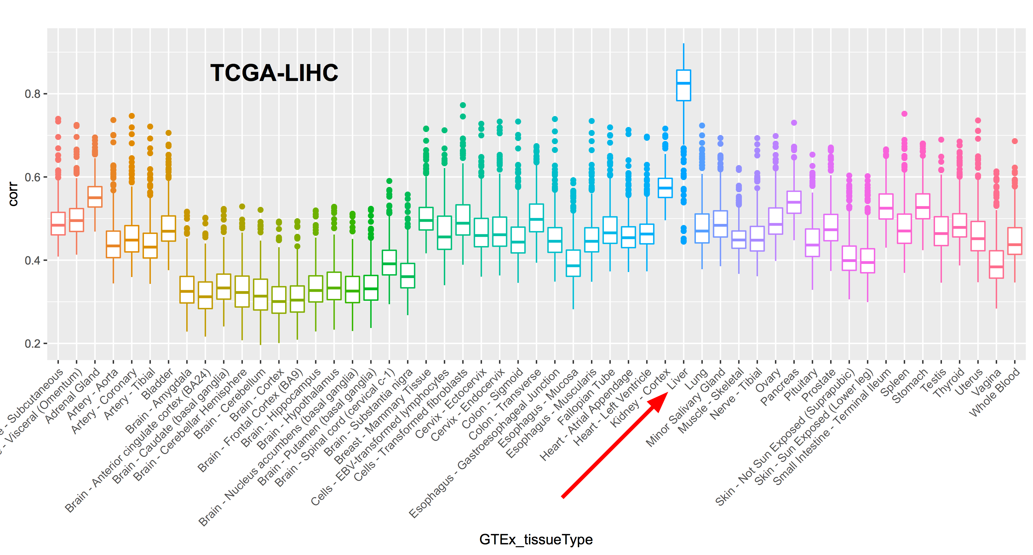
Where do we find unexpected correlations? When grouping by TCGA tissue, TCGA-SKCM actually has the highest correlation with Spleen (0.798). SKCM is the abbreviation for melanoma (SKin Cancer Melanoma) “a cancer in the type of skin cells called melanocytes” (from the GDC’s site). To me that was a little unexpected, so let’s unpack that a bit.
library(ggplot2)

skcmCorrs <- res0 %>%
  filter(TCGA_project == 'TCGA-SKCM') %>%
    select(GTEx_tissueType, TCGA_project, corr) %>%
      group_by(TCGA_project)

qplot(data=skcmCorrs, x=GTEx_tissueType, y=corr, geom="boxplot", col=as.factor(GTEx_tissueType)) +
  theme(legend.position="none") +
  theme(axis.text.x=element_text(angle=45, hjust=1))
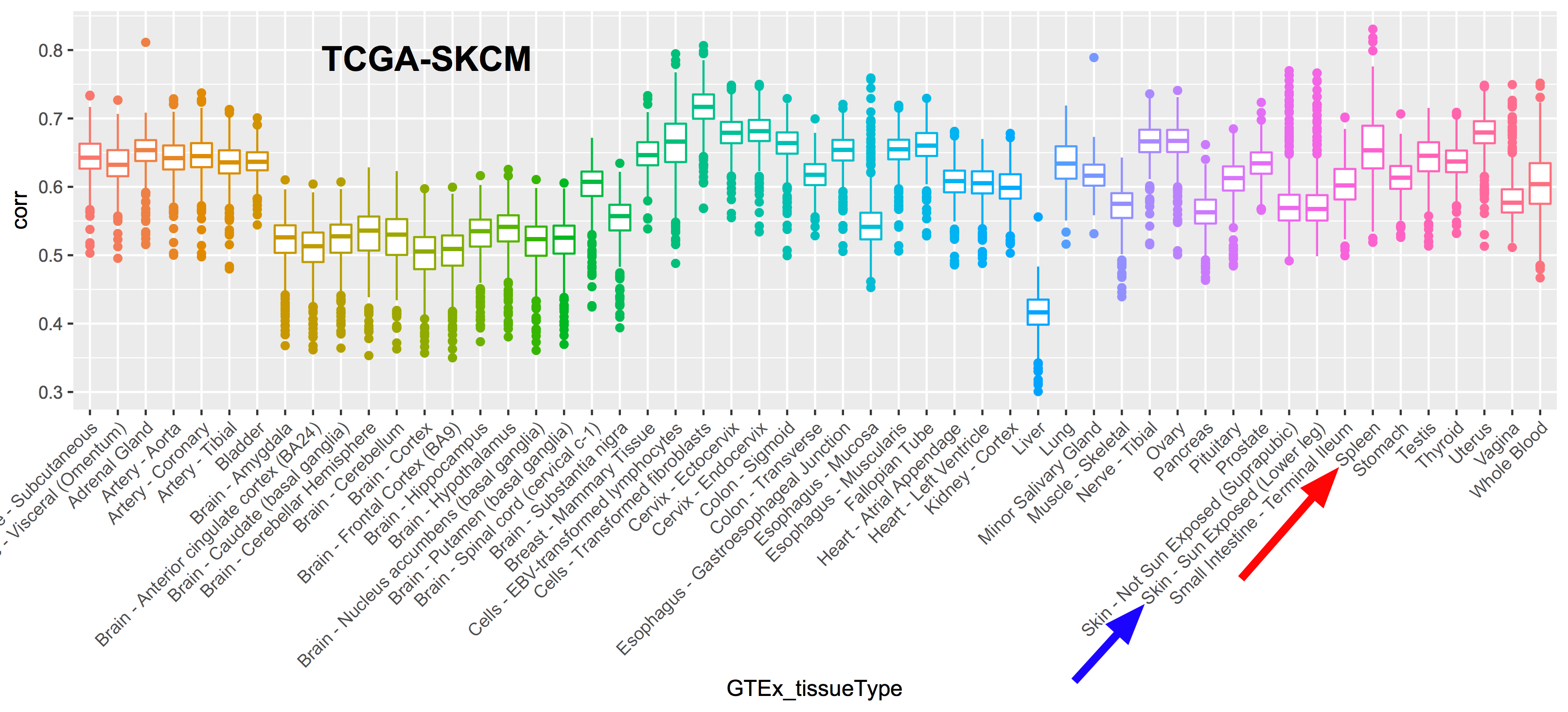
After mentioning this to Sheila, she remembered that many of the melanoma samples are metastatic samples taken from lymph nodes, and, the spleen, like the lymph nodes, is a secondary or peripheral lymphoid organ. Primary tumor sample barcodes are of the form ‘TCGA-XY-1234-01’ (with the final two digits indicating the sample type), while metastatic sample barcodes end in ‘-06’. Let’s label the points according to the sample type and see what that looks like.
skcmSpleenRows <- res0 %>% filter(GTEx_tissueType == 'Spleen' & TCGA_project == 'TCGA-SKCM')
qplot(data=skcmSpleenRows, x=1:nrow(skcmSpleenRows), y=corr, col=metastatic, pch=metastatic) +
  xlab("Samples") +
  ggtitle("SKCM correlation with spleen tissue")
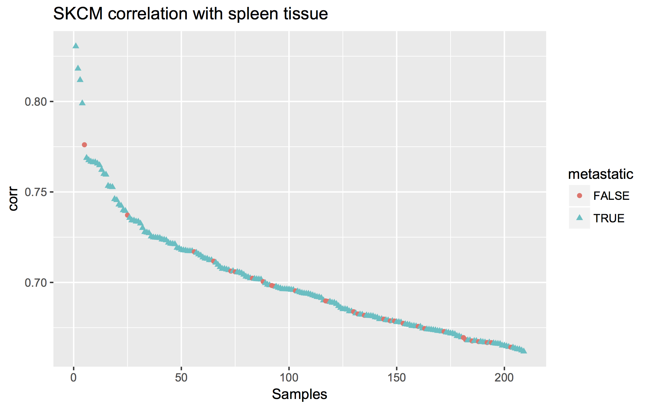
So from the plot we see that, indeed, most of the SKCM samples are metastatic samples taken from lymph nodes, explaining the high correlation that a few of them have with the Spleen tissue-type.
Lastly, let’s just look at the median correlations between each TCGA and GTEx tissue type.
library(dplyr)
library(tidyr)
library(pheatmap)
res1 <- res0 %>% group_by(GTEx_tissueType, TCGA_project) %>% summarize(MeanCorr = median(corr, na.rm=T))
res2 <- spread(res1, key=GTEx_tissueType, value=MeanCorr)
resdf <- as.data.frame(res2)
rownames(resdf) <- resdf$TCGA_project
pheatmap(resdf[,-1])
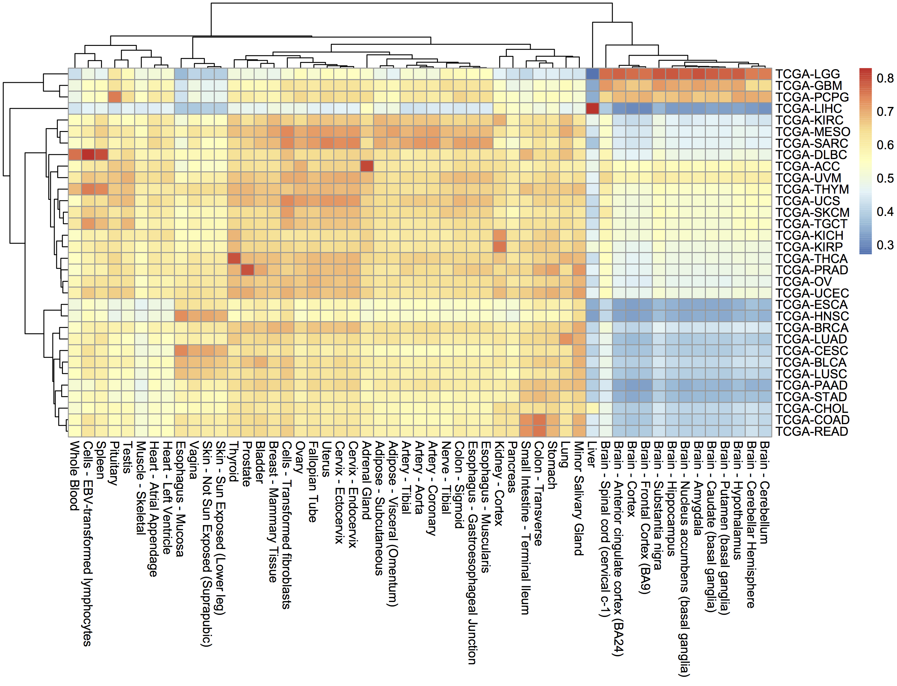
Thanks everyone! Hope you learned something this year. We sure did. See you in 2018!
Sincerely, the ISB-CGC team.
November, 2017
This month, we’re going to shift topics and talk about running scripts in the cloud. In this example we’re going to use R, but it would be just as easy to run a python script.
The code can be found here
In this example, I’m going to be fitting Bayesian logistic regression models using Stan (a statistical modeling and computation platform). Each job will process a different file, but we could also have each job represent a different set of parameters, all processing the same data.
We are going to use dsub to run the script, which is similar to qsub, the common job scheduler found on many clusters and grids. To run each job in parallel, dsub spins up a GCE VM, starts up a named docker on the VM, copies input data from a GCS bucket, runs the specified script, copies the output data back out to a (potentially different) GCS bucket, and finally shuts down the VM. (** See below for help on installation on Macs! **)
‘Batch mode’ is one of the most important dsub features. It allows one to launch many jobs with a single command. Batch mode takes a “tasks file” or as I call it, the “task matrix”, and reads each row as command line parameters for a job. So for example, one column can name the location (in a google bucket) of the input data, another column can have parameters related to the script.
As part of this demonstratation, we will:
Define a custom R script to process user data. (stan_logistic_regression.R, data/*)
Generate a ‘task matrix’, each row describing a job in the google cloud. (cmd_generator.R, task_matrix.txt)
Use Google dsub to automatically start up a VM, run a script, and shutdown. Please see the how_to_dsub.txt file for instructions.
OK, so first we will take a look at the R code. The way dsub works is that a docker image is started up on a VM, and at that time, variables defined in the ‘tasks file’ become available as environment variables. So you can think about these like command line arguments, but to get them in the script, we use ‘Sys.getenv()’. The variables enter the script as strings and will need to be typecast, depending on the need. The environment variable names are set in the tasks file as column names using –env. We’ll look at that next.
# get the file name from the env variable.
dat <- read.csv(Sys.getenv('DATA_FILE'))

# stan models take a list of data
data_list <- list(y = dat$y, x = dat$x, N = length(dat$y))

# compiling and producing posterior samples from the model.
stan_samples <- stan(model_code = model, data = data_list)

# use the environment variable as a file name for a plot.
png(Sys.getenv('OUTPUT_PLOT'))
plot(stan_samples)
dev.off()

# and finally writing out a table
write.table(as.data.frame(stan_samples), file=Sys.getenv('OUTPUT_TABLE'), quote=F, row.names=F)
It’s pretty easy to programmatically construct a tasks file. You can find an example of that in cmd_generator.R, which writes out a tab-delimited table with the variables needed in each row. There are essentially three types of parameters: inputs, outputs, and environment variables. Most importantly, the inputs and outputs need to be GCS urls to objects in a bucket. So I’ve put my data in my bucket, and I use that link in the script.
Please see these examples.
--env SAMPLE_ID     --input DATA_FILE                    --output OUTPUT_TABLE           --output OUTPUT_PLOT
1                   gs://my_bucket/data/data_file_1.csv  gs://my_bucket/stan_table1.txt  gs://my_bucket/stan_plot1.png
2                   gs://my_bucket/data/data_file_2.csv  gs://my_bucket/stan_table2.txt  gs://my_bucket/stan_plot2.png
3                   gs://my_bucket/data/data_file_3.csv  gs://my_bucket/stan_table3.txt  gs://my_bucket/stan_plot3.png
Now, if you’re on a Mac, it can be pretty hard to get dsub installed. It’s due to a conflict with the apple version of the ‘six’ python library, see https://github.com/pypa/pip/issues/3165 for more info.
To get around this, we can install dsub in a virtual environment . Make sure you’re using the ‘bash shell’.
virtualenv dsub_libs
source dsub_libs/bin/activate
pip install dsub
Now we’re pretty close at this point. We need to put our data in a google bucket and find a suitable docker image. If you can’t find a docker image with everything you need, it’s fairly easy to build one. But for this purpose, I searched for ‘docker and RStan’ and found some docker images.
To run dsub, the command looks like:
dsub \
  --project my-google-project-0001 \
  --zones "us-west-*" \
  --logging gs://my_google_bucket/logs/ \
  --image jackinovik/rstan-complete \
  --script ./stan_logistic_regression.R \
  --tasks task_matrix.txt \
  --preemptible \
  --wait
We simply run that and we get a response…:
Job: stan-logis--davidlgibbs--171107-193915-44
Launched job-id: stan-logis--davidlgibbs--171107-193915-44
3 task(s)
To check the status, run:
  dstat --project my-google-project-0001 --jobs 'stan-logis--davidlgibbs--171107-193915-44' --status '*'
To cancel the job, run:
  ddel --project my-google-project-0001 --jobs 'stan-logis--davidlgibbs--171107-193915-44'
Waiting for job to complete...
Waiting for: stan-logis--davidlgibbs--171107-193915-44.
Now, we can check if our job’s finished using the dstat command or simply look in our output bucket. If there’s a problem, it’s mandatory to read the logs!
The exact same procedure could be used to run python or bash scripts.
October, 2017
For October, we’re going to dive into using Plotly for visualziation in Shiny apps. In particular, we’re going to implement an interatictive heatmap using heatmaply. To start, here’s some important links.
ISB-CGC Gene Set Correlation Heatmaply!
Exciting highlights include using BigRQuery to make queries from inside Shiny! We do that by using service account authorization. And of course, heatmaply, an interactive heatmap that lets you zoom and scroll around.
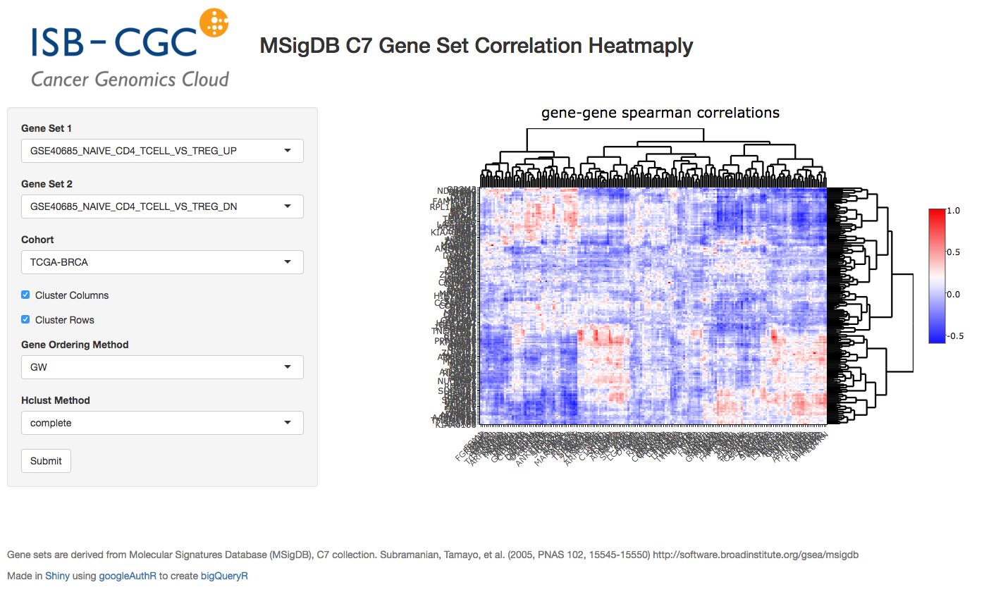
So we’ll just jump right into it!
First I’ll list out the ui.R code.
library(shiny)
library(plotly)
library(heatmaply)


source("global.R")

ui <- fluidPage(
  titlePanel(title=div(img(src="half_isb_logo.png"), "Immune-related Gene Set Correlation-Heatmaply (MSigDB C7)")),
  helpText(HTML("<strong>Hit submit to call Google BigQuery. In the heatmap, select an area to zoom.<strong>")),
  sidebarLayout(
    sidebarPanel(
      selectInput("var1", "Gene Set 1", getGeneSets(), selected ="GSE40685_NAIVE_CD4_TCELL_VS_TREG_UP"),
      selectInput("var2", "Gene Set 2", getGeneSets(), selected = "GSE40685_NAIVE_CD4_TCELL_VS_TREG_DN"),
      getTCGAProjs(), # returns a selectInput obj
      checkboxInput("showlabels", "Show Labels", value=T),
      checkboxInput("clustercols", label = "Cluster Columns", value = T),
      checkboxInput("clusterrows", label = "Cluster Rows", value = T),
      selectInput("seriate", "Gene Ordering Method", c("OLO", "GW", "mean", "none"), selected = "GW"),
      selectInput("hclust_method", "Hclust Method", c("ward.D", "ward.D2", "single",
                                                      "complete", "average", "mcquitty",
                                                      "median", "centroid"), selected="ward.D2"),
      actionButton(inputId="submit",label = "Submit")
    ),

    mainPanel(
      tags$head(
        tags$style(# thanks BigDataScientist @ stackoverflow!
          HTML(".shiny-notification {
               height: 50;
               width: 400px;
               position:fixed;
               top: calc(50% - 50px);;
               left: calc(50% - 200px);;
               }
               "
            )
          )
        ),
      plotlyOutput("plot", height = "600px")
    )
  ),
  br(),
  helpText("What's going on here? The genes belonging to two immune-related gene sets are used to compute Spearman correlation on RNA-seq data from a given type of cancer. It's a visualization of the relationship between two gene sets."),
  helpText("Heatmaply: Tal Galili, Alan O'Callaghan, Jonathan Sidi, Carson Sievert; heatmaply: an R package for creating interactive cluster heatmaps for online publishing, Bioinformatics, , btx657, https://doi.org/10.1093/bioinformatics/btx657"),
  helpText("Gene sets: Molecular Signatures Database (MSigDB), C7 collection. Subramanian, Tamayo, et al. (2005, PNAS 102, 15545-15550) http://software.broadinstitute.org/gsea/msigdb"),
  helpText("Made in", a("Shiny", href="http://shiny.rstudio.com/"), " using ", a("google bigquery, bigrquery, heatmaply, and plotly"))
)
So we start up a fluidPage layout, and define a number of controls in the sidebar. The gene set selectors get a long list of gene set names that I’ve captured from MSigDB and dumped in a file (around 4000 gene sets!).
Another interesting technique is to define a function, like getTCGAProjs(), that builds and returns a selectInput object, using the long list of TCGA projects. Works great and keeps the code easy to read.
Also notice the use of CSS to change the default progress bar.
OK, now we can jump over to the server.R file.
server <- function(input, output, session) {

  # calling BigQuery
  bq_data <- eventReactive(input$submit, {
    load("data/gene_set_hash.rda")
    geneNames1 <- getGenes(sethash, input$var1)
    geneNames2 <- getGenes(sethash, input$var2)
    cohort <- input$cohortid
    sql <- buildQuery(geneNames1, geneNames2, cohort)
    service_token <- set_service_token("data/my_private_key.json")
    data <- query_exec(sql, project='our_bq_project', useLegacySql = F)
    data
  })

  output$plot <- renderPlotly({

    withProgress(message = 'Working...', value = 0, {
      incProgress()

      # first make the bigquery
      bqdf <- bq_data()
      incProgress()

      # then build the correlation matrix
      df <- buildCorMat(bqdf)
      incProgress()

      # then get the heatmap options
      cluster_cols <- as.logical(input$clustercols)
      cluster_rows <- as.logical(input$clusterrows)

      # color scheme
      incProgress()
      rwb <- colorRampPalette(colors = c("blue", "white", "red"))
      heatmaply(df,
              main = 'gene-gene spearman correlations',
              Colv=cluster_cols, Rowv=cluster_rows,
              colors = rwb, seriate=input$seriate,
              hclust_method = input$hclust_method,
              showticklabels = as.logical(input$showlabels),
              margins = c(150,200,NA,0))
    })
  })


  output$event <- renderPrint({
    d <- event_data("plotly_hover")
    if (is.null(d)) "Hover on a point!" else d
  })
}
So, the first function that’s listed is the bq_data function. This function executes after the user makes their selection and hits the ‘submit’ button. I have previously taken the ~4000 gene sets, and built a hash (using the awesome hash library) that takes gene set names and returns the genes. The getGenes functions performs that task. Then the BigQuery SQL is then contructed:
buildQuery <- function(geneNames1, geneNames2, cohort) {
  q <- paste(
    "
    WITH
    --
    -- first we create a subtable for gene set 1
    --
    cohortExpr1 AS (
      SELECT
        sample_barcode,
        HGNC_gene_symbol,
        LOG10( normalized_count +1) AS logexpr,
        RANK() OVER (PARTITION BY HGNC_gene_symbol ORDER BY normalized_count ASC) AS expr_rank
      FROM
        `isb-cgc.TCGA_hg19_data_v0.RNAseq_Gene_Expression_UNC_RSEM`
      WHERE
        project_short_name = '",cohort ,"'
        AND HGNC_gene_symbol IN ",geneNames1 ,"
        AND normalized_count IS NOT NULL
        AND normalized_count > 0),
    --
    -- then we create a subtable for gene set 2
    --
    cohortExpr2 AS (
      SELECT
        sample_barcode,
        HGNC_gene_symbol,
        LOG10( normalized_count +1) AS logexpr,
        RANK() OVER (PARTITION BY HGNC_gene_symbol ORDER BY normalized_count ASC) AS expr_rank
      FROM
        `isb-cgc.TCGA_hg19_data_v0.RNAseq_Gene_Expression_UNC_RSEM`
      WHERE
        project_short_name = '",cohort ,"'
        AND HGNC_gene_symbol IN ",geneNames2 ,"
        AND normalized_count IS NOT NULL
        AND normalized_count > 0),
    --
    -- then we join the two gene expression tables,
    -- we could get rid of the logexpr fields, but maybe
    -- they'd prove useful in some other query.
    --
    jtab AS (
      SELECT
        cohortExpr1.sample_barcode,
        cohortExpr2.sample_barcode,
        cohortExpr1.HGNC_gene_symbol as g1,
        cohortExpr2.HGNC_gene_symbol as g2,
        cohortExpr1.expr_rank as e1,
        cohortExpr2.expr_rank as e2
      FROM
        cohortExpr1
      JOIN
        cohortExpr2
      ON
        cohortExpr1.sample_barcode = cohortExpr2.sample_barcode
      GROUP BY
        cohortExpr1.sample_barcode,
        cohortExpr2.sample_barcode,
        cohortExpr1.HGNC_gene_symbol,
        cohortExpr2.HGNC_gene_symbol,
        cohortExpr1.logexpr,
        cohortExpr1.expr_rank,
        cohortExpr2.logexpr,
        cohortExpr2.expr_rank )
    --
    -- last, we correlate the RANKs, to get a Spearman correlation.
    --
    SELECT
      g1,
      g2,
      corr(e1, e2) as spearmans
    FROM
      jtab
    GROUP BY
      g1,g2
    ",
    sep="")
}
OK, so with that query-string constructed, we can make the call to Google BigQuery. In order to get authorized, here we’re using a service account. To get that set up, you will need to log into your Google Cloud Console, and follow these instructions (Service account credentials). This will generate a small .json file containing your private key (protect it, and don’t lose it). Then we can use the bigrquery function set_service_token, providing the path to the json file. Very easy! After that we simply make the call using query_exec.
Then, to make the heatmap, we use the renderPlotly function. In that function, first we get the summarized data from BigQuery, which is returned as a data.frame (bqdf), and we transform that into a matrix using the reshape2 library.
library(reshape2)

buildCorMat <- function(bqdf) {
  # bqdf is a data.frame returned from query_exec
  # g1 and g2 are gene names
  # and we have a Spearman correlation
  meltdf <- melt(bqdf)
  sqdf <- dcast(meltdf, g1~g2, value.var = "value")
  # then a bit of tidying up.
  sqdf[is.na(sqdf)] <- 0
  rownames(sqdf) <- sqdf[,'g1']
  sqdf <- sqdf[,-1]
  return(sqdf)
}
With that done (building the correlation matrix), we can simply make the call to heatmaply, which is linked back to our plotlyOutput in the mainPanel (in the ui.R code).
So we’ve just tied together Shiny, Plotly, Heatmaply, and BigQuery into one interactive web tool. Got a question about it? Let me know! dgibbs at systemsbiology dot org.
September, 2017
Greetings! For September we’ve implemented a new statistical test: the one-way ANOVA. This statistical test can be used to determine whether there is a statistically significant difference between the means of two or more independent groups. Although in this example, I’m only looking at two groups, it would not be difficult to extend this to any number of groups, assuming there is a reasonable number of samples within each group.
Consider the model yij = m + ai + eij, where yij is a continuous variable over samples j, in groups i, and ai is a constant for each group i, and eij is a gaussian error term with mean 0.
Using this model, we are describing the data as being sampled from groups, with each group having a mean value equal to m + ai. The null hypothesis is that each of the group means is the same (ie that the ai terms are zero), while the alternative hypothesis is that at least one of the ai terms is not zero.
We use the F-test to compare these two hypotheses. To compute the test statistic, we compute the within-group variation and the between-group variation. Recall that sample variance is defined as the sum of squared differences between observations and the mean, divided by the number of samples (normalized).
Before we get into the query, please note that you can find a specialized version of the below query that compares the expression between individuals with a SNP and without a SNP, using the same SQL as the August query. I’ve put that query in this github gist.
And you can find the associated Shiny app, using the same layout from August, where we plot the F distribution and show a comparison of means. You can find that here.
Let’s look at the query:
WITH
  -- using standard SQL,
  -- we'll select our cohort and gene expression
  --
  cohortExpr AS (
  SELECT
    sample_barcode,
    LOG10(normalized_count) AS expr
  FROM
    `isb-cgc.TCGA_hg19_data_v0.RNAseq_Gene_Expression_UNC_RSEM`
  WHERE
    project_short_name = 'TCGA-BRCA'
    AND HGNC_gene_symbol = 'TP53'
    AND normalized_count IS NOT NULL
    AND normalized_count > 0),
  --
  -- And we'll select the variant data for our cohort,
  -- we're going to be comparing variant types (SNP, DEL, etc)
  --
  cohortVar AS (
  SELECT
    Variant_Type,
    sample_barcode_tumor AS sample_barcode
  FROM
    `isb-cgc.TCGA_hg19_data_v0.Somatic_Mutation_MC3`
  WHERE
    SYMBOL = 'TP53' ),
  --
  -- then we join the expression and variant data using sample barcodes
  --
  cohort AS (
  SELECT
    cohortExpr.sample_barcode AS sample_barcode,
    Variant_Type AS group_name,
    expr
  FROM
    cohortExpr
  JOIN
    cohortVar
  ON
    cohortExpr.sample_barcode = cohortVar.sample_barcode ),
  --
  -- First part of the calculation, the grand mean (over everything)
  --
  grandMeanTable AS (
  SELECT
    AVG(expr) AS grand_mean
  FROM
    cohort ),
  --
  -- Then we need a mean per group, and we can get a count of samples
  -- per group.
  --
  groupMeansTable AS (
  SELECT
    AVG(expr) AS group_mean,
    group_name,
    COUNT(sample_barcode) AS n
  FROM
    cohort
  GROUP BY
    group_name),
  --
  -- To get the between-group variance
  -- we take the difference between the grand mean
  -- and the means for each group and sum over all samples
  -- ... a short cut being taking the product with n.
  -- Later we'll sum over the n_sq_diff
  --
  ssBetween AS (
  SELECT
    group_name,
    group_mean,
    grand_mean,
    n,
    n*POW(group_mean - grand_mean,2) AS n_diff_sq
  FROM
    groupMeansTable
  CROSS JOIN
    grandMeanTable ),
  --
  -- Then, to get the variance within each group
  -- we have to build a table matching up the group mean
  -- with the values for each group. So we join the group
  -- means to the values on group name. We are going to
  -- sum over this table just like ssBetween
  --
  ssWithin AS (
  SELECT
    a.group_name AS group_name,
    expr,
    group_mean,
    b.n AS n,
    POW(expr - group_mean, 2) AS s2
  FROM
    cohort a
  JOIN
    ssBetween b
  ON
    a.group_name = b.group_name ),
  --
  -- The F stat comes from a ratio, the numerator is
  -- calculated using the between group variance, and
  -- dividing by the number of groups (k) minus 1.
  --
  numerator AS (
  SELECT
    'dummy' AS dummy,
    SUM(n_diff_sq) / (count(group_name) - 1) AS mean_sq_between
  FROM
    ssBetween ),
  --
  -- The denominator of the F stat ratio is found using the
  -- variance within groups. We divide the sum of the within
  -- group variance and divide it by (n-k).
  --
  denominator AS (
  SELECT
    'dummy' AS dummy,
    COUNT(distinct(group_name)) AS k,
    COUNT(group_name) AS n,
    SUM(s2)/(COUNT(group_name)-COUNT(distinct(group_name))) AS mean_sq_within
  FROM
    ssWithin),
  --
  -- Now we're ready to calculate F!
  --
  Ftable AS (
  SELECT
    n,
    k,
    mean_sq_between,
    mean_sq_within,
    mean_sq_between / mean_sq_within AS F
  FROM
    numerator
  JOIN
    denominator
  ON
    numerator.dummy = denominator.dummy)

SELECT
  *
FROM
  Ftable
OK, so let’s check our work. Using the BRCA cohort and TP53 as our gene, we have 375 samples with a variant in this gene. We’re going to look at whether the type of variant is related to the gene expression we observe. If we just pull down the data using the ‘cohort’ subtable (as above), we can get a small data frame, which let’s us do the standard F stat table in R.
> # dat is the data.frame created by running the above query
>
> head(dat)
    sample_barcode group_name     expr
1 TCGA-A2-A0T3-01A        DEL 2.623283
2 TCGA-A8-A07B-01A        DEL 2.450762
3 TCGA-AR-A5QQ-01A        DEL 2.579250
4 TCGA-A2-A0YE-01A        DEL 2.298823
5 TCGA-C8-A135-01A        DEL 2.744527
6 TCGA-A7-A13E-01A        DEL 3.246725
>
> dat %>% group_by(group_name) %>% summarize(mean=mean(expr), sd=sd(expr))
# A tibble: 3 × 3
  group_name     mean        sd
      <fctr>    <dbl>     <dbl>
1        DEL 2.791941 0.3220669
2        INS 2.642215 0.1158877
3        SNP 3.218580 0.3129593
>
>
> anova(lm(data=dat, expr~group_name))
Analysis of Variance Table

Response: expr
            Df Sum Sq Mean Sq F value    Pr(>F)
group_name   2 12.460  6.2302  65.147 < 2.2e-16 ***
Residuals  372 35.576  0.0956
---
OK, if you run the above BigQuery, you’ll see the same results. We see that the F statistic is really high, which makes sense looking at the difference in mean expression values across the groups (these are log10 expression values).
I have created a specialized version of the above test (as opposed to generalized, ha ha) that compares the expression between individuals with a SNP and without a SNP, using the same SQL to create groups as last month. I’ve put that query in this github gist.
And additionally, I’ve put that query into a Shiny app, that uses the same layout from August. You can find that here.
August, 2017
This month we have been working on a small demo application using BigQuery, with a graphical front-end built with R Shiny . You can try it out yourself here and even watch the video.
Using the R programming language, Shiny is an easy way to produce interactive visualizations that can be hosted on the web.
Shiny sites are hosted by a Shiny server, which you can set up locally or use the free shinyapps.io service, which is provided by the same company that produces the RStudio (which has a builtin Shiny server for dev work).
In the past, we’ve shown how queries can be programmatically built up; here we’re going to provide a user interface to collect variables that are inserted into the BigQuery (like gene names).
The query is going to look at patient survival, and how survival rates change with gene mutations. Therefore we’ll be using two tables and a small set of variables:
isb-cgc:TCGA_bioclin_v0.Clinical for survival data
days_to_last_known_alive: This field indicates the number of days to the last follow up appointment (still alive) or until death, relative to “time zero” (typically the day of diagnosis).
vital_status: This field is filled in for all but 4 cases and is correct as of the last available follow up for that individual. Over all TCGA, 7534 cases were known to still be “Alive”, while 3622 were “Dead”, and 4 were of unknown vital status.
isb-cgc:TCGA_hg38_data_v0.Somatic_Mutation for mutation status
Variant_Classification: eg Missense_Mutation, Silent, 3’UTR, Intron, etc (18 different values occur in this table)
Variant_Type: one of 3 possible values: SNP, DEL, INS
IMPACT: one of 4 values: LOW, MODERATE, HIGH, or MODIFIER
What we want the query to do, is to collect a cohort of patients into two groups, those that have a SNP with some potential effect in a particular gene, and those that do not. Then we can compare the survival rates between the two groups to assess whether the mutation has some potential effect.
Let’s take a look at an example query, then we’ll see how to build it up in the code.
-- using Standard SQL --
--
-- First we build our table of survival times
--
WITH clin_table AS (
SELECT
  case_barcode,
  days_to_last_known_alive,
  vital_status
FROM
  `isb-cgc.TCGA_bioclin_v0.Clinical`
WHERE
  project_short_name = 'TCGA-GBM' ),
--
-- Then we can build our table of mutation status.
-- We do that by using an If statement with a sub-query.
--
mut_table AS (
SELECT
  case_barcode,
  IF ( case_barcode IN (
    SELECT
      case_barcode
    FROM
      `isb-cgc.TCGA_hg38_data_v0.Somatic_Mutation`
    WHERE
      SYMBOL = 'IDH1'
      AND Variant_Classification <> 'Silent'
      AND Variant_Type = 'SNP'
      AND IMPACT <> 'LOW'), 'Mutant', 'WT') AS mutation_status
FROM
  `isb-cgc.TCGA_hg38_data_v0.Somatic_Mutation` )
--
-- Finally, we can join those tables.
--
SELECT
  mut_table.case_barcode,
  days_to_last_known_alive,
  vital_status,
  mutation_status
FROM
  clin_table
JOIN
  mut_table
ON
  clin_table.case_barcode = mut_table.case_barcode
GROUP BY
  mut_table.case_barcode,
  days_to_last_known_alive,
  vital_status,
  mutation_status
The Shiny App
Now we’ll move on to the description of the app. When creating a new Shiny project in RStudio, two main files are created: ‘ui.R’ and ‘server.R’. Additionally, I created one more called ‘global.R’. The ‘ui.R’ file contains the code needed to build the html interface, ‘server.R’ contains the code that responds to the interface, and ‘global.R’ contains the functions that build the query, call the BigQuery API, and plot the results.
Starting with the interface found in ‘ui.R’, the googleAuthR package was used to perform authorization, using the googleAuthUI(“loginButton”). Next, the GCP project ID is collected using the textInput widget, we need this because even after logging in, we still need to tell BigQuery which GCP project is going to be billed for the query. (You will need to be a member of at least one GCP project, with permissions to run BigQuery queries. To find out the ID(s) for GCP project(s) you are a member of, you can go to the Google Cloud Console.) Then, patient cohorts are selected using the selectInput widget, which is like a drop down menu of TCGA studies. And lastly, we have a textInput widget to specify the gene symbol. At the bottom of the interface is an actionButton called submit that kicks off the work.
ui <- fluidPage(

  #!! excluding layout code like sidebarLayout and panels. !!#

  googleAuthUI("loginButton"),

  textInput("projectid", "Project ID", value = "your project id", placeholder = "your project id"),

  selectInput("cohortid", label = "Cohort",
                  choices = list(
                    "TCGA-ACC"="TCGA-ACC",
                    "TCGA-BLCA"="TCGA-BLCA",
                    "TCGA-BRCA"="TCGA-BRCA",
                    "TCGA-CESC"="TCGA-CESC",
                    "TCGA-CHOL"="TCGA-CHOL",
                    ## etc ##
            ),selected = "TCGA-GBM") ,

  textInput("varname",  "Gene Symbol", value = "IDH1", placeholder = "IDH1"),

  actionButton(inputId="submit",label = "Submit")

)
In the ‘server.R’ file, there’s one main function called ‘server’. Inside that function, we get our accessToken by calling the googleAuth module, which is linked to the ‘loginButton’. Also we have a function linked to the submit button called outputPlot, which wraps our plot function in the googleAuthR::with_shiny function, in order to make our API calls while properly logged in.
See this help on authorization.
options("googleAuthR.scopes.selected" = c("https://www.googleapis.com/auth/bigquery"))
options("googleAuthR.webapp.client_id" = "get_this_from_your_cloud_console_under_Credentials_OAuth 2.0 client IDs.apps.googleusercontent.com")
options("googleAuthR.webapp.client_secret" = "get_from_cloud_console")


server <- function(input, output, session){

  ## Create access token and render login button
  access_token <- callModule(googleAuth, "loginButton", approval_prompt = "force")

  outputPlot <- eventReactive(input$submit,{
    ## wrap existing function using googleAuthR::with_shiny
    ## pass the reactive token using shiny_access_token param
    project  <- as.character(input$projectid)
    cohort   <- as.character(input$cohortid)
    varname  <- input$varname

    if(is.null(access_token())) {
      errorPlot()
    } else {
      with_shiny(f = drawPlot, shiny_access_token = access_token(), project, cohort, varname)
    }
  })

  output$plot <- renderPlot({outputPlot()}, width=600, height=500)
}
The plot is drawn using a model from the survival package and a ggplots style package called ggsurvminer
drawPlot <- function(project, cohort, varname) {
  #
  # first make a call to BigQuery, and build the data frame
  dat <- buildAndRunQuery(varname, project, cohort)
  #
  # then we fit our survival model
  fit <- survfit(Surv(days_to_last_known_alive, vital_status) ~ mutation_status, data=dat)
  #
  # finally visualize the survival model using ggsurvplot.
  survminer::ggsurvplot(fit=fit, data=dat, pval=T, risk.table=T, conf.int=T)
}
The last portion we’ll look at, and maybe the most important, involves the call to big query! In the ‘buildAndRunQuery’ function, we build up the query as a long string, then contruct an API function using googleAuthR functions, and finally make the API call, and get the results. There are helper functions found in the bigQueryR, but I think it’s instructional to see how the backend works. In future QotMs, we will explore using bigQueryR.
buildAndRunQuery <- function(varName, aproject, cohort) {
  #
  # First we're going to build the string representing the BigQuery #
  #
  q <- paste(
    "
    WITH
    clin_table AS (
      select
      case_barcode,
      days_to_last_known_alive,
      vital_status
    from
      `isb-cgc.TCGA_bioclin_v0.Clinical`
    WHERE
      project_short_name = '", cohort,"' ),
    mut_table AS (
    SELECT
    case_barcode,
    IF ( case_barcode IN (
      SELECT
      case_barcode
      FROM
      `isb-cgc.TCGA_hg38_data_v0.Somatic_Mutation`
      WHERE
      SYMBOL = '", varName, "'
      AND Variant_Classification <> 'Silent'
      AND Variant_Type = 'SNP'
      AND IMPACT <> 'LOW'), 'Mutant', 'WT') as mutation_status
    FROM
    `isb-cgc.TCGA_hg38_data_v0.Somatic_Mutation` )
  SELECT
    mut_table.case_barcode,
    days_to_last_known_alive,
    vital_status,
    mutation_status
  FROM
    clin_table
  JOIN
    mut_table
  ON
    clin_table.case_barcode = mut_table.case_barcode
  GROUP BY
    mut_table.case_barcode,
    days_to_last_known_alive,
    vital_status,
    mutation_status
    ",
    sep="")

  # define body for the POST request to the Google BigQuery API
  body = list(
    query=q,
    defaultDataset.projectId=aproject,
    useLegacySql = F
  )

  #create a function to make the POST call to Google BigQuery
  f = gar_api_generator("https://www.googleapis.com/bigquery/v2",
                        "POST",
                        path_args = list(projects=aproject, queries=""))

  # call function with body as input argument
  response = f(the_body=body)

  dat <- data.frame()
  if(!is.null(response))
  {
    # have to construct the data.frame from a list of results.
    dat = as.data.frame(do.call("rbind",lapply(response$content$rows$f,FUN = t)))
    colnames(dat) <- c("ID", "days_to_last_known_alive", "vital_status", "mutation_status")

    # then we need to do a little data-cleaning to get ready for our survival model
    dat$days_to_last_known_alive <- as.numeric(as.character(dat$days_to_last_known_alive))
    dat$vital_status <- ifelse(dat$vital_status == 'Alive', 0, 1)
    dat$mutation_status <- as.factor(dat$mutation_status)
  }
  return(dat)
}
The resulting plot will show if the two groups, defined by SNP mutation status, have significantly different survival rates. In our example, contrary to intuition, a mutation in the IDH1 gene, in GBM, actually has a positive effect on survival. (See this 2014 paper by Cohen et al about IDH1 and IDH2 Mutations in Gliomas for more information about this.)
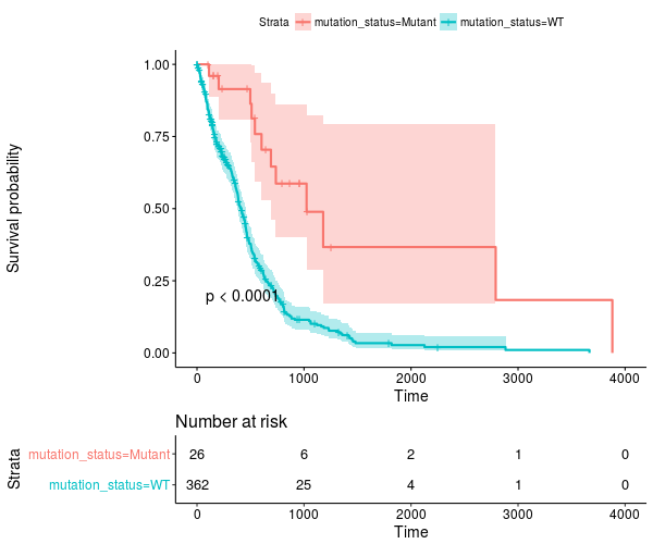
The results for the TCGA-LGG cohort are also quite striking – go have a look!
July, 2017
Way back in December we started talking about the new NCI-GDC Data Portal which includes both hg19 and hg38 alignments. At that time, those were part of isb-cgc:hg19_data_previews and isb-cgc:hg38_data_previews. Now, at this point they’ve matured into three data sets:
isb-cgc:TCGA_bioclin_v0
isb-cgc:TCGA_hg19_data_v0
isb-cgc:TCGA_hg38_data_v0
And, as you’ll discover, there’s been some changes to the “standard” column names that we used previously. This was done to better align with the GDC, and make things more universal across data sources.
For one, barcode column names (and most column names) have become all lower case and underscore_separated. So ‘AliquotBarcode’ has become ‘aliquot_barcode’. Same with SampleBarcode (sample_barcode). However, ParticipantBarcode has become case_barcode. Also ‘Study’ is now refered to as ‘project_short_name’. So if you’re having trouble getting an ‘old’ query to work, make sure the column names haven’t changed, and check whether it’s in Legacy SQL or Standard SQL.
As we transition to standard SQL and the new GDC datasets, one question that’s come up around here relates to records. Overall, in the isb-cgc datasets, there’s very few data types other than STRINGs, INTEGERs, and FLOATs. But occasionally you’ll bump into something that needs a different query structure, and the RECORD type is one of those. One place to find this rare beast is in the methylation probe annotation (isb-cgc:platform_reference.methylation_annotation).
Each methylation probe has a specified genomic location, given as a chromosome and the base position on that chromosome. An analytical question that often arises is something like “does methylation in this region of the genome affect RNA transcription?”. It’s a good question, and can actually be pretty hard to determine. But here, we’ll focus on one of the first steps in the analysis, mapping probes to genes.
In the isb-cgc:platform_reference.methylation_annotation table schema, we find a RECORD called ‘UCSC’. If we look at the details of the table (via the web interface) we see that the table has 485,577 rows and has the following description:
This table is based on the Illumina DNA methylation platform annotation information
found in the file HumanMethylation450_15017482_v.1.2.csv which can be obtained
from Illumina.  This information has been loaded into a BigQuery table and made
available to the public with permission from Illumina.
Sounds good! A couple important columns are going to be the IlmnID, which is the probe ID (example: cg10232580), and the UCSC RECORD, where we’ll find the gene symbol, RefGene accession ID, and the portion of the gene the probe is closest to (approximately).
Let’s start with an easy one:
SELECT
  Infinium_Design_Type,
  COUNT(Infinium_Design_Type) as type_count
FROM
  `isb-cgc.platform_reference.methylation_annotation`
GROUP BY
  Infinium_Design_Type
Row Infinium_Design_Type  type_count
1   I                     135501
2   II                    350076
Why does that matter? Well, the array was actually a blend of two different technologies. This paper and this paper show that the performance of the two probes is very different, and that type II probes appear to be less useful than the type I probes.
Now, let’s suppose we are interested in a particular pathway, and we’d like to know the distribution of probe types across the pathway genes. Using our previous ‘Query of the Month’ data set (isb-cgc:QotM.WikiPathways_20170425_Annotated), we can get a list of functionally related genes.
SELECT
  DISTINCT(Symbol) as gene_symbol
FROM
  `isb-cgc.QotM.WikiPathways_20170425_Annotated`
WHERE
  pathway = 'Oxidative Damage'
and we get 40 genes. So now we’re going to join the annotation table, to our table of pathway related genes, and get the probe types.
WITH
pathway AS (
SELECT
  DISTINCT(Symbol) as gene_symbol
FROM
  `isb-cgc.QotM.WikiPathways_20170425_Annotated`
WHERE
  pathway = 'Oxidative Damage'
  )
SELECT
    Infinium_Design_Type,
    COUNT(Infinium_Design_Type)
FROM
    `isb-cgc.platform_reference.methylation_annotation` as m
JOIN
    pathway
ON
    pathway.gene_symbol = m.UCSC.RefGene_Name
GROUP BY
  Infinium_Design_Type
Query Failed
Error: Cannot access field RefGene_Name on a value with type
ARRAY<STRUCT<RefGene_Group STRING, RefGene_Accession STRING, RefGene_Name STRING>> at [18:34]
What happened? It’s that darned RECORD, which in our error, actually looks to be an ARRAY of STRUCTS! We have previously used arrays in our queries in past months where we took a list of values and created an array to be passed to a JavaScript function. The result of the function gave us back an array, and we had to UNNEST it, to get back one row per entry. It’s similar in this instance. Some probes are mapped to multiple RefGene_Accession IDs. For example, cg10241718 maps to NM_033302, NM_033303, NM_033304, and NM_000680. Interestingly, you see this same set as part of the HG-U133A probe annotations (Thanks, genecard-geneannot webservice). These are representing four different transcripts of the same gene ADRA1A, the methylation probe has the same relationship to three of the isoforms (the gene body), but for one isoform, NM_000680, the probe is positioned 3’-UTR, which could change its effect. In light of that, we might want to group by gene symbol (mostly the same) and the refgene_group, which tells us the relative position of the probe to the gene.
To (finally!) address the problem of RECORDS, we need to check the BigQuery docs There, we see that the RECORD in Legacy SQL has becomes a STRUCT in Standard SQL. In order to flatten the table, in Legacy SQL we would use FLATTEN, but now, in Standard SQL we are going to use UNNEST.
So what’s the difference between an ARRAY and a STRUCT? Well an ARRAY is “an ordered list of zero or more elements of non-ARRAY values,” and a STRUCT is a “container of ordered fields each with a type.” Hmmm, sounds pretty similar, the difference being that a STRUCT can be a collection of different data types (STRINGS and INTs for example), while ARRAYs have to be a single data type.
To get around that, we are going to flatten the table using UNNEST.
SELECT
  RefGene_Name,
  RefGene_Group
FROM
  `isb-cgc.platform_reference.methylation_annotation`,
  UNNEST(UCSC)
LIMIT
  1000
Row   RefGene_Name    RefGene_Group
1       null          null
2       null          null
3       IQCE          Body
4       IQCE          Body
5       CRYGN         3'UTR
6       IQCE          Body
7       IQCE          Body
8       ELFN1         5'UTR
That’s more like it! Now we can write our final query.
WITH
  -- first we'll UNNEST our probes
  --
  probes AS (
  SELECT
    RefGene_Name,
    RefGene_Group,
    Infinium_Design_Type
  FROM
    `isb-cgc.platform_reference.methylation_annotation`,
    UNNEST(UCSC) ),
  --
  -- Then we'll select genes taking part in our pathway of interest
  --
  genes AS (
  SELECT
    DISTINCT(Symbol) AS gene_symbol
  FROM
    `isb-cgc.QotM.WikiPathways_20170425_Annotated`
  WHERE
    pathway = 'Oxidative Damage' ),
  --
  -- We can join the unnested table to our table of genes.
  --
  join_table AS (
  SELECT
    genes.gene_symbol,
    probes.RefGene_Group,
    probes.Infinium_Design_Type
  FROM
    probes
  JOIN
    genes
  ON
    genes.gene_symbol = probes.RefGene_Name
  GROUP BY
    genes.gene_symbol,
    probes.RefGene_Group,
    probes.Infinium_Design_Type )
--
-- And summarize on the probe type.
--
SELECT
  Infinium_Design_Type,
  COUNT(Infinium_Design_Type),
  RefGene_Group
FROM
  join_table
GROUP BY
  RefGene_Group,
  Infinium_Design_Type
Row Infinium_Design_Type  type_count  RefGene_Group
1   I                     3           3'UTR
2   I                     17          TSS1500
3   I                     20          TSS200
4   I                     20          Body
5   I                     20          1stExon
6   I                     23          5'UTR
7   II                    25          5'UTR
8   II                    25          1stExon
9   II                    29          TSS200
10  II                    31          3'UTR
11  II                    38          TSS1500
12  II                    39          Body
OK! So, this pathway is covered by probes of both types, and we do see more of the type II probes (which lack in performance), but there’s also a good number of type I probes that should be useful.
So, in summary, when using the ISB-CGC tables, you probably won’t run into too many RECORD data types, but if you do, you’ll be prepared.
As an exercise for the reader, you might want to try and join the information explored above with the information in the one of the GENCODE tables – try using the methylation probe coordinates and the GENCODE gene coordinates to see if the information in the UCSC record in the methylation table is completely accurate, or check to see if there are important differences between hg19/GRCh37 and hg38/Grch38. If you come up with some useful queries, feel free to email us and we’ll feature you on this page!
March, 2017
This month we’re going to compute a pairwise distance matrix and visualize it using a heatmap in R. Many methods, such as clustering, depend on having a distance matrix, and although I would not recommend using BigQuery to download large tables, this works well for smaller feature sets (10s-100s).
In this example, we will be selecting primary tumor samples from both BRCA and STAD cohorts, along with a list of the top 50 most variable miRNAs. Then we’ll compute a pairwise distance metric on samples. The distance will be based on Spearman’s correlation.
As usual, we are going to be using standard SQL, so make sure to select that option.
WITH
  --
  -- *sample_lists*
  -- First, start by defining the list of BRCA TP samples.
  -- (TP == tumor, primary)
  --
  brca_sample_list AS (
  SELECT
    SampleBarcode
  FROM
    `isb-cgc.tcga_201607_beta.Biospecimen_data`
  WHERE
    SampleTypeLetterCode='TP'
    AND Study='BRCA'
  LIMIT
    50),
  --
  -- Then let's create a list of STAD samples.
  --
  stad_sample_list AS (
  SELECT
    SampleBarcode
  FROM
    `isb-cgc.tcga_201607_beta.Biospecimen_data`
  WHERE
    SampleTypeLetterCode='TP'
    AND Study='STAD'
  LIMIT
    50),
  --
  -- Now, we are going to merge the two sample tables using a UNION ALL.
  --
  sample_list AS (
  select * from stad_sample_list
  UNION ALL
  select * from brca_sample_list
  ),
  --
  -- *miRNA_list*
  -- Next, we define the miRNAs of interest. We order the miRNAs by standard
  -- deviation, then take the top 50. Notice we select value from the
  -- subset defined above.
  --
  miRNA_list AS (
  SELECT
    mirna_accession,
    STDDEV(normalized_count) AS sigma_count
  FROM
    `isb-cgc.tcga_201607_beta.miRNA_Expression`
  WHERE
    SampleBarcode IN (
    SELECT
      SampleBarcode
    FROM
      sample_list )
  GROUP BY
    mirna_accession
  ORDER BY
    sigma_count DESC
  LIMIT
    50 ),
  --
  -- *miRNA_data*
  -- Now that we have the sample_list and the mirna_list, we can select our
  -- data of interest from the larger miRNA_Expression table.
  --
  miRNA_data AS (
  SELECT
    SampleBarcode,
    Study,
    mirna_id,
    mirna_accession,
    LOG10(normalized_count+1) AS log10_count
  FROM
    `isb-cgc.tcga_201607_beta.miRNA_Expression`
  WHERE
    SampleBarcode IN (
    SELECT
      SampleBarcode
    FROM
      sample_list )
    AND mirna_accession IN (
    SELECT
      mirna_accession
    FROM
      miRNA_list ) ),
  --
  -- *pairs*
  -- Now, we JOIN the miRNA_data matrix with *itself*, creating all possible pairs of samples
  -- (excluding self-comparisons which are unnecessary) combined with a dense-ranking of
  -- the miRNA expression values. By computing the Pearson correlation on ranks, we
  -- end up with Spearman's correlation!
  --
  pairs AS (
  SELECT
    lhs.mirna_id,
    lhs.mirna_accession,
    lhs.SampleBarcode AS SampleA,
    rhs.SampleBarcode AS SampleB,
    lhs.Study AS StudyA,
    rhs.Study as StudyB,
    DENSE_RANK() OVER (PARTITION BY lhs.mirna_accession ORDER BY lhs.log10_count ASC) AS ExpA,
    DENSE_RANK() OVER (PARTITION BY rhs.mirna_accession ORDER BY rhs.log10_count ASC) AS ExpB
  FROM
    miRNA_data AS lhs
  JOIN
    miRNA_data AS rhs
  ON
    lhs.mirna_accession=rhs.mirna_accession
    AND lhs.SampleBarcode < rhs.SampleBarcode )
  --
  -- **Finally**, we compute the pairwise distance between each pair of samples.
  --
SELECT
  SampleA,
  SampleB,
  StudyA,
  StudyB,
  COUNT(mirna_accession) AS numObs,
  (1.-CORR(ExpA, ExpB))  AS sampleDistance
FROM
  pairs
GROUP BY
  SampleA,StudyA,
  SampleB,StudyB
ORDER BY
  sampleDistance ASC
Now, let’s see that distance matrix in R!
library(bigrquery) # make sure it's a recent version with the useLegacySql param!#

q <- "The Query From Above"

corrs <- query_exec(q, project="YOUR PROJECT ID", useLegacySql=F)

# Use bigrquery to get the results or export the results to cloud storage and
# download them like so.
# gcs_url <- "gs://MY-BUCKET/MY-FILE.csv"
# corrs <- read.csv(pipe(sprintf("gsutil cat %s", gcs_url)))

library(dplyr)
library(ggplot2)
library(pheatmap)

mat <- xtabs(sampleDistance~SampleA+SampleB, data=corrs)
# or tidyr::spread(data=corrs, key=SampleA, value=sampleDistance, fill=0)

dim(mat) # 99 x 99

# Make the matrix symmetric.
mat2 <- mat + t(mat)

# Let's make an annotation matrix for cancer type
studyMat <- unique(corrs[,c("StudyA", "SampleA")])
studyMat$color <- ifelse(studyMat$Study == "BRCA", "blue", "red")
rownames(studyMat) <- studyMat$SampleA

# We can show the distances between samples as a dendrogram
# install.packages("dendextend")
library(dendextend)
hc <- hclust(as.dist(mat2), method="ward.D2")
dend <- as.dendrogram(hc)
labels_colors(dend) <- studyMat[labels(dend), "color"]
dend <- set(dend, "labels_cex", 0.5)

## Fig1 ##
plot(dend, main="BRCA in clue and STAD in red")

# If we want to make two groups, then we cut the dendrogram
# leaving two branches.
cas <- cutree(tree=hc, k=2)

# Then we can use our cluster labels to annotate the heatmap.
annotMat <- data.frame(cluster=cas)
annotMat$SampleID <- names(cas)
rownames(annotMat) <- names(cas)
annotMat <- merge(x=annotMat, by.x="SampleID", y=studyMat, by.y="SampleA")
rownames(annotMat) <- annotMat$SampleID

# And we can plot cluster assignments on a heatmap
# to see how hclust-default and pheatmap-defaults compare.

## Fig2 ##
pheatmap(mat2, fontsize=6, annotation=annotMat[,-1])

# Or we can use the dendsort library (from pheatmap examples)
library(dendsort)
callback = function(hc, ...){dendsort(hc)}

## Fig3 ##
pheatmap(mat2, fontsize=6, annotation=annotMat[,-1], clustering_callback = callback)

# Modify ordering of the clusters using clustering callback option
callback = function(hc, mat){
    sv = svd(t(mat))$v[,1]
    dend = reorder(as.dendrogram(hc), wts = sv)
    as.hclust(dend)
}
## Fig4 ##
pheatmap(mat2, clustering_callback = callback, annotation=annotMat[,-1],
    fontsize_row=4, fontsize_col=4, border_color=NA)
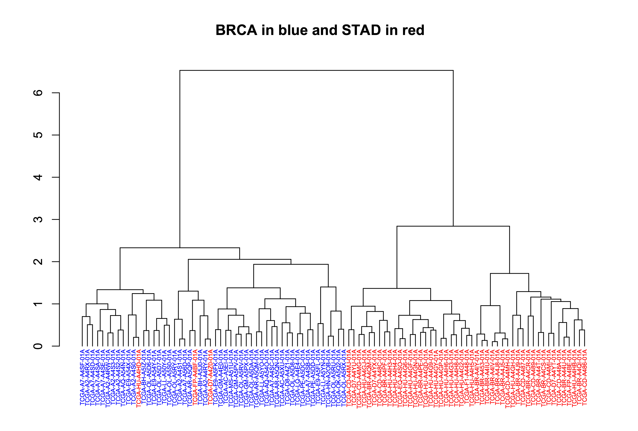
Fig1. Dendrogram showing the sample-wise relationships based on miRNA expression.
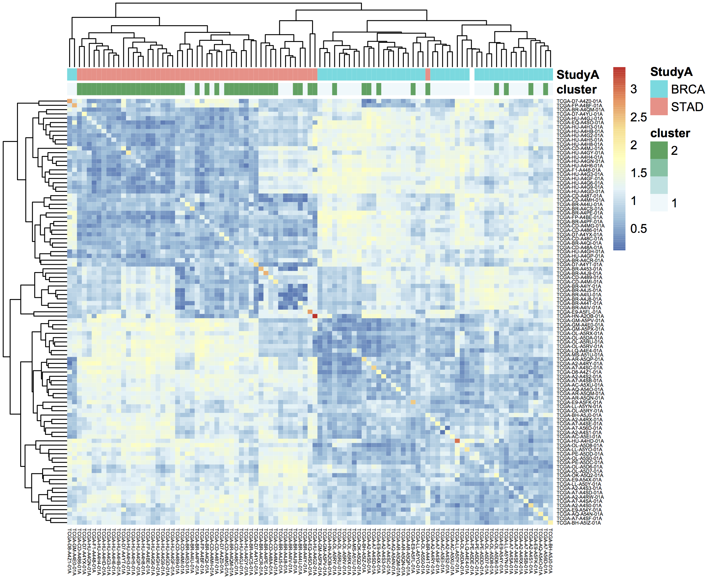
Fig2. Heatmap of pairwise distances, using pheatmap default clustering.
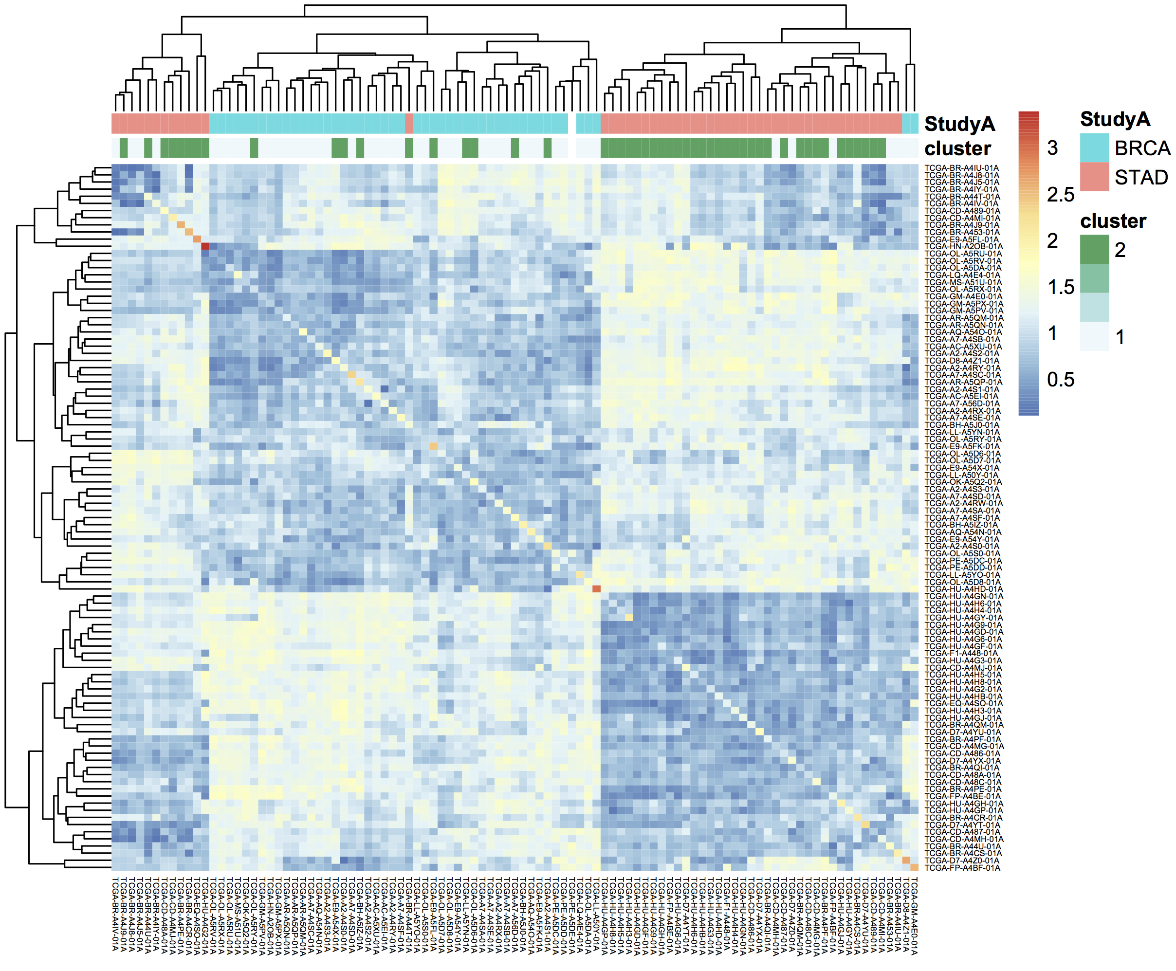
Fig3. Heatmap of pairwise distances, using the dendsort library.
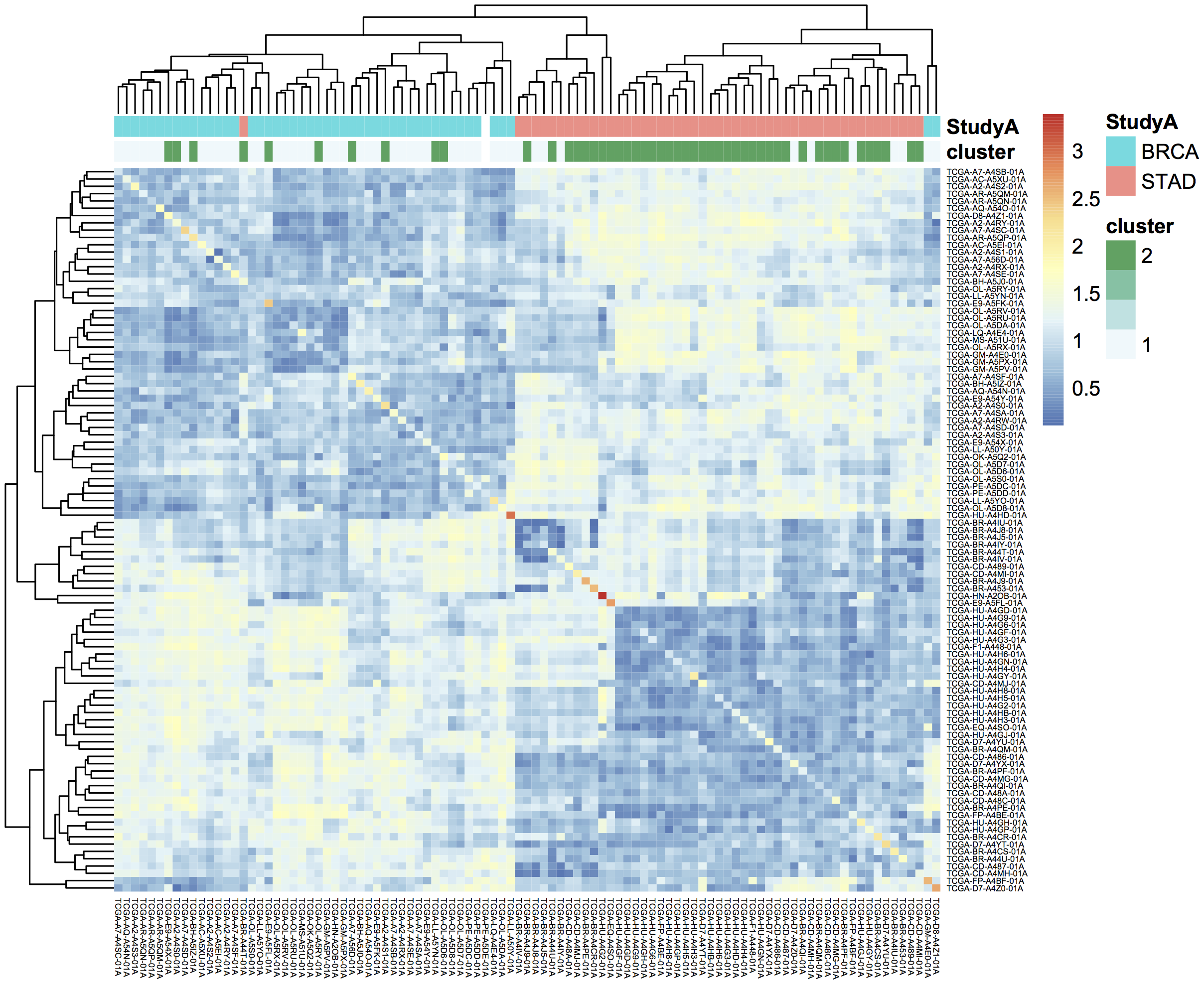
Fig4. Ordering the samples after singular value decomposition.
February, 2017
This month, we explore user defined functions or UDFs. BigQuery allows you to define custom functions, things that you can’t easily do in standard SQL, using JavaScript. These functions are defined as part of the SQL and then called within the query.
UDFs take a set of parameters, and return a value. They are strongly typed functions, which means that we need to define the types of inputs and outputs. For example, we might have FLOAT64 and BOOL input types and return a STRING. See the official Google documentation for the complete list of available types. (Note in particular that there is no INT64 type, so you will need to use either FLOAT64 or STRING when working with integers, depending on your needs.)
In our first example, we’ll define two new functions. The first classifies a sample as having a higher expression value than a given input level. And second, a function that glues three strings together. Then, in the SQL query we call both functions. These initial queries will be starting points for a more complicated example below.
These queries use Standard SQL, so if you’re in the web interface, remember to open the options panel and uncheck the ‘Use Legacy SQL’ button.
-- this next line tells BigQuery that a UDF is coming
CREATE TEMPORARY FUNCTION
  -- followed by the function name and parameter names/types:
  BiggerThan (x FLOAT64, y FLOAT64)
  -- and then the return type
  RETURNS BOOL
  -- and the language
  LANGUAGE js AS """
    // careful to use this delimiter for comments inside the function
    return (x > y);
  """;

-- now let's create another function that takes 3 input strings
-- combines them, using underscores and returns a single string:
CREATE TEMPORARY FUNCTION
  Combiner (x STRING, y STRING, z STRING)
  RETURNS STRING
  LANGUAGE js AS """
    return (x + "_" + y + "_" + z);
  """;

--
-- Now that we've defined our two UDFs, we can use them.
-- But first we're going to create an intermediate table
-- with the expression of ESR1 in the BRCA samples:
--
WITH
  gene1 AS (
  SELECT
    AliquotBarcode AS barcode1,
    Study AS study1,
    SampleTypeLetterCode AS code1,
    HGNC_gene_symbol AS gene_id1,
    AVG(LOG(normalized_count+1, 2)) AS count1
  FROM
    `isb-cgc.tcga_201607_beta.mRNA_UNC_RSEM`
  WHERE
    Study = 'BRCA'
    AND SampleTypeLetterCode = 'TP'
    AND HGNC_gene_symbol = 'ESR1'
    AND normalized_count >= 0
  GROUP BY
    AliquotBarcode,
    gene_id1,
    study1,
    code1)

--
--
-- Now we can call our functions,
-- processing the subtable.
--
SELECT
  Combiner(barcode1, study1, code1) AS cString,
  BiggerThan(count1, 5.1) AS overExp
FROM
  gene1
OK, so that was just warm-up, and obviously what was being done with the UDFs could have been done in SQL as well. But now we’re going to do something a bit more complicated(!), and estimate cluster assignments using a K-means algorithm (wikipedia), implemented in JavaScript, as a UDF!
We’re going to try to cluster each BRCA sample based on the expression of two genes: ESR1 and EGFR. This type of clustering is implemented as an iterative process that starts with two random cluster centers. In each iteration, each sample is labeled according to the nearest cluster-center, and then we recompute the locations of the cluster centers.
CREATE TEMPORARY FUNCTION

  -- In this function, we're going to be working on arrays of values.
  -- we're also going to define a set of functions 'inside' the kMeans.

  -- *heavily borrowing from https://github.com/NathanEpstein/clusters* --

  kMeans(x ARRAY<FLOAT64>,  -- ESR1 gene expression
         y ARRAY<FLOAT64>,  -- EGFR gene expression
         iterations FLOAT64,  -- the number of iterations
         k FLOAT64)           -- the number of clusters

  RETURNS ARRAY<FLOAT64>  -- returns the cluster assignments

  LANGUAGE js AS """
  'use strict'


  function sumOfSquareDiffs(oneVector, anotherVector) {
    // the sum of squares error //
    var squareDiffs = oneVector.map(function(component, i) {
      return Math.pow(component - anotherVector[i], 2);
    });
    return squareDiffs.reduce(function(a, b) { return a + b }, 0);
  };

function mindex(array) {
  // returns the index to the minimum value in the array
  var min = array.reduce(function(a, b) {
    return Math.min(a, b);
  });
  return array.indexOf(min);
};

function sumVectors(a, b) {
  // The map function gets used frequently in JavaScript
  return a.map(function(val, i) { return val + b[i] });
};

function averageLocation(points) {
  // Take all the points assigned to a cluster
  // and find the averge center point.
  // This gets used to update the cluster centroids.
  var zeroVector = points[0].location.map(function() { return 0 });
  var locations = points.map(function(point) { return point.location });
  var vectorSum = locations.reduce(function(a, b) { return sumVectors(a, b) }, zeroVector);
  return vectorSum.map(function(val) { return val / points.length });
};

function Point(location) {
  // A point object, each sample is represented as a point //
  var self = this;
  this.location = location;
  this.label = 1;
  this.updateLabel = function(centroids) {
    var distancesSquared = centroids.map(function(centroid) {
      return sumOfSquareDiffs(self.location, centroid.location);
    });
    self.label = mindex(distancesSquared);
  };
};


function Centroid(initialLocation, label) {
  // The cluster centroids //
  var self = this;
  this.location = initialLocation;
  this.label = label;
  this.updateLocation = function(points) {
    var pointsWithThisCentroid = points.filter(function(point) { return point.label == self.label });
    if (pointsWithThisCentroid.length > 0) {
      self.location = averageLocation(pointsWithThisCentroid);
    }
  };
};


var data = [];

// Our data list is list of lists. The small list being each (x,y) point
for (var i = 0; i < x.length; i++) {
  data.push([x[i],y[i]])
}

// initialize point objects with data
var points = data.map(function(vector) { return new Point(vector) });


// intialize centroids
var centroids = [];
for (var i = 0; i < k; i++) {
  centroids.push(new Centroid(points[i % points.length].location, i));
};


// update labels and centroid locations until convergence
for (var iter = 0; iter < iterations; iter++) {
  points.forEach(function(point) { point.updateLabel(centroids) });
  centroids.forEach(function(centroid) { centroid.updateLocation(points) });
};

// return the cluster labels.
var labels = []
for (var i = 0; i < points.length; i++) {
  labels.push(points[i].label)
}

return labels;

""";
--
-- *** In this query, we create two subtables, one for each gene of
--     interest, then create a set of arrays in joining the two tables.
--     We call the UDF using the arrays, and get a result back
--     made of arrays.
--
--     Due to a technical issue we save the table of arrays to
--     to a personal dataset, then unpack it. ***
--
WITH
  -- gene1, the first subtable
  --
  gene1 AS (
  SELECT
    ROW_NUMBER() OVER() row_number,
    AliquotBarcode AS barcode1,
    HGNC_gene_symbol AS gene_id1,
    AVG(LOG(normalized_count+1, 2)) AS count1
  FROM
    `isb-cgc.tcga_201607_beta.mRNA_UNC_RSEM`
  WHERE
    Study = 'BRCA'
    AND SampleTypeLetterCode = 'TP'
    AND HGNC_gene_symbol = 'ESR1'
    AND normalized_count >= 0
  GROUP BY
    AliquotBarcode,
    gene_id1),
  --
  -- gene2, the second subtable
  --
  gene2 AS (
  SELECT
    AliquotBarcode AS barcode2,
    HGNC_gene_symbol AS gene_id2,
    AVG(LOG(normalized_count+1, 2)) AS count2
  FROM
    `isb-cgc.tcga_201607_beta.mRNA_UNC_RSEM`
  WHERE
    Study = 'BRCA'
    AND SampleTypeLetterCode = 'TP'
    AND HGNC_gene_symbol = 'EGFR'
    AND normalized_count >= 0
  GROUP BY
    AliquotBarcode,
    HGNC_gene_symbol),
  --
  -- Then we create a table of arrays
  -- and join the two gene tables.
  -- ** We need to make sure all the arrays are constructed using the same index. **
  --
  arrayTable AS (
  SELECT
    ARRAY_AGG(m1.row_number ORDER BY m1.barcode1) AS arrayn,
    ARRAY_AGG(m1.barcode1 ORDER BY m1.barcode1) AS barcode,
    ARRAY_AGG(count1 ORDER BY m1.barcode1) AS esr1,
    ARRAY_AGG(count2 ORDER BY m1.barcode1) AS egfr
  FROM
    gene1 AS m1
  JOIN
    gene2 AS m2
  ON
    m1.barcode1 = m2.barcode2 )
  --
  -- Now we call the k-means UDF.
  --
SELECT
  arrayn,
  barcode,
  esr1,
  egfr,
  kMeans(esr1, egfr, 200.0, 2.0) AS cluster
FROM
  arrayTable
  --
  -- save the resulting table to a personal dataset
We need to save the above results to an intermediate table. You will need to have a dataset that you have write-access to in BigQuery to do this. For your convenience, we’ve saved the query above as a public gist and also created a bitly link to it. Rather than pasting the entire script into the BigQuery web UI, you can us the bq command line (part of the cloud SDK) and run the query and automatically save the outputs as shown below.
#!/bin/bash

qFile="kMeans_in_BQ.sql"
## get the lengthy query from the bitly link, and rename
wget -O $qFile http://bit.ly/2mn1R5D

## before you can run this you will need to modify
## the destination table to be in a project and dataset
## that you have write-access to,
## eg:  dTable="isb-cgc:scratch_dataset.kMeans_out"
dTable="YOUR_PROJECT:DATASET_NAME.TMP_TABLE"

## run the query using the 'bq' command line tool
## not all of the options are strictly necessary -- with
## the exception of "nouse_legacy_sql"
bq query --allow_large_results \
         --destination_table=$dTable \
         --replace \
         --nouse_legacy_sql \
         --nodry_run \
         "$(cat $qFile)" > /dev/null
The results of the kMeans query is one row of arrays. It’s a little tricky to unpack the arrays into rows, which is what the next query does. (Again you’ll need to edit it to select from the intermediate table you created in the previous step. Remember that in Standard SQL, the delimiter between the project name and the dataset name is just a ‘.’ whereas the bq command-line requres a ‘:’ as a separator.)
WITH
  resultTable AS (
  SELECT
    *
  FROM
    `YOUR_PROJECT.DATASET_NAME.TMP_TABLE` )
SELECT
  index row_idx,
  barcode[OFFSET(index_offset)] AS AliquotBarcode,
  esr1[OFFSET(index_offset)] AS ESR1,
  egfr[OFFSET(index_offset)] AS EGFR,
  cluster[OFFSET(index_offset)] AS Cluster
FROM
  resultTable,
  UNNEST(resultTable.arrayn) AS index
WITH
OFFSET
  index_offset
ORDER BY
  index
Finall let’s visualize the resulting clusters! Save the cluster assignments to a csv file, and read it into R.
library(ggplot2)
res0 <- read.table("results-from-the-k-means.csv", sep=",", header=T, stringsAsFactors=F)
qplot(data=res0, x=EGFR, y=ESR1, col=as.factor(Cluster))
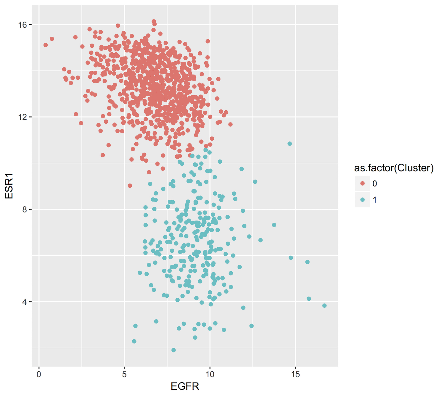
January, 2017
This month we’ll be comparing Standard SQL and Legacy SQL. It’s possible to write queries using either form, but as we’ll see, using standard SQL can be easier to write and improves readability.
In order to ‘activate’ standard SQL in the web browser, just under the ‘New Query’ text window, click the ‘Show Options’ button, and towards the bottom of the options you’ll find the ‘Use Legacy SQL’ check box – uncheck that, and then you can ‘Hide Options’ to collapse the options away again.
To use R and bigrquery to execute standard SQL, you’ll need to make sure you’re using the most up-to-date version of the R package. I would recommend installing it from the github page using devtools. Please see bigrquery for more information on installation. The important bit: there’s now support for sending a parameter called ‘useLegacySql’ in the REST calls.
Our task this month will be to compute correlations between copy number variants and gene expression, over all genes, using only BRCA samples. The copy number data is expressed in a series of segments, each with a chromosome, start-point, end-point, and value indicating whether a duplication or deletion event (or neither) has taken place.
Note that the mean copy-number values are not discrete because these data represent heterogeneous mixtures of cells – only a fraction of the cells might include an amplification or a deletion, so the ‘mean copy-number’ value represents the effect of the discrete amplifications or deletions of a specific genomic segment, averaged over the heterogenous population of cells.
One might hypothesize that a copy number amplified gene would have higher expression levels than when not amplified. However, our gene expression data has no location information, making it necessary to join the genomic locations from an appropriate reference. The resulting annotated expression table can then be joined to the copy number segments. But computing the overlap of DNA segments and genes locations can get tricky! Below we show two different ways of accomplishing the task.
Data Tables
You can get familiar with the data sources by opening the BigQuery web interface and taking a preview of the tables.
isb-cgc.tcga_cohorts.BRCA … Curated cohort table for TCGA BRCA study: 1087 unique patients and 2236 unique samples.
isb-cgc.genome_reference.GENCODE_v19 … This table is based on release 19 of the GENCODE reference gene set. Note that these annotations are based on the hg19/GRCh37 reference genome.
isb-cgc.tcga_201607_beta.mRNA_UNC_HiSeq_RSEM … This table contains all mRNA expression data produced by the UNC-LCCC (Lineberger Comprehensive Cancer Center) using the Illumina HiSeq platform and processed through their RNASeqV2 / RSEM pipeline.
isb-cgc.tcga_201607_beta.Copy_Number_segments … This table contains one row for each copy-number segment identified for each TCGA aliquot. Affymetrix SNP6 data is used in making the calls.
Legacy SQL
# This query makes use of a legacy UDF or 'user defined function'.
# To define UDFs in R, we need to define it 'inline'.
# For another example of inline definitions, see:
# https://github.com/googlegenomics/bigquery-examples/blob/master/pgp/sql/schema-comparisons/missingness-udf.sql

# Big legacy SQL queries grow like onions, they start in the center,
# and grow in layers, until the outer-most select statement returns the result.
# And like onions, they will make you cry.

SELECT
  # Here's the final select statement, computing Pearson's correlation
  # on the avgCNsegMean, the copy number mean for a particular gene
  # and avglogExp, the average expression for the same gene.
  gene,
  chr,
  CORR(avgCNsegMean,avglogExp) AS corr,
  COUNT(*) AS n
FROM (

  SELECT
    # This is the select statement on the joined CN and expr tables,
    # where averages are computed on copy number and expression.
    annotCN.gene AS gene,
    annotCN.chr AS chr,
    annotCN.SampleBarcode AS SampleBarcode,
    AVG(annotCN.CNsegMean) AS avgCNsegMean,
    AVG(exp.logExp) AS avgLogExp
  FROM (

    SELECT
      # This is the select statement that annotates the CN segments via binning.
      # To annotate the segments, the CN segment start and end positions are binned,
      # as well as the gene reference information.
      # The bins provide a sort of grid that can be used for aligning the segments
      # to gene locations.
      geneInfo.gene AS gene,
      geneInfo.chr AS chr,
      geneInfo.region_start AS gene_start,
      geneInfo.region_end AS gene_end,
      geneInfo.bin AS bin,
      cnInfo.SampleBarcode AS SampleBarcode,
      cnInfo.Segment_Mean AS CNsegMean,
      cnInfo.region_start AS cn_start,
      cnInfo.region_end AS cn_end
    FROM (
      SELECT
        label AS gene,
        chr,
        region_start,
        region_end,
        bin
      FROM js (  # This User-defined function bins the genome making the join possible.

          (SELECT
            gene_name AS label,
            FLOAT(start) AS value,
            LTRIM(seq_name,\"chr\") AS chr,
            start AS region_start,
            END AS region_end
          FROM
            [isb-cgc:genome_reference.GENCODE_v19]
          WHERE
            feature=\"gene\"
            AND gene_status=\"KNOWN\"
            AND source=\"HAVANA\"),

            label, value, chr, region_start, region_end,

            \"[{'name': 'label', 'type': 'string'},   // Output schema
             {'name': 'value', 'type': 'float'},
             {'name': 'chr',   'type': 'string'},
             {'name': 'region_start', 'type': 'integer'},
             {'name': 'region_end',   'type': 'integer'},
             {'name': 'bin',   'type': 'integer'}]\",

             \"function binIntervals(row, emit) {
               // This is JavaScript ... here we use '//' for comments
               // Legacy UDFs take a single row as input.
               // and return a row.. can be a different number of columns.
               var binSize = 10000;  // Make sure this matches the value in the SQL (if necessary)
               var startBin = Math.floor(row.region_start / binSize);
               var endBin = Math.floor(row.region_end / binSize);

               // Since an interval can span multiple bins, emit
               // a record for each bin it spans.
               for(var bin = startBin; bin <= endBin; bin++) {
                 emit({label: row.label,
                       value: row.value,
                       chr: row.chr,
                       region_start: row.region_start,
                       region_end: row.region_end,
                       bin: bin,
                      });
               }
            }\")) AS geneInfo

    JOIN EACH (
      # This is the join between the binned CNs, and the binned gene reference. #

      SELECT
        # This is the select statement that bins the gene reference information
        label AS SampleBarcode,
        value AS Segment_Mean,
        chr,
        region_start,
        region_end,
        bin
      FROM ( js (
          (SELECT
            SampleBarcode AS label,
            Segment_Mean AS value,
            Chromosome AS chr,
            start AS region_start,
            END AS region_end
          FROM
            [isb-cgc:tcga_201607_beta.Copy_Number_segments]
          WHERE
            SampleBarcode IN (
            SELECT
              SampleBarcode
            FROM
              [isb-cgc:tcga_cohorts.BRCA] ) ),

          label,value,chr,region_start,region_end,

          \"[{'name': 'label', 'type': 'string'},
            {'name': 'value', 'type': 'float'},
            {'name': 'chr',   'type': 'string'},
            {'name': 'region_start', 'type': 'integer'},
            {'name': 'region_end',   'type': 'integer'},
            {'name': 'bin',   'type': 'integer'}]\",

           \"function binIntervals(row, emit) {
             // This is JavaScript ... here we use '//' for comments
             // Legacy UDFs take a single row as input.
             var binSize = 10000;  // Make sure this matches the value in the SQL (if necessary)
             var startBin = Math.floor(row.region_start / binSize);
             var endBin = Math.floor(row.region_end / binSize);
             // Since an interval can span multiple bins, emit
             // a record for each bin it spans.
             for(var bin = startBin; bin <= endBin; bin++) {
               emit({label: row.label,
                     value: row.value,
                     chr: row.chr,
                     region_start: row.region_start,
                     region_end: row.region_end,
                     bin: bin,
                    });
             }
          }\"
        ) ) ) AS cnInfo
    ON
      ( geneInfo.chr = cnInfo.chr )
      AND ( geneInfo.bin = cnInfo.bin ) ) AS annotCN

  JOIN EACH (
    # Here's the join between annotated copy number table and the gene expression table.

    SELECT
      # Here we get the gene expression data, and barcodes.
      # We join on the SampleBarcodes in each table.
      SampleBarcode,
      HGNC_gene_symbol,
      LOG2(normalized_count+1) AS logExp
    FROM
      [isb-cgc:tcga_201607_beta.mRNA_UNC_HiSeq_RSEM]
    WHERE
      SampleBarcode IN (
      SELECT
        SampleBarcode
      FROM
        [isb-cgc:tcga_cohorts.BRCA] ) ) AS exp
  ON
    ( exp.HGNC_gene_symbol = annotCN.gene )
    AND ( exp.SampleBarcode = annotCN.SampleBarcode )
  GROUP BY
    gene,
    chr,
    SampleBarcode )
GROUP BY
  gene,
  chr
HAVING
  corr IS NOT NULL
ORDER BY
  corr DESC
Standard SQL
# In standard SQL, we define a list of tables, that can build
# off earlier definitions, so it's a little more linear and modular.

WITH
# This says: "we're going to define a list of tables WITH which we will perform subsequent SELECTs..."

  geneInfo AS (
    # First table: the gene reference information
    SELECT
      gene_name AS gene,
      LTRIM(seq_name,'chr') AS chr,
      `start` as region_start,
      `end`   as region_end
    FROM
      `isb-cgc.genome_reference.GENCODE_v19`
    WHERE
      feature='gene'
      AND gene_status='KNOWN'
      AND source = 'HAVANA'),

cnInfo AS(
  # Second: the copy number data, but only for the BRCA samples (note the sub-query).
  SELECT
    SampleBarcode,
    Segment_Mean,
    Chromosome AS chr,
    `start` AS region_start,
    `end`   AS region_end
  FROM
    `isb-cgc.tcga_201607_beta.Copy_Number_segments`
  WHERE
    SampleBarcode IN (
    SELECT
      SampleBarcode
    FROM
      `isb-cgc.tcga_cohorts.BRCA` )),

gexp AS (
  # Third: we get the gene expression data, again only for the BRCA samples
  # included is a LOG() transform as well as an AVG() aggregation function
  # which will only be relevant if there are multiple expression values for
  # a single (gene,sample) pair.
  SELECT
    SampleBarcode,
    HGNC_gene_symbol,
    AVG(LOG(normalized_count+1,2)) AS logExp
  FROM
    `isb-cgc.tcga_201607_beta.mRNA_UNC_HiSeq_RSEM`
  WHERE
    SampleBarcode IN (
    SELECT
      SampleBarcode
    FROM
      `isb-cgc.tcga_cohorts.BRCA` )
  GROUP BY
    SampleBarcode,
    HGNC_gene_symbol),

cnAnnot AS (
  # Now, we start to re-use previously defined tables.  Here, we annotate
  # the copy-number segments by JOINing on matching chromosomes and
  # looking for overlapping regions between the copy-number segments and
  # the gene regions previously obtained from the GENCODE_v19 table.
  SELECT
    geneInfo.gene AS gene,
    geneInfo.chr AS chr,
    geneInfo.region_start AS gene_start,
    geneInfo.region_end AS gene_end,
    cnInfo.SampleBarcode AS SampleBarcode,
    AVG(cnInfo.Segment_Mean) AS Avg_CNsegMean
  FROM
  cnInfo JOIN geneInfo
  ON
    (geneInfo.chr = cnInfo.chr)
  WHERE
  (cnInfo.region_start BETWEEN geneInfo.region_start AND geneInfo.region_end) OR
  (cnInfo.region_end   BETWEEN geneInfo.region_start AND geneInfo.region_end) OR
  (cnInfo.region_start < geneInfo.region_start AND cnInfo.region_end > geneInfo.region_end)
  GROUP BY
    gene,
    chr,
    gene_start,
    gene_end,
    SampleBarcode
),

bigJoin AS (
  # This is essentially the final step: in this last table definition, we make
  # a big join between the annotated copy-number table with the gene-expression
  # table and use the built-in CORR() function to compute a Pearson correlation.
  SELECT
    cnAnnot.gene AS gene,
    cnAnnot.chr AS chr,
    CORR(cnAnnot.Avg_CNsegMean,gexp.logExp) AS corr_cn_gexp,
    count(*) as n
  FROM
    cnAnnot join gexp
  ON
    ( gexp.HGNC_gene_symbol = cnAnnot.gene )
    AND ( gexp.SampleBarcode = cnAnnot.SampleBarcode )
  GROUP BY
    gene,
    chr
)

# Finally, let's pull down all the rows!
select *
from bigJoin
R script
# Here, we're going to execute the two above queries, and see how
# the correlations compare.

library(bigrquery)
library(ggplot2)

my_project_id <- "xyz"

q_legacy <- " ... first query above"

q_std <- " ... second query from above ..."

legacy_res <- query_exec(q_legacy, project=my_project_id, useLegacySql=T)

std_res <- query_exec(q_std, project=my_project_id, useLegacySql=F)

res0 <- merge(legacy_res, std_res, by="gene")

dim(std_res)
#[1] 18447     4

dim(legacy_res)
#[1] 18424     4

dim(res0)
#[1] 18424     7

qplot(data=res0, x=corr_cn_gexp, y=corr, main="CN and Expr correlation in BRCA",
      xlab="Standard SQL", ylab="Legacy SQL")
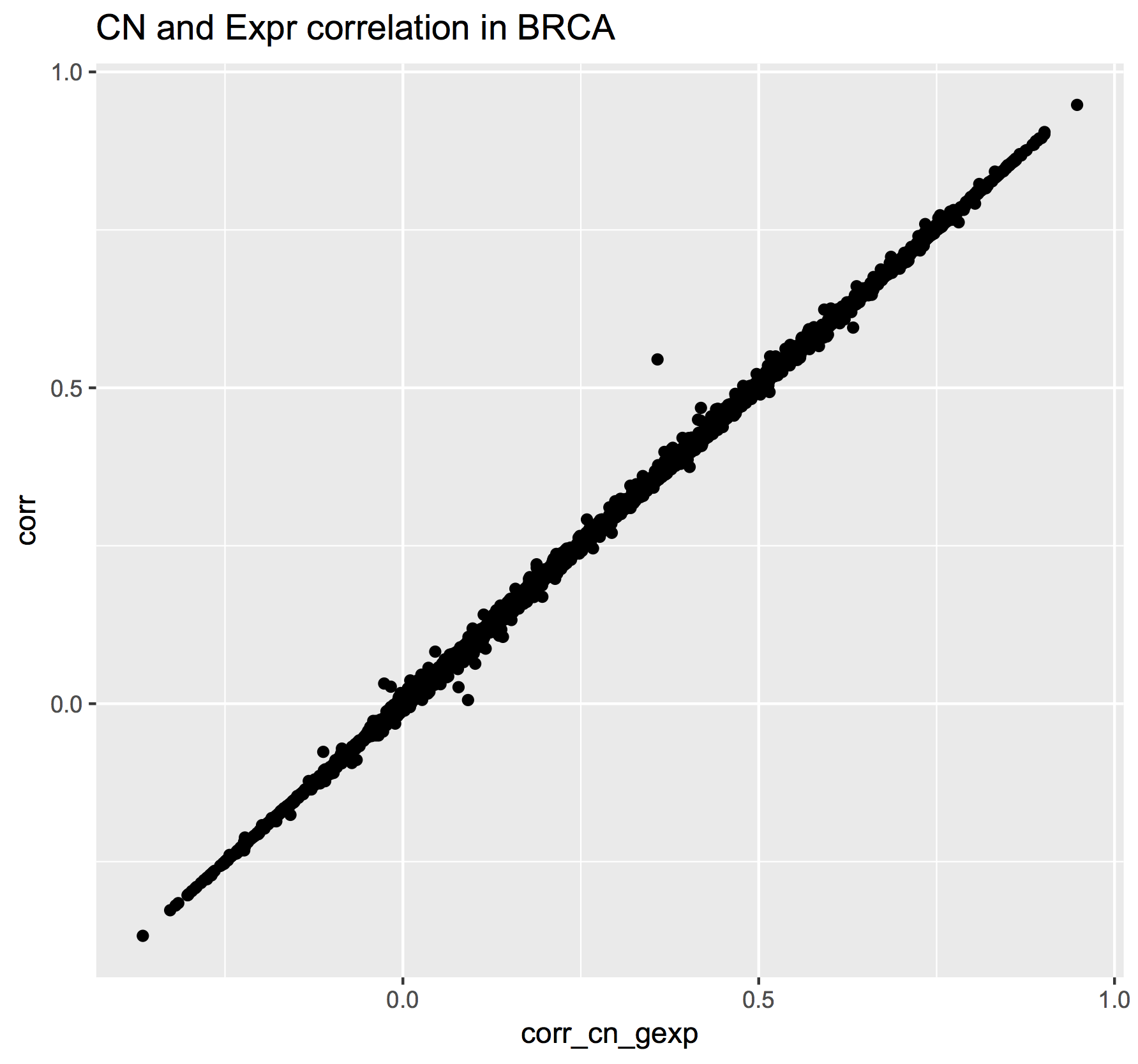
This plot shows the correlations found using the Legacy SQL solution (y-axis) compared to the correlations found using the Standard SQL solution (x-axis). Note that an exact match between the two methods was not expected because the implementation is not identical. The “legacy” solution bins the copy-number segment values into uniform length genomic segments, while the “standard” solution takes a simpler approah.
December, 2016
The ISB-CGC team is starting to add the new hg38-based TCGA data available from the NCI-GDC Data Portal and one of the first obvious questions might be: how does the new hg38 expression data compare to the hg19 data?
Description
This is exactly the type of question that the ISB-CGC resources and the BigQuery engine were made to answer. In a single SQL query, we will compare two sets of gene-level expression estimates based on RNA-Seq data. The first set consists of the hg19-based RSEM normalized gene-level expression values previously available from the TCGA DCC and now available in an easy-to-use table in BigQuery (and also from the NCI-GDC Legacy Archive). The second set was produced by the NCI-GDC mRNA Analysis Pipeline which includes a STAR alignment to hg38, and gene expression quantification using HTSeq (with annotation based on GENCODE v22).
Rather than look at one gene at a time, it’s easy (and fast!) to compute correlations for all genes simultaneously. Note that this is done in a single query. You do not want to loop over all of the genes, computing one correlation at a time because the cost of a BigQuery query depends primarily on the amount of data scanned during the query, and since the data for all genes across all TCGA samples are in a single table, if you were to loop over 10,000 genes running one query per gene, your costs would go up by a factor of 10,000! As we show below, BigQuery computes across all the genes at once (one of its benefits), and thus keeps the costs low.
In addition to using the two gene-expression data tables, our SQL query also uses the GENCODE_v22 table (one of many tables in the isb-cgc.genome_reference dataset) to map from the HGNC gene symbol (used in the older hg19 expression table) to the Ensembl gene identifier (used in the new hg38 expression table).
The query below performs both Pearson and Spearman correlations for each gene. The result is a table with 20,021 rows – one for each gene, with the Ensembl gene identifier, the gene symbol, the Pearson and Spearman correlation coefficients, and the difference between the two. The table has also been sorted by the Spearman coefficient, in descending order. This query executes in less than one minute and processes a total of 34 GB of data. This is a great example of how cloud computing can significantly enhance analytic capabilities beyond running large analytic bioinformatics pipelines quickly!
Back in June, Google
announced
full support for Standard SQL in BigQuery. The query below makes use of Standard SQL,
so if you want to try running this query yourself by cutting-and-pasting it into the
BigQuery web UI you’ll need to go into the
Show Options section and uncheck the “Use Legacy SQL” box. If you’re used to
using Legacy SQL, one small change you’ll need to make right away is in how
you refer to tables: rather than [isb-cgc:genome_reference.GENCODE_v22] for
example, you will instead write isb-cgc.genome_reference.GENCODE_v22 inside single-quotes.
As a concrete example of what these data look like, we created plots of the expression data for EGFR in R (see below for the SQL and R code).
BigQuery SQL
WITH
--
-- *GdcGene*
-- We start by extracting gene-expression data from the new NCI-GDC/hg38-based
-- table in the isb-cgc:hg38_data_previews dataset.  For each row, we
-- extract simply the SamplesSubmitterID (aka the TCGA sample barcode),
-- the Ensembl gene ID (eg ENSG00000182253), and the FPKM value.  The input
-- table has ~671M rows and many more fields, but we just need these 3.
GdcGene AS (
SELECT
  SamplesSubmitterID AS sampleID,
  Ensembl_gene_ID AS geneID,
  HTSeq__FPKM AS HTSeq_FPKM
FROM
  `isb-cgc.hg38_data_previews.TCGA_GeneExpressionQuantification` ),
--
-- *GeneRef*
-- Next, we're going to get the gene-id to gene-symbol mapping from the GENCODE
-- reference table because the NCI-GDC table reference above contains only the gene-id
-- while the expression data we want to compare that to contains gene symbols.
GeneRef AS (
SELECT
  gene_id,
  gene_name
FROM
  `isb-cgc.genome_reference.GENCODE_v22`
WHERE
  feature='gene' ),
--
-- *Hg38*
-- Now we'll join the two tables above to annotate the NCI-GDC expression data with gene-symbols,
-- and we'll call it Hg38.  We're also going to create a ranking of the expression values
-- so that we can compute a Spearman correlation later on.
Hg38 AS (
SELECT
  GdcGene.sampleID,
  GdcGene.geneID,
  GeneRef.gene_name,
  GdcGene.HTSeq_FPKM,
  DENSE_RANK() OVER (PARTITION BY GdcGene.geneID ORDER BY GdcGene.HTSeq_FPKM ASC) AS rankHTSeq
FROM
  GdcGene
JOIN
  GeneRef
ON
  GdcGene.geneID = GeneRef.gene_id ),
--
-- *Hg19*
-- Now, we'll get the older hg19-based TCGA gene expression data that was generated
-- by UNC using RSEM.  This table has ~228M rows and we're just going to extract
-- the sample-barcode, the gene-symbol, the normalized-count, and the platform (since
-- this data ws produced on two different platforms and this might be relevant later).
-- As above, we will also create ranking of the expression values.
Hg19 AS (
SELECT
  SampleBarcode,
  HGNC_gene_symbol,
  normalized_count as RSEM_FPKM,
  DENSE_RANK() OVER (PARTITION BY HGNC_gene_symbol ORDER BY normalized_count ASC) AS rankRSEM,
  Platform
FROM
  `isb-cgc.tcga_201607_beta.mRNA_UNC_RSEM`
WHERE
  HGNC_gene_symbol IS NOT NULL ),
--
-- *JoinAndCorr*
-- Finally, we join the two tables and compute correlations
JoinAndCorr AS (
SELECT
  hg38.geneID AS gene_id,
  hg38.gene_name AS gene_name,
  CORR(LOG10(hg38.HTSeq_FPKM+1),
    LOG10(hg19.RSEM_FPKM+1)) AS gexpPearsonCorr,
  CORR(hg38.rankHTSeq,
    hg19.rankRSEM) AS gexpSpearmanCorr
FROM
  Hg19
JOIN
  Hg38
ON
  hg38.sampleID=hg19.SampleBarcode
  AND hg38.gene_name=hg19.HGNC_gene_symbol
GROUP BY
  hg38.geneID,
  hg38.gene_name )
--
-- Lastly, we make one last select
-- to get a difference between Pearson and Spearman correlations.
SELECT
  gene_id,
  gene_name,
  gexpPearsonCorr,
  gexpSpearmanCorr,
  (gexpSpearmanCorr-gexpPearsonCorr) AS deltaCorr
FROM
  JoinAndCorr
WHERE
  IS_NAN(gexpSpearmanCorr) = FALSE
ORDER BY
  gexpSpearmanCorr DESC
The results of any BigQuery query executed in the BigQuery web UI can easily be saved to a table in case you want to perform follow-up queries on the result. For example we might want to ask what the distribution of the correlation coefficients produced by the preceding query look like. We can ask BigQuery to compute the deciles on the saved results like this:
SELECT
  APPROX_QUANTILES ( gexpPearsonCorr, 10 ) AS PearsonQ,
  APPROX_QUANTILES ( gexpSpearmanCorr, 10 ) AS SpearmanQ,
  APPROX_QUANTILES ( deltaCorr, 10 ) AS deltaQ
FROM
  `<<insert your results table name here>>`
The result of the above query shows that 80% of genes have a Pearson correlation >= 0.84 and a Spearman correlation >= 0.88, and that 80% of the time the difference between these two correlations is between -0.012 and +0.098. The median Pearson correlation is nearly 0.93 and the median Spearman correlation is nearly 0.96.
Visualizations
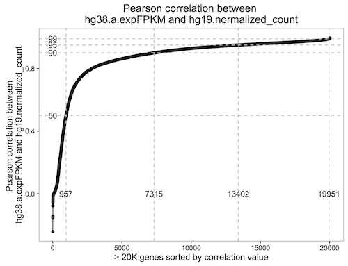
This plot shows the cumulative distribution of the Pearson correlation between the hg19 RSEM expression and the hg38 HTSeq expression data. Each point represents one gene.
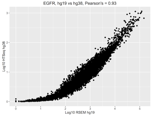
This plot shows the EGFR log10 expression, with the hg19 RSEM values on the x-axis and the hg38 HTSeq values on the y-axis. Note that overall, the difference between the RSEM and HTSeq methods may have a more significant impact on the expression values than the change in the genome build.

This plot shows the ranked EGFR expression, with the hg19 RSEM values on the x-axis and the hg38 HTSeq values on the y-axis.
R Script
Note that the latest version of the bigrquery package supports standard SQL, so make sure you’re up to date.
library(devtools)
devtools::install_github("rstats-db/bigrquery")

library(bigrquery)
library(ggplot2)
library(stringr)

# saving the above query as a string variable named 'q'

res1 <- query_exec(q, project='isb-cgc-02-abcd', useLegacySql = FALSE)

n <-  dim(res1)[1]
ys <- c(0.5, 0.9, 0.95, 0.99)
ls <- sapply(1:4, function(i) sum(res1$gexpPearsonCorr < ys[i]))

qplot(x=1:n, y=sort(res1$gexpPearsonCorr)) + geom_line() +
geom_hline(yintercept = ys, col='grey', lty=2) +
geom_vline(xintercept = ls, col='grey', lty=2) +
annotate(geom="text", label=ls[1], x=ls[1], y=0) +
annotate(geom="text", label=ls[2], x=ls[2], y=0) +
annotate(geom="text", label=ls[3], x=ls[3], y=0) +
annotate(geom="text", label=ls[4], x=ls[4], y=0) +
annotate(geom="text", label="50", y=ys[1], x=0) +
annotate(geom="text", label="90", y=ys[2], x=0) +
annotate(geom="text", label="95", y=ys[3], x=0) +
annotate(geom="text", label="99", y=ys[4], x=0) +
xlab("> 20K genes sorted by correlation value") +
ylab("Pearson correlation between \nhg38.a.expFPKM and hg19.normalized_count") +
ggtitle("Pearson correlation between \nhg38.a.expFPKM and hg19.normalized_count") +
theme_bw() +
theme(panel.grid.major = element_blank(), panel.grid.minor = element_blank(),
      panel.background = element_blank(), axis.line = element_line(colour = "black"))


# As an exercise, you could make the above plot with Spearman's correlations.


# Then let's take a look at one of our favorite genes, EGFR.

q <- "
  WITH
  --
  Hg38 AS (
  SELECT
    SamplesSubmitterID AS sampleID,
    Ensembl_gene_ID AS geneID,
    DENSE_RANK() OVER (PARTITION BY Ensembl_gene_ID ORDER BY HTSeq__FPKM ASC) AS rankHTSeq,
    HTSeq__FPKM AS HTseq_FPKM
  FROM
    `isb-cgc.hg38_data_previews.TCGA_GeneExpressionQuantification`
  WHERE
    Ensembl_gene_ID = 'ENSG00000146648'),
  --
  Hg19 AS (
  SELECT
    SampleBarcode,
    HGNC_gene_symbol,
    normalized_count as RSEM_FPKM,
    DENSE_RANK() OVER (PARTITION BY HGNC_gene_symbol ORDER BY normalized_count ASC) AS rankRSEM,
    Platform
  FROM
    `isb-cgc.tcga_201607_beta.mRNA_UNC_RSEM`
  WHERE
    HGNC_gene_symbol = 'EGFR' )
  --
  -- *Join and Get Expr*
  SELECT
    hg38.geneID AS gene_id,
    hg19.HGNC_gene_symbol AS gene_name,
    LOG10(hg38.HTseq_FPKM+1) as Log10_hg38_HTSeq,
    LOG10(hg19.RSEM_FPKM+1) AS Log10_hg19_RSEM,
    rankRSEM,
    rankHTSeq
  FROM
    Hg19
  JOIN
    Hg38
  ON
    hg38.sampleID=hg19.SampleBarcode
  GROUP BY
    gene_id,
    gene_name,
    Log10_hg38_HTSeq,
    Log10_hg19_RSEM,
    rankRSEM,
    rankHTSeq"

result <- query_exec(q, project="isb-cgc-02-abcd", useLegacySql=F)

qplot(data=result, x=Log10_hg19_RSEM, y=Log10_hg38_HTSeq, main="EGFR, hg19 vs hg38, Pearson's = 0.93", xlab="Log10 RSEM hg19", ylab="Log10 HTSeq hg38")

qplot(data=result, x=rankRSEM, y=rankHTSeq, main="EGFR, hg19 vs hg38, Spearman's = 0.96", xlab="Rank RSEM hg19", ylab="Rank HTSeq hg38")

# As an exercise, try plotting some other genes. Maybe genes
# with both high and low correlations. What do you notice?
Let us know if you’re having trouble! We’re here to help.
Additional Resources:
ISB-CGC examples-R github repo
ISB-CGC Analysis with R workshop material
BigQuery web UI quickstart
BigQuery 101 video
Fun with a Petabyte: Pushing the limits of Google BigQuery video
